Off the Top: Design Entries

20052010201520202025

Showing posts: 1-15 of 104 total posts


22 September 2026

A Stunning Video on Design and Porcelain Watch Face Creation

As I was wrapping things up last night and I had calm travel videos on for ambient background, YouTube offered up something different that I found amazing on many levels.

The video was from the watch brand anOrdain (anOrdain from Glasgow’s Southside), which I had not heard of, but that isn’t a surprise as I’m not a big “watch guy”. I’ve had a few decent watches, my dad’s Rolex when he passed and that was 99% sentimental. And Apple Watch which is largely utilitarian, but designed well.

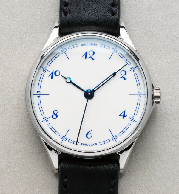
The anOrdain video was on their YouTube channel and focussed solely on their Model 1 Porcelain watch and the design, craftsmanship, and the process. I found the video incredibly well produced and the story of their process to make the porcelain face, the typography, and the hands. It is a highly designed and crafted watch and the video matches that really well.

The Blue on White Porcelain Video

The video Blue On White | The Model 1 Porcelain - YouTube - anOrdain color hues, pacing, focus on details is a wonderful bit of video craft on its own. But, it matches the watch maker’s esthetic and practice so very well. I’ve watched a couple other videos and they have the same craft and design forward esthetic and feel.

What I Fell For

I don’t know that I’ve really fallen for a watch. I have for things really well designed and crafted, but watches rarely fit that bill as many tilt toward flashy and gaudy not elegant. What struck me with the watch is the face with the white porcelain and the incredible blue that is a Delft Blue. It somewhat reminds me of the Elizabeth Tower Clock / Big Ben - Wikipedia after it had been refurbished and the decades of dirt and grime removed and the hands and markings were blue (Big Ben Elizabeth Tower London 2023 01 Detail - Big Ben - Wikipedia). This combination resonates really well with me and it is calming and beautiful in a way most watch faces aren’t.

White watch face with Delft Blue numbers and markings, with blue hands created from heated steel

That wonderful white and blue combination is often really striking to me. On the anOrdain watch, The Model 1 Porcelain, it is matched with the details of the face with the curved blue rectangle markings, the custom typeface by Kia Tasbihgou (Design Practice of Kia Tasbihgou and Kiatas on Instagram and article about his typeface designs A campaigner for the unconventional, Kia Tasbihgou discusses his latest typefaces ), which is classical and playfully exaggerated like a hand drawn set of numbers. The hands on the watch are distinct and unique from each other, and are a blue from heated steel, which are a different hue and shade, but rhymes really well.

This is well outside my budget. It looks very much like an art piece crafted for one’s wrist.


Modernized Page Structure for the Model of Attraction Draft from March 2002

I’ve been looking at filling in the gaps around the Personal InfoCloud and setting the foundation for it in the four InfoClouds in an Overview of the InfoClouds, but pointing back to a quick framing of the Model of Attraction, mostly leans to the original draft (and only a first draft) of the Model of Attraction - First Draft :: vanderwal.net that I wrote on a flight back home from Austin when the idea hit.

Looking at that page, the page was still in a 2002 or 2003 layout and design, which is quite similar to what it is today, but the text was much smaller and the page much narrower.

Update of the Layout Structure

I updated the layout structure of the page and the HTML framework of the page and used the current CSS that does much of the layout work (then and now). I also fixed a few typos and corrected the date at the top, which was a year off as stated elsewhere, as March 2002 is the correct date.

I Haven’t Read Through This In a Long While

As I was resetting the scaffolding of the page I realized it has been a long time since I have read this in full, and I need to set aside time to do that. There are quite a few things I wrote out fully in the rough draft and in the outlined sections at the end, which set the foundations for much that was to follow. But, it goes much farther in a broad sense pulling things in and building bridges to uses of the model within different domains that people work in. The initial piece also calls out the initial rough use of info cloud in my quote:

“Users have a rough cloud of information following them that has a magnetic attraction toward them and their interests.”

I had forgotten about that. It had been captured by someone I was talking with as the idea was gelling and I used it a couple of times and realized it had gravity. This became the hook for InfoCloud.


12 September 2026

Large Observable Update

Around mid-week Observable announced a major update on their blog (A new Observable) and my evenings turned into looking at updates to the Notebooks, charts / data visualization offerings and much more. There are more interactive charting models and this is the first time I’ve noticed a downloadable notebook app for Macs (I haven’t tried it yet).

I use D3 by Observable quite a bit for data visualizations form data focussed apps (I also have been using Plotly for local Python interactive data apps). I started using D3 in late 2011 for some small data visualization projects, but in 2012 was working on a large project that made extensive use of it and it has stuck as a tool in my tool belt.

I often use Pandas, Polars, and Jupyter, but also RStudio. It might be time to look at Observable’s notebook, but I’m not overly fond of JavaScript and I’ve been using Claude to assist cut down the struggles with JS and getting to looking at and interacting with data visualizations.

The D3 and Observable sites have been some of the best resources for understanding data visualization basics and good fits for data and visualizations. The education aspect, as well as the really good quality charts and visualization tools have made it a regular resource that I use and regularly point others to.

I still have a lot of Observable and D3js tabs open as I’m pulling better notes for myself. But, I figured it was a good time to share it with others.


10 September 2026

Affinity for the Canva Affinity

I’ve been a long-time fan of the design apps by Affinity. When they were bought by Canva I had a little concern (just a little as I know some of the people behind Canva (Canva), but also I have confidence in them to do the right thing). When the updated Affinity Studio app (Affinity) came out from Canva that collapsed all the paid design apps (and more) in to one app and it was free, I was really curious and have become quite impressed.

Over the last many months I’ve been playing with Affinity and trying various things out that make the combined app really interesting. I’ve loved the standalone photo app, but that is one I’ve had the toughest time getting my mind around the new dynamics of it. But, I love the typography focus as it gives a lot of control. The publishing app and its integration have me using typography and components of the publishing app to do interesting small projects.

One of the things I did with the Affinity combined app was a series of playing with a capital letter A. One of my favorites turned out to be one I call “mallard A”. Mallard A is simple, and uses the vector tools to some frayed feather touches to the bottom of the bend to serif. But, I also liked the ease and control playing with the gradient.

Serif capital letter A with frayed feather near the left bottom serif and gradient purple to dark green


25 August 2026

Vibe Markets Don’t Always Rhyme with Good Product

My recent Four Cornerstones of Development post (which I found the initial blog mention on a March 2001 archive page - Off the Top :: March 2001 and later on mention I’m working on an essay on it, which I somewhat remember having a publication ask me to write it for them, but no longer exists) was surfacing in discussion a bit lately when talking with those building quick things for themselves that they had used LLM for coding (as well as much of the interaction and visual design), which is viable for personal use for a stretch and then you hit the reliable, maintainable, repeatable thresholds of pain.

Ooh! This Looks Interesting

But, I’ve looked at a quite a few of these projects (not those that aren’t really products) as they initially seem like they would solve a use case gap I have. But, I saw a video for an app that was pitched and it hit a long-standing need I had that has heavy friction. It was an app that linked to Glaze, which is a product / service from Raycast. I read through the information about Glaze and thought this could be “interesting”. I had trouble finding the app that caught my interest as the Glaze app marketplace is a mess. I finally found the app, looked at the descriptions and images and figured I’d give it a go. I found I had to download the Glaze app to seemingly run the app I wanted within Glaze. This was less than optimal putting a silo wrapper around apps, that has never worked well and there is a long and abundant history of attempts at this poor model. (An app with scripts and workflows that can be added through a marketplace / gallery like Raycast or Alfred is a good model, but full apps that is a very different story).

The Needed Perspective Framing (Likely to be skipped to preserve a rant)

I’m not adverse to people using coding assistance, but there is a lot more to building an app or script than just code (and often being a developer or engineer helps keep the AI coding assistance in check as they can resurface long gone poor practices that are abundant in the training material). Not having background in development nor product management nor design creates a lot of gaps and little depth to know if something is actually good or not.

I’ve Seen this Movie Before and …

I opened Glaze and got the app I had interest in set up, and it was slow, not well considered with limited functionality that would be helpful for a basic app in the genre it sat in. The hope I had was shot, I was rather disappointed (it happens a lot) with the level of a “proof of concept” build that only examines is something possible to let you then you interrogate the hell out of it to figure out what is wrong and how to improve it before you get to the prototype or alpha version. I shut the app and won’t open it again.

I looked at other apps in Glaze. All I looked at had the same level of quality (or I should say lack of quality and basic understanding of what an app is, let alone what a product is).

I jumped to the four cornerstones, as I would on something I was building or running a product group that is creating and developing. Things were sort of usable, but half a cornerstone doesn’t get you very far. There is a lot to know and understand beside an interface that does something and I haven’t found AI services that fill much of this ground that needs to be covered in a solid manner. They can help code decently on small-ish projects (and slightly larger) and get okay (yet often problematic) interfaces. But, the other considerations and forward-looking needs to plan for or at a minimum consider so to account for future adaptation are missing or not supported well. The person building has to bring that understanding with them to drive this to a decent outcome.

Creating an app seems easy but there is a lot that should be considered and accounted for in the process, even for something simple. Putting out what will soon be abandoned ware with a “developer” / creator that didn’t quite ship something solid and left it at that, and not to return.

It May be an Idea Farm

There are a lot of great ideas in Glaze, but the lack of quality has me deleting the Glaze and adding a reminder to not go back. The deletion of Glaze took around 2 hours as the thorough app deletion tools I have were getting errors from many components claiming deletion was not permitted. This often happens when an app is running, but the app had been quit. It has been a long time since I’ve had to go through rounds of rebooting my Mac to rip out stubborn poor app remnants.

Know What You are Getting In To

There are people who have been building good niche products that have used AI to help fill gaps. Most of them have a lot of experience with UI, UX, product, and/or development to know what needs to be done at least at a basic level. Not all of them have worked through all four cornerstones, but they have considered them, and have lived through the hell from not considering and/or working through the cornerstones.


2 August 2026

BBC Global Focus on Lina Ghotmeh and Her Architecture

This morning I woke too early to head to the farmer’s market so I hit YouTube (as one does) and found this gem from BBC Global, Lina Ghotmeh: How to design buildings that remember the past. It is about Lina Ghotmeh, whom I didn’t know about before.

The video is wonderful, but the work of Ghotmeh is stunning. It has been a while since I’ve run into a new (to me) architect who is refreshing to hear discuss their work and perspectives, but also sees things differently and that difference make a fantastic outcome. The beauty of flow and space in her work, but also deeply considered understanding of history and cultural context is magnificent.

It has been a while since I’ve heard good architecture discussions, from basics to really good quotable insights.

Architecture has to talk about the environment, it has to talk about context, and to do that, we have to understand that environment in the large sense of what an environment is.

There was a great quote regarding her winning the work to be the architect for the Estonian museum - Lina Ghotmeh — Architecture | Estonian National Museum - and she said the blind review panel thought they were Estonian with how well they understood the culture, history, and environment. That is the sign of good design and development, where the needs and concerns are understood and perceived as those doing the work are “one of us”.

The competition itself was opened in 2005. It was an anonymous competition, so they didn’t know that we were foreigners — they thought we were Estonians.

The discussion of the Stone Garden work in Beirut, Lebanon provided really good insight and creativity to embrace the pained history while easing a means for inspiration for growth and recovery. (Lina Ghotmeh — Architecture | Stone Garden Housing - Beirut)

In 2020, August 4th, there was a huge explosion in the port of Beirut. Stone Garden was one of the first buildings that was hit. It actually resisted the explosion. It was designed to endure earthquakes because Lina did look back at the site, at history, at what was happening in Beirut. In itself, the building embodies resilience.

A term that Ghotmeh’s firm uses is, “archaeology of the future”, which I find to be a really good reflexive perspective while researching, designing, and building something informed for the near now and the future.

It’s about always digging in the place, understanding the context, understanding the client — that takes the form of different research elements, images. Every time you build something, you’re actually projecting into the future. And that’s why it’s an archaeology of the future.

The video wraps with her presentation to the British Museum for the redevelopment of the Western Range - Lina Ghotmeh — Architecture | Stone Garden Housing - Beirut and the outcome of that pitch and review process.

Looking at the Corpus of Work for Lina Ghotmeh

This video has had me digging into the architecture firm, Lina Ghotmeh — Architecture | Paris and going through the volume of work she and her firm have already done. There is so much wonderful work and many insights, that I know I will be returning to it.


22 June 2026

Does the Internet Make My Type Look Small

Early in the week I was “doing a thing” that is part of future improvement to the back catalog of 25 plus years of posts and I looking at my site a lot, as well as other sites and my type looked small when comparing to most. To me my site was quite readable and keeping comfortable line lengths, but there was a size difference that I really hadn’t noticed as much.

I checked with a few fellow bloggers, whom I swore recently had type around the same rendered size mine has, but they nearly all said they hadn’t touched their type size in years (a couple had adjusted it in recent months). Their type sizes were larger.

Adjusting Type Size

The last visual adjustments I made were in 2020 and it was a bumping up of the default type size and making the page size wider, as screens were larger and could accommodate the size increase of the type (today I found my original draft of the Model of Attraction is still in the older page size - Model of Attraction - First Draft).

I still set the default font size in pixels and call Helvetica Neue to be displayed. I started working with the modifying the CSS in the Lab - vanderwal.net, as there are enough page types in there to test many of the layouts and furniture with the adjustments.

I bumped up the font size two pixels and that needed a lot of adjustments for the header, nav bar, margins, and padding. I was about halfway through the adjustments of sizing for other CSS elements when I realized the line lengths for body text were tight, like a cheap suit that “stretches”. I backed down the font size one pixel and that improved the type size nicely and kept good line lengths and reading more comfortable. One thing I needed to do was add height to the heading to let the “highly creative” heading set more clearly again. This meant adjusting the height of the heading background image (there is plenty of width).

I completed adjusting the margins and padding and the body text was breathing well. I opened a few other pages from other sites I regularly visit for blogs and new and informative sites. The type on vanderwal.net felt like it fit on the web.

Moving the CSS Out of the Lab

On Friday I took the steps to move the CSS over to this side of things.Because there are some things that are a little different on the Lab side I needed to use diff to compare the two CSS files and update this side. I turned to my trusty BBEdit to do the task (I hadn’t used the compare in BBEdit in years) and it reminded me why I like using BBEdit for the, “I wish I had something that could…” type tasks.

After about a half an hour things were sorted and most things looked as I had hoped. There are a handful of alignments that need fussing with. There is a margin and / or padding issue that has been around from the last size tweaking a few years back.

Side Benefit

There are some small benefits that have come from these adjustments. One is related to the links page and improved ease clicking Vision Pro and on iPad. I have kept the line height a bit tight as there are many links and on a laptop or desktop screen it is fine clicking. It has also improved clicking on mobile as the touch target is increase.


10 May 2026

Joy Filled Email about Poem1 Shipping

This weekend started with an email about something shipping that I’ve anticipated for nearly 2.5 years. In January 2024 Matt Webb posted about a hardware clock what shows AI created poems for all the times of a day on an e-ink screen. This was something that caught my interest, less for the AI and more for the whimsey. But, the other part of it was hardware and the adventure that brings.

Not Matt’s First Hardware Experience

Matt had been part of Webb and Schulze, which turned into BERG London that was highly innovative playing with ideas at the edges. One of their creations was little printer. Part of watching that journey was some of the creation and manufacturing of the hardware that Berg shared out.

With this poem clock that Matt named “Poem1”, he turned it into a kickstarter project, and that brought along with it a look into the creation of a hardware product as it really is for things not at the scale of tens of thousands, if not orders of magnitude higher. Hardware is hard for electronics with getting all the parts approved, and then lined up to run through production it is a painstaking process and incredibly long.

So Excited by the Email

When I saw the email I was excited, like one is for people finishing an around the globe sailing adventure or some other long arduous feat. Getting the device will bring enjoyment, but watching from the blog about the inception of the idea, through turning it into a Kickstarter project and the emails about progress and the long waits between emails when approval waits were happening (or looking for plan B or Q for dealing with a part change needed).

I am so happy for Matt and having his device out into the world in people’s hands shortly.


18 September 2025

Swan Song's AR Design and Creation

I have a serious soft spot for the movie Swan Song (which stars Mahershala Ali and Glenn Close that is set in the near future in the Pacific Northwest. I was a fan of its soft and deep thought invoking exploration of life and replication, but also its near future view of technology. While others have been excited by the Minority Report’s manic augmented reality (AR) interface, the design and use of near future AR as part of work and personal life was really good. To say I was fascinated, may be putting it lightly. Swan Song (2021 Benjamin Cleary film) - Wikipedia was released in 2021 and Apple had yet to have announce Apple Vision Pro with its visionOS and really good graphics and workable interface. The visual and interaction design of what the main character (Cameron) worked in was incredibly good. Once Apple Vision Pro was out it felt like Cameron’s interfaces and interactions were part of the future road map.

The Design Studio Behind the Digital Interfaces and Interaction Design

Being that Swan Song movie was part of Apple Studios - Wikipedia I was believing Apple had a part in the creation of the user interfaces and interaction design of the AR in the movie. But, poking around in Vimeo I stumbled on the design reel for Swan Song - Territory Studio, so I finally found the studio that created the AR and digital design elements in the film.

Territory Studio’s Design Overview

Territory Studio’s page for the high level design overview of what they created for Swan Song is really good. I had been feeling like Swan Song’s design and AR team were more closely tied to Apple as their AR interaction design is very much like Apple’s sensibilities, with a more muted palette from a calm future. A lot of things that are in Apple Vision Pro’s user interface and interaction design patterns seem to have been hinted at, if not felt like they were previewed in Swan Song. But, I’m not so sure of the connection or how specious it may be.

The Territory Studio page has highlights of their visual / virtual design language, personal UIs, home office AR, AR home gaming, speculative hardware, smart watch UIs, and virtual mimoji. I really would love an even deeper dive, as this is much of the virtual interactive world I’ve been waiting for, and been hoping to see come to life for years prior to the film.

There is a whole lot in Swan Song that I loved from the time it was released, which was a couple years or so ahead of Apple Vision Pro being released. The headset-less AR and interaction design is one piece. But, I also was deeply taken by the whole story, cinematography, and feelings the film evoked, but also the keep thinking and consideration it evoked.

Swan Song Demo Video from Territory Studio

The show real from Territory’s work on Swan Song is in Vimeo: Swan Song Breakdown Reel - Vimeo


23 June 2025

Strong Opinion About Slide Over on iPadOS

I should say up front, I’m deeply appreciative of Apple and all the products, OSes, services, and applications they make, as most everything is done with care and craft with and eye and understanding of detail. Having interactions with develop support and internal developers now and over the years, I’ve always been impressed in their focus on getting things right and doing thing better. Nearly every interaction with Apple from customer support, sales support, Apple’s developers, and people inside Apple has been fantastic and from people who aim to do their best and look to make really solid products and services for their customers.

Apple Announces the New ipadOS

At this month’s Apple WWDC 2025 they made the announcements about the new ipadOS 26, which seems like it may be a good step forward with the new windowed interface, that moves it into looking and acting much like a Mac. There are many other updates and improvements.

Subtraction of Productivity is Far from an Improvement

But… subtraction of one prime productivity advancement that the iPad has had for many of its iterations is that of Slide Over, which if you aren’t familiar (it seems Apple isn’t), is the ability to have an app that will slide in from the side of the screen and hover in a narrow mode, while the other app (or apps, as two apps on screen has been around for a while as well) is still in view.

This meant, with one flick and (in Steve Jobs’ parlance) boom! you have a note app (my strong preference has been for Drafts) that allows me to capture ideas in markdown quickly and then (or later) push the note out elsewhere - Twitter, Mastodon, note directories that Obsidian sits over, Messages, etc.) then flick it back out of the way. It is simple, quick, efficient, and productive, which is what Apple always seemed to put as a priority.

I often have Drafts and PCalc sitting one flick (two for PCalc for the second flick), which is ONE STEP to get a productivity app of my choice in place to divert my focus from a video I’m learning from, reading I’m wanting to capture a note or to do from, a quick calculation, or whatever I want to need at the ready and then get back to focussing. This is a super power that iPad has enabled. It is what separates an iPad apart from Mac and other devices in a big way.

The New ipadOS 26 is Four Large Steps Backward for One Element of Productivity

This new window model on ipadOS 26 is nice and could be helpful, but trying to do the same quick productivity action is at minimum four steps. That isn’t a productivity gain or enhancement. That is four large steps backward Apple. Four anti-productivity steps backward. If I wanted to lose productivity like that, I would switch to Windows.

The corner quick swipe from the corner of the iPad isn’t available unless I’m using the full window interface for finger use and only getting access to Apple Notes (a really nice product, but for various reasons isn’t my first choice, nor second choice). In the new interface the quick corner access is available with Pencil swipes. The full window interface you can add a finger swipe.

But, going from a window I’m working or learning in and want to get a Drafts up and ready, if I have it in my dock it is a tap to open, get it out of the way (often two moves for placement and then narrowing it, if not also adjusting the window I’m also using, and then typing in Drafts) and that is the quickest way. Spotlight is the other option, which adds a step.

It Is an iPad not A Mac

Apple, this device is the iPad it isn’t a Mac, it has special super powers, which include the ability to help focus and be productive. With this new ipadOS 26 new functionality and capabilities are added that are helpful, but don’t take away the iPad’s strength as well. It may be those leading iPad don’t live with it as a core device and don’t care about its strengths and super powers, or they don’t understand productivity so they slipped up.

The windowed world of ipadOS 26 could easily have Slide Over and keep the super power of one flick for productivity. I’m hoping the fall release of ipadOS 26 still includes the productivity super power that sets the iPad apart and allows its users to have super productivity powers that help set them apart with the partnership of Apple’s products helping them be their best.


13 January 2021

Weeknote - 10 January 2021

The first week back at work after a 10 day break was going well, other than a continual battle with my work computer that had a battery bulge that started six months ago and slowly turned into throttling, slow cursor and slow recognition of keystrokes at times, and regular crashes. The long replacement / fix cycle is pure Covid impact. After on Friday 5pm my refresh the laptop arrived, it felt like I got half my brain back spending time getting it setup (that process is still underway).

But, the insurrection actions to take over the U.S. Capitol took the focus of the week. Work Thursday and Friday was a welcome distraction, but lack of sleep and a computer doing its best to die made them not overly productive. I never thought I would see the U.S. foundations attacked in such a brutal way. Large mobs fed by outright lies trying to keep Congress from doing what the Constitution requires them to do is years and decades in the making. Chants to execute the Vice President because he said he couldn’t do what there is no legal path for him to do is beyond excuse. Attacking the the monuments to the democracy, but also attacking the Constitution and what it has laid out to protect the U.S. democracy is pure insurrection. This is a true wicked problem that is a tightly wound gordian knot of complexity. Having leader still sitting in office that supported the insurrection and the lies that created its actions is beyond me. They are sitting in seats and elected bodies they don’t believe in and want to destroy and want to run a country with a Constitution they want to destroy.

Read

Friends shared the Rijksmuseum’s now offering high resolution images of their collection, which are stunning.

I restumbled upon SPACE10, which I used to follow but the RSS feed seem to have broken, but some of their long pieces (which is many of them) are not structured well for a long read and they have the scroll bar in the browser turned off to know roughly how far along you are in a long piece, and there are no anchors in the long pieces to link to sections of relevance. It is a really not well conceived site for people thinking about architecture and a structured world.

That said, their piece on The Digital in Architecture: Then, Now and in the Future is rather good, it reminds me of a collection of presentations on information architecture from some of the top information architects from around 2003 to 2015 or so. The piece also has a good bibliography, but nothing is linked (I’m really not sure they understand what they are doing with the web, but they content is interesting and that is likely why I pushed it off my radar in the past).

Team Topologies: Organizing Business and Technology Teams for fast Flow by Matthew Skelton and Manuel Pais finally arrived. This looks much better than what I had thought it was and may dig into it over the weekend. I picked it up to gut around the topic of teams and optimizing them, particularly around adaptive teams. I a lot of experience with building and running teams and team ecosystems in large organization and bringing helping them be modern and breaking out of the command and control as well as chain of command model non-digital companies lean on (which destroy capabilities and efficiencies and mostly died out in the early 2000s except for the dinosaur companies - for more than 20 years I’ve flipped that models and been able to vastly improve every important metric). I haven’t found good books on teams that echo not only the experiences I’ve had and have consulted others on, but ones I see as prevalent in most of the high performing companies that work the same way. I know Team Topologies is more focussed on DevOps / developer / engineering models, but some underlying foundations for improving my framing of things is what I’m looking to get out of it. There are some things I don’t fully agree with and I regularly see as problematic that are listed in headings, but I don’t know their take. What I do know is a lot of the reference materials they point to are ones I’ve long used and have in my foundations as they echo experiences and things I’ve seen in practice that are really good (I love well documented books, particularly ones that use solid references that hold up with time).

Also arrived is a used version of Paul Madonna’s Everything is its own reward, which is a book of his monochrome watercolor and sketches of San Francisco. It is wonderful and takes me back to a San Francisco I deeply miss and loved. Even though it was used, but still had the poster piece tucked into its back cover sleeve. This poster is a wonderful edition.

Watched

News…

Listened

New to me band, Her, fit the mood early in the week and I’ve added them to easy access in some playlists.

Exponent - Episode 191: Facebook, Twitter, and Trump was a good conversation that was a bit out of sync, but good from a thinking and considering the situation piece.

Postlight Podcast - WordPress and Beyond: With Matt Mullenweg was really good, as expected. Some of the side discussion that started Paul Ford thinking, really have me intrigued. I’m needing to go back and track these down.

I had A.J. Croce’s A.J. Croce album on and had forgotten how good it really is. It is so well recorded and produced as on decent headphones or sound system it sounds like you are in the room with them. This was the in the soundtrack of the cross country drive with my dad in 1993. But, even with those wonderful memories I’ve always loved this album as there is so much good music in it and the lyrics are really good with nice turns of phrase.

Productivity

I’ve gone back to a practice of daily notes (the daily dump) in Obsidian / markdown that helps keep track of thoughts. It is similar to the sections I have for the weeknote template, but include: Thoughts, read, talked to, health, watched, listened to, worked on (personal items - I haven’t kept a daily work journal in a long while, but have daily meeting notes I keep in my work environment), learned, ate, bought, added to wishlist. These last two are to keep track of why.

One of the things I’m trying to sort through in my notes, research, and writing process workflow that I’m doing between just the daily notes and weeknotes is a microcosm of my regular workflows for writing (which I’m getting back to). My notes sit in directories in markdown files that are now in Dropbox for mobile device access and Obsidian sits on top of them linking things together and all is searchable in spotlight and DevonThink Indexes it. My writing is now in iA Writer, which works best with iCloud directories, which can be searched by Spotlight, but is outside Obsidian and outside DevonThink.

I sometimes start writing in iA Writer, but they may be: Just a stub, more fleshed out but still a draft, mostly finished but not posted / published, or posted / published. I have many pieces from mid-summer around the Black Lives Matter protests after George Floyd was murdered, which really moved me, but they weren’t finished or posted. Weeknotes ran into multi-week notes, then into just idle and start from scratch. There are things I know I have written I want to point to, but they aren’t shared out (this is a common issue). I finally created a quick template for marking the state at the bottom of a piece in progress. But, this isn’t helping sort through my central repository in Obsidian where searching across that collection and interlinking to pull things closer.

I’ve swapped through a bunch of writing apps and at the moment I have no interest in moving off iA Writer as I really like it. There are some things I need to investigate for some writing coming (footnotes, tables, and possibly integration with Grammarly as I need to get back into good writing patterns and practices). In the past my long or focussed writing was in Scrivener, which I still love, but its treatment of markdown as second class citizen, which made it difficult to have a smooth workflow with for publishing to the web. I used Ulysses for a short while, but its own structures and not freely available markdown files made it not work well at all in my workflows. There is a lot I really like with Ulysses and Scrivener with notes and note management, but easy working across devices isn’t as smooth as iA Writer nor as smooth as the workflow that is easy with freely available markdown files.


15 July 2016

Breaking Radio Silence Again

It has been a while since I’ve posted here. I’m thinking I may go back to a daily update for a stretch to keep the blogging muscle limber and trained.

Personal InfoCloud Backlog too

Over on other blog, [http://www.personalinfocloud.com](Personal InfoCloud) I have had a few more recent posts, but I have a very long backlog of content for that space as well. I need to rewrite the intro to the latest post there, Team Roles Needed for Social Software Projects.

I also have a series there called Shift Happened that I have at least 12 most posts that need to get written (edited, or more likely rewritten). The next two in the Shift Happened series are related to UX in enterprise software and services and the subject of Adaption. Both of these subjects could likely have more than one post each. The UX in enterprise needs a grounding / framing piece as many still think of UX as visual design and not things being designed for use (nor all the various roles and domains that make up successful UX design). The Adaption pieces need the framing of complexity and complex adaptive systems to get set as a footing, but also needs to frame how adaption works and enables being comfortable in an ever changing environment that we live in today. As well a focus on Adaptive Road Maps is needed as how one plans in an ever shifting and complex environment is needed when today’s road maps for the next 2 to 5 years are shot to pieces after a quarter or two. Having and maintaining a long focus on where a company or product is headed is really helpful, particularly when needing to understand foundation priorities needed for a long haul in a world were agile practices drive the day-to-day, but those agile practices are incredibly nearsighted and often discourage the long view (I’ve had a lot of work related discussions about this in the last 6 months or so as it is a common deep pain point for many).

Health

A common question is about health after the eColi issue in 2014 to early 2015. My health seems to be good. Getting through last winter’s holiday season had me on edge as I was partially expecting to fall ill again. Thankfully, I stayed healthy.


16 February 2015

Design and Business Leadership Snippets

There have been quite a few pieces lately on the importance of design and design leadership. The importance of design is getting to the true understanding of what the problems are and thinking about solving out from there without preconceptions of solutions, but letting solutions evolve form the need. Different and well fitting solutions often result from this approach, which is real innovtion and not copying someone else’s solutions for your use as innovation approach.

Matt Milan’s “It’s never been more important for design firms to think differently” is the cornerstone for this thinking differently approach and its deep value. I’d add to this is knowing not only the current state of where the various mediums, systems, and devices are sitting, but where they are headed in the next year or two, so to openly plan for adaption and keep the potential integrations as open possibilities.

Brian Zmijewski’s The Design Leadership Gap and Lead by Design are two really good pieces that take a look at the need for strong design leadership.

Kai Brunner’s Is DevOps Driving the Future of UX Design? is a great look at how to mix and have success with design and DevOps. The two prodominant models don’t really work well and how to work to get to a more optimal model.


14 December 2014

Link Like Bin 13 December 2014

Another week of cleaning up, organizing, and working out partly broken identity and still working to get that resolved. Just the second time in 14 years with a Mac that I have had something this bothersome, which is much better than the nearly monthly with prior OS and same “corporate” OS when working on client sites.


3 December 2014

24 Ways: A Web Holiday Favorite

Nothing makes me happier than to see the winter holiday begin and 24 Ways start its annual release of web development and design goodness. Drew McLellan and the 24 Ways crew have done another great job and I look forward eagerly for every day’s gem that is released.

To make all of this better, 24 Ways is in its 10th year. Congratulations for all the great content and work, from the very first to the current offering of the day.


This work is licensed under the Creative Commons Attribution-NonCommercial-ShareAlike License.