Off the Top: Interface Design Entries

20052010201520202025

Showing posts: 1-15 of 110 total posts


29 August 2026

Markdown Apps Loosely Joined

I recently posted about the different web browsers I regularly use, My Browser Family, and it makes sense to go through my different apps I use for Markdown in a similar way. My use is very closely tied to my Small Apps Loosely Joined mindset (part of the Shift Happed series on Personal InfoCloud). “Small apps loosely joined” focusses on having a core adaptable data structure (like markdown) and use different apps with written content where the app has helpful capabilities that are needed in a workflow or to focus on a type of work as a step in a workflow. Much like a woodworker picks up different tools to perform different tasks and doesn’t use a saw or chisel for all tasks, the small apps loosely joined model is similar. This works and has worked insanely well for 15+ years that I’ve leaned heavily on markdown.

I end up in markdown discussions rather easily it seems. The way I have taken notes in text apps with asterisks or dashes for bullets and the octothorp (you know, this thing #) for headings goes a long way back for me (starting somewhere in the 1990s). When I came across markdown in the early 2000s, after I had looked at and tried Textile Markup, but markdown didn’t fully connect. It echoed what I had done and offered more, but at the time I didn’t see the advantage of the added capabilities.

In 2010 and 2011 I started to shift much of my note taking and writing away from apps that were siloed and lock-in models. The flow from notes from a meeting, to my personal notes and annotations, and on to writing that gets shared out was a series of less than optimal apps that all had lock-in and heavy friction. Microsoft products not only had intentional lock-in but were continually buggy. I loved (and still do) Scrivener for writing longer pieces in it due to its managing notes and scraps related to the longer writing piece, but getting things in, as well as getting things out into my various sharing / publishing workflows had a lot of friction. At this time my parents were sick and passed on. When my mom passed my laptop hard drive took it as a hint and it too left the living world. I had everything backed up and I was working off the back up drive hanging off my Mac, and was waiting on a hard drive replacement, but needed something for notes for meetings (with banks, lawyers, and so much more) that I could move across everything. I nabbed an iPad for that mobility to take to meetings have files move across and back to my Mac. This tipped me into a full markdown life.

Like Many, Not All Markdown Goes to the Web

Markdown started by John Gruber to be an easy means of writing with light structure, while maintaining decent readability and to fit his model notes, which Textile didn’t fully fit. John created markdown and the markdown conversion to HTML as a matched set. Over the years many write markdown that gets converted to HTML, but around 2010 I’d see people were using markdown that never was converted to HTML. Markdown was what they wrote in as it was highly portable and editable from any text tool or markdown app and not in buggy and lock-in software. I noticed this in San Francisco on a trip where I stopped in a couple law offices to visit friends and the receptionist and legal assistants were mostly using markdown. This surprised me, as it wasn’t something I expected. Largely markdown for writing has been in tech adjacent roles and organizations. Later year seeing high school kids and college kids using markdown for their notes and paper drafts, then pasting to Google Docs was really impressive with the deftness they worked and how they managed everything. (A funny sidenote is many who went through school this way were appalled that Microsoft Word didn’t natively understand markdown). Markdown isn’t the parent’s use case any longer.

Today markdown for me only has around 20% that gets turned into HTML. Most are notes and documents that stay in markdown or turned into Google Docs, PDFs, text in Keynote presentations, and much more. Markdown is incredibly flexible with just enough structure to get converted as needed.

At First Many Apps Only Sort of Joined

This 2011 timeframe was the heyday of small light markdown apps. I picked up many apps and found a few that worked well. I was knee-deep in the markdown matrix table that Brett Terpstra maintained that showed the markdown app and the capabilities and compared what seemed like well over 60 apps. I used Simplenote, Byword, 1Writer, Ulysses, and Bear notes quite a bit and have kept them around but don’t use them as much due to friction for where and how they keep markdown files and some interfaces didn’t evolve. I also have used Working Copy, Git on iOS on Mac and iOS (iPad) for working on larger documents across devices and with others.

Moving to Less Friction for Markdown Loosely Joined

Apps that stayed around and were added in respected where I kept my notes and work. Most of the notes and writing stayed in a notes directory, but also were in project work. My notes directory on my Mac was linked out to iCloud so I could have access from my iPad or other devices. For a long stretch my basic notes app on my Mac was NVAlt, which allowed for tagging the markdown files, which meant that while they lived in my notes directory, I could aggregate all project work in the project folders, other media, and notes all with a file tag on Mac. This was fine until NVAlt stopped opening.

My Menagerie of Markdown Apps Now

My markdown notes that NVAlt sat over (which also included a folder from Notional use) had a few thousand notes when it stopped opening. But, the markdown notes weren’t owned and controlled by NVAlt and I could use nearly any markdown app I had to open and edit them. I wanted something very close to NVAlt.

Obsidian

In June 2020, after trying to find a replacement for how I worked with NVAlt I tried a few apps, but the one standout was Obsidian which slid perfectly into the exact role that NVAlt had for me. This role was to sit over the directory of notes and oversee them, but functionality on top of the markdown notes. Obsidian added even more capabilities (which most of my other markdown apps also adopted portions of over time). Obsidian is where my daily notes, drafts of longer pieces, meeting notes, and so much more go. Everything is relatively findable and refindable through backlinks (wikilinks) that are bridges between notes (but also with a plug-in Strange New Worlds - Obsidian Plugin I can see what other notes link to the note I’m linking to, and part of the magic is the note I’m pointing to doesn’t need to exist to see those links), tags to aggregate related notes with that tag, and search.

The other great advantage of Obsidian is transclusion, where one note can be added in as a view into another note. I can start a note in a meeting note or a daily note, then highlight a section and extract that section as its own note, but then transclude that note back in to show it where it was. This extraction and transclusion allows for that one piece of notes to mature and / or be included as a transclusion into other notes. The transclusions can also bring in a sub-heading into another note to show the section in the sub-heading. (I have a longer take on how and why I don’t use zettelkasten, which is similar to what I learned going into college for how to have far better study habits and write papers far more easily, but it also broke contextual understanding and really broke multiple contextual relationships).

iA Writer

My longer form markdown writing app is iA Writer. Often an idea for writing will start as something small in Obsidian (often in a larger note) and gets fleshed out a little there. But, when it starts getting longer I will extract it as its own note and then pick it up in iA Writer to take it farther. I love iA Writer as the interface is quite plain and it is just me and words and minimal structure. I often will create sub-headings early in longer pieces as outline structure to be filled in. Then it is just writing. The iA Writer app also has some light grammar checking (which fits my needs well), a quick preview to see your work as output that has some design and layout in the UI. It can be turned into a very minimal interface as well with focus on the line your cursor is on and just a few lines around that active line.

By and large, iA Writer replaced Scrivener and Ulysses as my longer writing app. The segmentation and notes capability in these other apps have made their way in as sort of similar forms into iA Writer (not everything, but enough for me). What largely caused iA Writer to replace the other two was very little friction getting my writing out into other outputs. Dragging the proxy icon to Marked (now Marked 3) is all that I need to get to HTML, styled PDF, or Word.

Marked (now Marked 3)

The Marked app, which is now in its 3rd major version, is the markdown conversion and clean-up app of choice. Marked has a lot of different capabilities, including proofing, writing statistics (like readability score and much more), writing support with proof reading, linting, and support for a wide set of markdown capabilities. Everything for using Marked for converting markdown to other formats is quite customizable and rather straight forward if you have some skills.

MarkEdit

The MarkEdit. app is one app I use as my default markdown file opener. It is like Mac’s TextEdit app, but focuses on markdown. It shows all of the markdown marks in plain sight. I find the showing everything raw is a good thing for review and understanding structure quickly.

I receive markdown files from others quite a bit, I also have access to other’s Obsidian vaults, and I have many markdown files that are spread all around my Mac and cloud environments. When opening one of these from search or a link I want to keep it outside of my Obsidian so they don’t get included and intermingled. This is really helpful reading and editing other’s shared Obsidian vaults as I can open, read, edit, and then close it while keeping clear of my Obsidian. If I want to copy something from my notes in Obsidian to another’s Obsidian, the two apps for two different environments look different, which helps reduce errors.

BBEdit

Another plain interface for markdown I use is BBEdit by Bare Bones Software, which supports markdown, but is the jack-of-all-trades text and basic coding tool. BBEdit is a go to for a lot of different text and coding needs where clearing out the cruft of an IDE or app is needed. I often open markdown documents in BBEdit when there are a lot of consistent text modifications I need to make. I have pulled in large outlines I have made in markdown and I need to do much work with nested levels in the outline.

Drafts App

I use Drafts for text and idea capture when I am away from my Mac. Everything from quick atomic notes (like where I parked, name of a book mentioned when at coffee, etc.). Drafts has long had solid voice-to-text for all Apple devices (iPhone, Watch, iPad, Mac) so it a great capture application. Drafts also has a highly adaptable capability for what to do with the note once captured, like sending it to my notes directory that Obsidian sits over. It is fully markdown capable. I can take a voice-to-text note on my Watch when driving, or invoke Siri and have it open Drafts to a blank not and tap the mic and leave a voice-to-text note that automatically is save and I can open it when I park and add some markdown elements and use and action to send it off to Obsidian, text message, or so many different end points.

iPad Apps

I started using markdown heavily, largely because my Mac hard drive crashed and I was taking notes on an iPad. I’ve gone through a lot of different iPad apps for markdown.

I have Obsidian, iA Writer, and Drafts, which I use pretty much the same way as how I use them on the Mac. Obsidian on iPad is a bit more limited, but still good for capture and modifications of notes in the directories I have it sitting over. I have Drafts always available as a slideover option off to the right of the screen.

I have Editorial for iOS as a relatively plain markdown editor. I don’t use it as much as I used to, but good to know it is there and it is quite capable.

The iPad also has small focussed apps for certain tasks. I use TextCase for changing capitalization in notes. I use Terminology by Agile Tortoise, which is the same developer as Drafts, as a really good reference tool when writing on iPad.

Trying a Couple Apps

There are a couple of apps that I’ve been trying on Mac, which may have a place. The first is Lettera, which is a markdown editor for Mac by the makers of Bear, which is currently in a limited beta. When I was using Bear notes app I loved the interface as it was clean, but what I didn’t like about Bear was the lock-in of notes in the app, as there was too much friction to use a note outside of Bear. Lettera is the markdown editor that is free of Bear. It still seems to default to a Lettera folder in iCloud, but opens markdown notes from anywhere. This may be a better reading and annotation app (it has easy to use callouts) for some of the uses I’ve used MarkEdit.

The other app is one I’m trying again as I used it 8 years ago (or so) when it was in beta and free, but became fragile, buggy, and would crash. It looked good and was rather simple. They changed from the free app to a paid app with the same name. I ended up with two versions with the same app with the icon and it was difficult to discern which was the flakey app and which was the good. Once the good version became pay, so I had neither working. This was Typora. In recent months many new to markdown have been talking about Typora and I get asked about it. Today I finally downloaded it again after deleting both of my instances of it a few years ago.

The current Typora has a lot of capabilities now, far beyond what it used to have. It has a similar interface, until you open settings then it has a lot of customizations. Typora can now cover a lot of ground. Much of it is covered in other apps I have, but I may find my current model of having different apps for different uses that are incredibly good for the purpose I use them is my preferred way of working. Having different apps helps me focus on what I am doing in that app to the markdown file and the task and focus needed from me for that task. To get to the same thing in Typora I would have to go to settings and make changes to keep that focus, but the context of the different app isn’t there. Moving between apps I will also keep the markdown file in multiple apps and see an edit in one instantly show in all the other apps (what good magic is this). Typora nice interface with additions for math UI (through LaTex) and charts (through Mermaid) may be a draw to keep it around.



25 August 2026

Adjusting Daily Aggregation for Less Friction

Sunday I hit a point where my daily automations (which I layout in part here - My Automations Over the Ages and Today’s View in my morning process and weekly process) and placing the outputs into my Daily Dump note sections was really making for a lot of friction in my note taking / note making. Additionally, it was breaking focus and holding my concentration on what I was trying to capture in my note’s sections.

How Daily Dump Notes are Setup

My Daily Dump has 14 sections: Plans, Thoughts, Review, Read, Talked With, Listened, Watched, Productivity, Worked, Learned, Played, Ate, Health, Bought, and Added to a wishlist.

The intent with the subheads in my note is to quickly jump to the section as I run across something or am thinking through and idea or concept and capture the thoughts or what I consumed and ideas from it, so I can get back to it later in my notes. But, since this is markdown and in Obsidian I can take the notes with its subheading and text, extract it, and then transclude it (move it out and link it back in to show it in another note). But, having each day’s note relatively clean (the exception is the Plans section for things brewing and on the front burner to do are moved from the prior day’s note to the current day’s with a python script that keeps the completed tasks on the prior day and removes things not completed and moved them to today).

Friction from Adding Aggregation to the Sections

The daily aggregations pulled in things captured from various reading and copying or favoriting tasks that get automatically captured in Instapaper and Pinboard, as well as all the files I created and modified. I also have notes from Drafts that I capture on the go and tagged to get pulled in aggregated, as well as a list of things I watched online that I want to track, but also list of videos watched where I’ve captured the transcript in Readwise I may want to review (and likely do a further clean-up step).

All of this was getting aggregated into collective notes by type and transcluded into the relevant groups in my Daily Dump note. This added a lot of friction to the intent of my Daily Dump for quick easy drop into a section and capture a note and then after sort out how I may handle it. Add to this, Sunday my Weekly Review runs and captures all of this from the week and compiles it into one note so with a heat map at the top so I can review it to see what I’ve been doing and find things to cut back on or put focus on for the upcoming week. The Weekly Review was transcluded into Productivity, which is ironic as all of this adding of aggregation transclusions was making me really unproductive.

The Fix to Bring Back Focus and Quick Capture

On Sunday I had enough of the friction and took time to sort out a solution. I liked the capture and the ability to scan through and find things I need to continue working on or make a change on, but having it in my quick capture notes area made it tough.

I added a “Review” section just under Plans and now all aggregations and transclusions go there. The best part is when I’m not reviewing it, a heading in Obsidian can be collapsed, which gives me focus on everything else.

On Sunday I did a quick manual restructuring of my note by putting everything aggregated into the Review section and then collapsed it. This was a magical focus trick.

Updating the Python Script that Automates Transclusion

Sunday I did the first edit of the python script that takes the aggregations notes created earlier in the moring and transcludes them in and repointed them to not go into the other categories, but all go into Review. This hasn’t run perfectly yesterday nor today (it works when I trigger it to run manually, but not from the trigger to run the script), but it is getting closer.

Protecting Focus is Key

Protecting focus and being able to quickly shift focus and be productive is key and has been something I’ve been working to do since I was a kid. Over the years I’ve learned the distractions and how to pull focus and calm back in. Removing the friction from abundance of information already in where I needed clean space to quickly capture created the large problem.

Now my big next step is sorting out the time to actually get a good weekly review done from what I’ve aggregated. The capture has been really good, but I just need to get better about protecting time on Sunday (or move this to Saturday) so I can sit and focus on what was done, what I can reduce and what needs focus to get done.


16 August 2026

Halfway Through Blaugust

At the halfway point of Blaugust following my saying I was in on Blaugust and aiming for 31 post in August, it is time for a check-in. On the 16th of August I have 22 posts (counting this post), which is more than I expected. I had two personal goals for the Blaugust endeavor: 1) Get back in the habit of posting and comfortable with the workflow; 2) Make a dent on my long list of blogfodder.

Back Comfortable with My Workflow

Not only am I comfortable with my workflow, but I’ve made tweaks to it. I have a lot of Daily Dump notes with things written out in the sections that could easily turn into a blog post. Now I have a smoother flow taking those notes and quickly extracting them to their own note, immediately having it transcluded back in, add the blog note framings, as well as blogfodder tracking, which makes it very quick to extract, wrap it for a post, and run through the edit and posting steps.

I am not only more comfortable with my process, but I’m feeling like I’m back living in my site again. I am using my blog search as I prep a note to potentially post to see what I have that may be similar or nice to add to a post as a reference. I also have been finding quite a few small UI gaffs that needed fixing and knocking them out. All pages in the blog area should have “Blog Search” in the navigation. There were layout twitches in layout switching between blog main page and individual post pages, which has been there a long time. This twitch isn’t fully gone, but far less noticeable.

Another thing I did was add some categories to accommodate creative and fiction posts, which I have been trying to sort out what to do with them. I may have another option at some point, but for now I have a decent option.

Making a Dent In Blogfodder List?

Uh… On this front I have knocked out a few items on the blogfodder list, cleaned up the list a little, but the list got a bit longer. Many of the posts for Blaugust have been new ideas and not coming out of the blogfodder list. Many of the items on the list are longer pieces and need more work, but they are likely going to be posted on Personal InfoCloud, but I will note here that I’ve posted there (just like the old days).

Some of those longer pieces will cover: “folksonomy and LLMs” (this question comes up a lot and helping quite a few understand the realities and frame their needs); “My working with AI since 2008”; “My AI policy for my sites (in short nothing read was created or edited by AI)”; “AI and Social Computing (particularly around teams and organizations)”; and other topic. I have quite a few others I swore I have posted over the years, but nope, so I’ve queued those up as well.


15 November 2014

Khoi Turns Infocards into Wildcard

This past week one of my favorite designers, Khoi Vinh released a product for iOS that is a great play on information card UI called Wildcard. Khoi has a really good write-up of the journey launching Wildcard.

Wildcard is Best When Used

The real joy is in using Wildcard. Khoi created a wonderfully usable and quite intuitive UI and interaction model all based on information cards, which work wonderfully on mobile and other constrained UI devices. Wildcard is a mix of news summary and scrolling service and product finding service.

Information cards are often mis-used and misunderstood. Both Google and Twitter started in with adding infocards to their design and information structuring a few years back. Both did this as a means to surface well chunked and structured content into small chunks for mobile and other UI constrained interfaces, but also for information scanning and lite representation interfaces and interaction models, like Google Now and the Twitter stream. The model does not work as well on fuller information and content sites, as it constrains in ways that are not moving things forwards, but instead setting false arbitrary constraints.

An Interconnected Service

One of the great pleasures in Wildcard is it not only has its own hold onto for later interaction and service, but it has fully integrated sharing with others and into your own services where you track, store, and manage your information nuggets. It does a really good job of integrating into one’s own personal knowledge flows and capture services.

Far too many services (see (unfortunately) Medium as example of current balkanization from other services) have been shifting to make it difficult for the reader and user of their content to work with the content as they wish and need in their information flows. This fracturing means it is more difficult to share and attribute content (and send people to the site) when blogging or other write-ups.

Khoi has long understood the value of information relationships and information flows for use and reuse, which shows brightly here in Wildcard.

Moved Wildcard to the Front Row

After spending about 15 minutes with Wildcard in my first use of it, it moved to the front row of my “News” folder in my iOS devices. It may become one of my first go to apps to see what is happening in the world around me.

A Model Interaction App

One of the things that struck me in my first use was the intuitive interaction model and information model for moving into a collection and around and deeper in the collection and then back out. Wildcard is really well done on this front. It is one of those things where when I am done using it the ease of use (for the most part - there are one or so “wha?” moment, but for a just launched product that is great) really stands out and I start working through how it works and functions. I’m likely going to have a sit down with it not to use it, but to map out what it is doing, because for me its interaction design is really good and fluid.

It is always a joy to find an app or service that not only does its job well and seems to get out of the way, but works to augment your workflows and existing resources for use and reuse. But, when it stands out as a really easy to use service on first use and good for discovery and exploring, it is worth sitting and better understanding the how and why it does that so I can better think through options and paths for things I am working on or advising.

Kudos Khoi!


10 February 2011

January 2011 Books Read

My monthly list of books read is something I have had in mind for a long time. I was inspired by Matt Webb's book list which he was doing for a while years back. Not only is the sharing out with others helpful, but it also helps me finish reading a book.

Books read January 2001 with short summaries.

Shibumi: A Novel by Traviathan
A really good thriller set in Japan and Europe. Not only was the story good, but the details and a good cultural view of Japan during World War II. This book caught and held my attention early and I really enjoyed it.
Halting State by Charles Stross
This thriller set slightly in the future where MMORPGs start intertwingling with life. A bank robbery occurs in the game which starts the whole story rolling. The interplay and storyline between virtual games and physical life interwoven with its pervasive digital layers we depend on today is really well done.
Business Model Generation: A Handbook for Visionaries, Game Changers, and Challengers by Alexander Osterwalder and Yves Pigneur
Business Model Generation is a surprise gem in that I had heard very good things about it and a quick skim of it in a bookstore convinced me to pick it up. But, the design, layout, and thoughtful thinking of how it steps through the model for understanding and thinking through business models is nothing short of stellar. The stuffy, staid, and often broken world of business models got tipped on its ear through design and understanding that makes walking through creation of a business model a sane process, but also leads to rethinking existing models for whole organizations or parts. It is a great way to look to see where software and services can have a positive impact when mapping out an organizations model.
Smart Things: Ubiquitous Computing User Experience Design by Mike Kuniavsky
Smart Things is a fantastic walk through design considerations and methods for information interfaces for and streams from physical products. This book is very well thought out, well written and augmented with examples and very well produced. Not only is this a great book for designers, but for people working through ideation, iterations, and innovations for improving information use in, from, and with the world of things around us.


22 January 2011

Traits of Blogs with Highly Valued Content for Me

I was going through my inbound feeds of blogs, news, and articles and catching up on the week. In doing so I open things that are of potential interest in an external browser (as mentioned before in As if Had Read) and realized most have some common traits. Most don't have Twitter feed (most Twitter feeds run at a vastly different information velocity and with very different content areas that distract from the content at hand). As well, many do not have comments on them any more or have moderated comments using built-in commenting service/tool (very rarely is Disqus used).

Strong Content is the Draw

The thing in common is all are focused on the that blog post's content. The content and the focus on the idea at hand is the strength of the attraction.

Some of the blogs are back to their old ways of posting short ideas and things that flow through their lives the want to hold on to, but as also comfortable enough to share out for other's with similar interest.

Ancillary Content Can Easily Distract Attention and Value

Sorting out what the focus of a blog (personal or professional) is essential. The focus is the content and the main pieces on the page. It is good to help keep the focus there without any swirling tag cloud (these seem to be the brunt of the fun poking sticks at conferences these days as they add no value and are completely and utterly unusable, so much so those with the mike continually question what understanding somebody has to add them to their page or site) or any other moving updating object. When talking with readers most say they do not notice these objects, just like web ads have taught us to ignore their blinking and flashing and twirling. As is often said personal sites begin to look like entries in a NASCAR race, where the most anticipated outcomes are the wrecks.

I have seen many attempts at personal homepages and personal aggregation pages, which are of big interest to me (for personal archiving, searching, and review), which are a better place for pulling together the Twitter feed, Flickr, Instagram, Tumblr, etc. Aggregation of this content in a feed option is good too, but keeping the blog page content to a main focus on content is good for the reader and attention on the written word.

Yes, over on the right I have my social bookmarked links. It has been my intention to pull recent items with tags related to content tags, but that has yet to happen.


27 June 2009

Social Design for the Enterprise Workshop in Washington, DC Area

I am finally bringing workshop to my home base, the Washington, DC area. I am putting on a my "Social Design for the Enterprise" half-day workshop on the afternoon of July 17th at Viget Labs (register from this prior link).

Yes, it is a Friday in the Summer in Washington, DC area. This is the filter to sort out who really wants to improve what they offer and how successful they want their products and solutions to be.

Past Attendees have Said...

"A few hours and a few hundred dollar saved us tens of thousands, if not well into six figures dollars of value through improving our understanding" (Global insurance company intranet director)

From an in-house workshop:
"We are only an hour in, can we stop? We need to get many more people here to hear this as we have been on the wrong path as an organization" (National consumer service provider)

"Can you let us know when you give this again as we need our [big consulting firm] here, they need to hear that this is the path and focus we need" (Fortune 100 company senior manager for collaboration platforms)

"In the last 15 minutes what you walked us through helped us understand a problem we have had for 2 years and a provided manner to think about it in a way we can finally move forward and solve it" (CEO social tool product company)

Is the Workshop Only for Designers?

No, the workshop is aimed at a broad audience. The focus of the workshop gets beyond the tools' features and functionality to provide understanding of the other elements that make a giant difference in adoption, use, and value derived by people using and the system owners.

The workshop is for user experience designers (information architects, interaction designers, social interaction designers, etc.), developers, product managers, buyers, implementers, and those with social tools running already running.

Not Only for Enterprise

This workshop with address problems for designing social tools for much better adoption in the enterprise (in-house use in business, government, & non-profit), but web facing social tools.

The Workshop will Address:

Designing for social comfort requires understanding how people interact in a non-mediated environment and what realities that we know from that understanding must we include in our design and development for use and adoption of our digital social tools if we want optimal adoption and use.

  • Tools do not need to be constrained by accepting the 1-9-90 myth.
  • Understanding the social build order and how to use that to identify gaps that need design solutions
  • Social comfort as a key component
  • Matrix of Perception to better understanding who the use types are and how deeply the use the tool so to build to their needs and delivering much greater value for them, which leads to improved use and adoption
  • Using the for elements for enterprise social tool success (as well as web facing) to better understand where and how to focus understanding gaps and needs for improvement.
  • Ways user experience design can be implemented to increase adoption, use, and value
  • How social design needs are different from Web 2.0 and what Web 2.0 could improve with this understanding

More info...

For more information and registration to to Viget Lab's Social Design for the Enterprise page.

I look forward to seeing you there.


12 March 2009

Catching Up On Personal InfoCloud Blog Posts

Things here are a little quiet as I have been in writing mode as well as pitching new work. I have been blogging work related items over at Personal InfoCloud, but I am likely only going to be posting summaries of those pieces here from now on, rather than the full posts. I am doing this to concentrate work related posts, particularly on a platform that has commenting available. I am still running my own blogging tool here at vanderwal.net I wrote in 2001 and turned off the comments in 2006 after growing tired of dealing comment spam.

The following are recently posted over at Personal InfoCloud

SharePoint 2007: Gateway Drug to Enterprise Social Tools

SharePoint 2007: Gateway Drug to Enterprise Social Tools focusses on the myriad of discussions I have had with clients of mine, potential clients, and others from organizations sharing their views and frustrations with Microsoft SharePoint as a means to bring solid social software into the workplace. This post has been brewing for about two years and is now finally posted.

Optimizing Tagging UI for People & Search

Optimizing Tagging UI for People and Search focuses on the lessons learned and usability research myself and others have done on the various input interfaces for tagging, particularly tagging with using multi-term tags (tags with more than one word). The popular tools have inhibited adoption of tagging with poor tagging interaction design and poor patterns for humans entering tags that make sense to themselves as humans.

LinkedIn: Social Interaction Design Lessons Learned (not to follow)

I have a two part post on LinkedIn's social interaction design. LinkedIn: Social Interaction Design Lessons Learned (not to follow) - 1 of 2 looks at what LinkedIn has done well in the past and had built on top. Many people have expressed the new social interactions on LinkedIn have decreased the value of the service for them.

The second part, LinkedIn: Social Interaction Design Lessons Learned (not to follow) - 2 of 2 looks at the social interaction that has been added to LinkedIn in the last 18 months or so and what lessons have we as users of the service who pay attention to social interaction design have learned. This piece also list ways forward from what is in place currently.


25 January 2009

Optimizing Tagging UI for People & Search

Overview/Intro

One of my areas of focus is around social tools in the workplace (enterprise 2.0) is social bookmarking. Sadly, is does not have the reach it should as it and wiki (most enterprise focused wikis have collective voice pages (blogs) included now & enterprise blog tools have collaborative document pages (wikis). I focus a lot of my attention these days on what happens inside the organization’s firewall, as that is where their is incredible untapped potential for these tools to make a huge difference.

One of the things I see on a regular basis is tagging interfaces on a wide variety of social tools, not just in social bookmarking. This is good, but also problematic as it leads to a need for a central tagging repository (more on this in a later piece). It is good as emergent and connective tag terms can be used to link items across tools and services, but that requires consistency and identity (identity is a must for tagging on any platform and it is left out of many tagging instances. This greatly decreases the value of tagging - this is also for another piece). There are differences across tools and services, which leads to problems of use and adoption within tools is tagging user interface (UI).

Multi-term Tag Intro

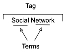
multiterm tag constructionThe multi-term tag is one of the more helpful elements in tagging as it provides the capability to use related terms. These multi-term tags provide depth to understanding when keeping the related tag terms together. But the interfaces for doing this are more complex and confusing than they should be for human, as well as machine consumption.

In the instance illustrated to the tag is comprised or two related terms: social and network. When the tool references the tag, it is looking at both parts as a tag set, which has a distinct meaning. The individual terms can be easily used for searches seeking either of those terms, but knowing the composition of the set, it is relatively easy for the service to offer up "social network" when a person seeks just social or network in a search query.

One common hindrance with social bookmarking adoption is those familiar with it and fans of it for enterprise use point to Delicious, which has a couple huge drawbacks. The compound multi-term tag or disconnected multi-term tags is a deep drawback for most regular potential users (the second is lack of privacy for shared group items). Delicious breaks a basic construct in user focussed design: Tools should embrace human methods of interaction and not humans embracing tech constraints. Delicious is quite popular with those of us malleable in our approach to adopt a technology where we adapt our approach, but that percentage of potential people using the tools is quite thin as a percentage of the population.. Testing this concept takes very little time to prove.

So, what are the options? Glad you asked. But, first a quick additional excursion into why this matters.

Conceptual Models Missing in Social Tool Adoption

One common hinderance for social tool adoption is most people intended to use the tools are missing the conceptual model for what these tools do, the value they offer, and how to personally benefit from these values. There are even change costs involved in moving from a tool that may not work for someone to something that has potential for drastically improved value. The "what it does", "what value it has", and "what situations" are high enough hurdles to cross, but they can be done with some ease by people who have deep knowledge of how to bridge these conceptual model gaps.

What the tools must not do is increase hurdles for adoption by introducing foreign conceptual models into the understanding process. The Delicious model of multi-term tagging adds a very large conceptual barrier for many & it become problematic for even considering adoption. Optimally, Delicious should not be used alone as a means to introduce social bookmarking or tagging.

We must remove the barriers to entry to these powerful offerings as much as we can as designers and developers. We know the value, we know the future, but we need to extend this. It must be done now, as later is too late and these tools will be written off as just as complex and cumbersome as their predecessors.

If you are a buyer of these tools and services, this is you guideline for the minimum of what you should accept. There is much you should not accept. On this front, you need to push back. It is your money you are spending on the products, implementation, and people helping encourage adoption. Not pushing back on what is not acceptable will greatly hinder adoption and increase the costs for more people to ease the change and adoption processes. Both of these costs should not be acceptable to you.

Multi-term Tag UI Options

Compound Terms

I am starting with what we know to be problematic for broad adoption for input. But, compound terms also create problems for search as well as click retrieval. There are two UI interaction patterns that happen with compound multi-term tags. The first is the terms are mashed together as a compound single word, as shown in this example from Delicious.

Tag sample from Delicious

The problem here is the mashing the string of terms "architecture is politics" into one compound term "architectureispolitics". Outside of Germanic languages this is problematic and the compound term makes a quick scan of the terms by a person far more difficult. But it also complicates search as the terms need to be broken down to even have LIKE SQL search options work optimally. The biggest problem is for humans, as this is not natural in most language contexts. A look at misunderstood URLs makes the point easier to understand (Top Ten Worst URLs)

The second is an emergent model for compound multi-term tags is using a term delimiter. These delimiters are often underlines ( _ ), dots ( . ), or hyphens ( - ). A multi-term tag such as "enterprise search" becomes "enterprise.search", "enterprise_search" and "enterprise-search".

While these help visually they are less than optimal for reading. But, algorithmically this initially looks to be a simple solution, but it becomes more problematic. Some tools and services try to normalize the terms to identify similar and relevant items, which requires a little bit of work. The terms can be separated at their delimiters and used as properly separated terms, but since the systems are compound term centric more often than not the terms are compressed and have similar problems to the other approach.

Another reason this is problematic is term delimiters can often have semantic relevance for tribal differentiation. This first surface terms when talking to social computing researchers using Delicious a few years ago. They pointed out that social.network, social_network, and social-network had quite different communities using the tags and often did not agree on underlying foundations for what the term meant. The people in the various communities self identified and stuck to their tribes use of the term differentiated by delimiter.

The discovery that these variations were not fungible was an eye opener and quickly had me looking at other similar situations. I found this was not a one-off situation, but one with a fair amount of occurrence. When removing the delimiters between the terms the technologies removed the capability of understanding human variance and tribes. This method also breaks recommendation systems badly as well as hindering the capability of augmenting serendipity.

So how do these tribes identify without these markers? Often they use additional tags to identity. The social computing researchers add "social computing", marketing types add "marketing", etc. The tools then use their filtering by co-occurrence of tags to surface relevant information (yes, the ability to use co-occurrence is another tool essential). This additional tag addition help improve the service on the whole with disambiguation.

Disconnected Multi-term Tags

The use of distinct and disconnected term tags is often the intent for space delimited sites like Delicious, but the emergent approach of mashing terms together out of need surfaced. Delicious did not intend to create mashed terms or delimited terms, Joshua Schachter created a great tool and the community adapted it to their needs. Tagging services are not new, as they have been around for more than two decades already, but how they are built, used, and platforms are quite different now. The common web interface for tagging has been single terms as tags with many tags applied to an object. What made folksonomy different from previous tagging was the inclusion of identity and a collective (not collaborative) voice that intelligent semantics can be applied to.

The downside of disconnected terms in tagging is certainty of relevance between the terms, which leads to ambiguity. This discussion has been going on for more than a decade and builds upon semantic understanding in natural language processing. Did the tagger intend for a relationship between social & network or not. Tags out of the context of natural language constructs provide difficulties without some other construct for sense making around them. Additionally, the computational power needed to parse and pair potential relevant pairings is somethings that becomes prohibitive at scale.

Quoted Multi-term Tags

One of the methods that surfaced early in tagging interfaces was the quoted multi-term tags. This takes becomes #&039;research "social network" blog' so that the terms social network are bound together in the tool as one tag. The biggest problem is still on the human input side of things as this is yet again not a natural language construct. Systematically the downside is these break along single terms with quotes in many of the systems that have employed this method.

What begins with a simple helpful prompt...:

 SlideShare Tag Input UI

Still often can end up breaking as follows (from SlideShare):

SlideShare quoted multi-term tag parsing

Comma Delimited Tags

Non-space delimiters between tags allows for multi-term tags to exist and with relative ease. Well, that is relative ease for those writing Western European languages that commonly use commas as a string separator. This method allows the system to grasp there are multi-term tags and the humans can input the information in a format that may be natural for them. Using natural language constructs helps provide the ability ease of adoption. It also helps provide a solid base for building a synonym repository in and/or around the tagging tools.

Ma.gnolia comma separated multi-term tag output

While this is not optimal for all people because of variance in language constructs globally, it is a method that works well for a quasi-homogeneous population of people tagging. This also takes out much of the ambiguity computationally for information retrieval, which lowers computational resources needed for discernment.

Text Box Per Tag

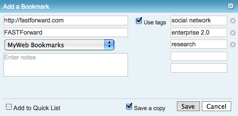
Lastly, the option for input is the text box per tag. This allows for multi-term tags in one text box. Using the tab button on the keyboard after entering a tag the person using this interface will jump down to the next empty text box and have the ability to input a term. I first started seeing this a few years ago in tagging interfaces tools developed in Central Europe and Asia. The Yahoo! Bookmarks 2 UI adopted this in a slightly different implementation than I had seen before, but works much the same (it is shown here).

Yahoo! Bookmarks 2 text box per tag

There are many variations of this type of interface surfacing and are having rather good adoption rates with people unfamiliar to tagging. This approach tied to facets has been deployed in Knowledge Plaza by Whatever s/a and works wonderfully.

All of the benefits of comma delimited multi-term tag interfaces apply, but with the added benefit of having this interface work internationally. International usage not only helps build synonym resources but eases language translation as well, which is particularly helpful for capturing international variance on business or emergent terms.

Summary

This content has come from more than four years of research and discussions with people using tools, both inside enterprise and using consumer web tools. As enterprise moves more quickly toward more cost effective tools for capturing and connecting information, they are aware of not only the value of social tools, but tools that get out the way and allow humans to capture, share, and interact in a manner that is as natural as possible with the tools getting smart, not humans having to adopt technology patterns.

This is a syndicated version of the same post at Optimizing Tagging UI for People & Search :: Personal InfoCloud that has moderated comments available.


7 May 2008

Enterprise Social Tools: Components for Success

One of the things I continually run across talking with organizations deploying social tools inside their organization is the difficultly getting all the components to mesh. Nearly everybody is having or had a tough time with getting employees and partners to engage with the services, but everybody is finding out it is much more than just the tools that are needed to consider. The tools provide the foundation, but once service types and features are sorted out, it get much tougher. I get frustrated (as do many organizations whom I talk with lately) that social tools and services that make up enterprise 2.0, or whatever people want to call it, are far from the end of the need for getting it right. There is great value in these tools and the cost of the tools is much less than previous generations of enterprise (large organization) offerings.

Social tools require much more than just the tools for their implementation to be successful. Tool selection is tough as no tool is doing everything well and they all are focussing on niche areas. But, as difficult as the tool selection can be, there are three more elements that make up what the a successful deployment of the tools and can be considered part of the tools.

Four Rings of Enterprise Social Tools

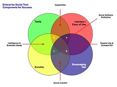
Enterprise Social Tool: Components for Success The four elements really have to work together to make for a successful services that people will use and continue to use over time. Yes, I am using a venn diagram for the four rings as it helps point out the overlaps and gaps where the implementations can fall short. The overlaps in the diagram is where the interesting things are happening. A year ago I was running into organizations with self proclaimed success with deployments of social tools (blogs, wikis, social bookmarking, forums, etc.), but as the desire for more than a simple set of blogs (or whichever tool or set of tools was selected) in-house there is a desire for greater use beyond some internal early adopters. This requires paying close attention to the four rings.

Tools

The first ring is rather obvious, it is the tools. The tools come down to functionality and features that are offered, how they are run (OS, rack mount, other software needed, skills needed to keep them running, etc.), how the tools are integrated into the organization (authentication, back-up, etc.), external data services, and the rest of the the usual IT department checklist. The tools get a lot of attention from many analysts and tech evangelists. There is an incredible amount of attention on widgets, feeds, APIs, and elements for user generated contribution. But, the tools do not get you all of the way to a successful implementation. The tools are not a mix and match proposition.

Interface & Ease of Use

One thing that the social software tools from the consumer web have brought is ease of use and simple to understand interfaces. The tools basically get out of the way and bring in more advanced features and functionality as needed. The interface also needs to conform to expectations and understandings inside an organization to handle the flow of interaction. What works for one organization may be difficult for another organization, largely due to the tools and training, and exposure to services outside their organization. Many traditional enterprise tools have been trying to improve the usability and ease of use for their tools over the last 4 to 5 years or so, but those efforts still require massive training and large binders that walk people through the tools. If the people using the tools (not administering the tools need massive amounts of training or large binders for social software the wrong tool has been purchased).

Sociality

Sociality is the area where people manage their sharing of information and their connections to others. Many people make the assumption that social tools focus on everything being shared with everybody, but that is not the reality in organizations. Most organizations have tight boundaries on who can share what with whom, but most of those boundaries get in the way. One of the things I do to help organizations is help them realize what really needs to be private and not shared is often much less than what they regulate. Most people are not really comfortable sharing information with people they do not know, so having comfortable spaces for people to share things is important, but these spaces need to have permeable walls that encourage sharing and opening up when people are sure they are correct with their findings.

Sociality also includes the selective groups people belong to in organizations for project work, research, support, etc. that are normal inside organizations to optimize efficiency. But, where things get really difficult is when groups are working on similar tasks that will benefit from horizontal connections and sharing of information. This horizontal sharing (as well as diagonal sharing) is where the real power of social tools come into play as the vertical channels of traditional organization structures largely serve to make organizations inefficient and lacking intelligence. The real challenge for the tools is the capability to surface the information of relevance from selective groups to other selective groups (or share information more easily out) along the way. Most tools are not to this point yet, largely because customers have not been asking for this (it is a need that comes from use over time) and it can be a difficult problem to solve.

One prime ingredient for social tool use by people is providing a focus on the people using the tools and their needs for managing the information they share and the information from others that flow through the tool. Far too often the tools focus on the value the user generated content has on the system and information, which lacks the focus of why people use the tools over time. People use tools that provide value to them. The personal sociality elements of whom are they following and sharing things with, managing all contributions and activities they personally made in a tool, ease of tracking information they have interest in, and making modifications are all valuable elements for the tools to incorporate. The social tools are not in place just to serve the organization, they must also serve the people using the tools if adoption and long term use important.

Encouraging Use

Encouraging use and engagement with the tools is an area that all organizations find they have a need for at some point and time. Use of these tools and engagement by people in an organization often does not happen easily. Why? Normally, most of the people in the organization do not have a conceptual framework for what the tools do and the value the individuals will derive. The value they people using the tools will derive needs to be brought to the forefront. People also usually need to have it explained that the tools are as simple as they seem. People also need to be reassured that their voice matters and they are encouraged to share what they know (problems, solutions, and observations).

While the egregious actions that happen out on the open web are very rare inside an organization (transparency of who a person is keeps this from happening) there is a need for a community manager and social tool leader. This role highlights how the tools can be used. They are there to help people find value in the tools and provide comfort around understanding how the information is used and how sharing with others is beneficial. Encouraging use takes understanding the tools, interface, sociality, and the organization with its traditions and ways of working.

The Overlaps

The overlaps in the graphic are where things really start to surface with the value and the need for a holistic view. Where two rings over lap the value is easy to see, but where three rings overlap the missing element or element that is deficient is easier to understand its value.

Tools and Interface

Traditional enterprise offerings have focussed on the tools and interface through usability and personalization. But the tools have always been cumbersome and the interfaces are not easy to use. The combination of the tools and interface are the core capabilities that traditionally get considered. The interface is often quite flexible for modification to meet an organizations needs and desires, but the capabilities for the interface need to be there to be flexible. The interface design and interaction needs people who have depth in understanding the broad social and information needs the new tools require, which is going to be different than the consumer web offerings (many of them are not well thought through and do not warrant copying).

Tools and Sociality

Intelligence and business needs are what surface out of the tools capabilities and sociality. Having proper sociality that provides personal tools for managing information flows and sharing with groups as well as everybody as it makes sense to an individual is important. Opening up the sharing as early as possible will help an organization get smarter about itself and within itself. Sociality also include personal use and information management, which far few tools consider. This overlap of tools and sociality is where many tools are needing improvement today.

Interface and Encouraging Use

Good interfaces with easy interaction and general ease of use as well as support for encouraging use are where expanding use of the tools takes place, which in turn improves the return on investment. The ease of use and simple interfaces on combined with guidance that provides conceptual understanding of what these tools do as well as providing understanding that eases fears around using the tools (often people are fearful that what they share will be used against them or their job will go away because they shared what they know, rather than they become more valuable to an organization by sharing as they exhibit expertise). Many people are also unsure of tools that are not overly cumbersome and that get out of the way of putting information in to the tools. This needs explanation and encouragement, which is different than in-depth training sessions.

Sociality and Encouraging Use

The real advantages of social tools come from the combination of getting sociality and encouraging use correct. The sociality component provides the means to interact (or not) as needed. This is provided by the capabilities of the product or products used. This coupled with a person or persons encouraging use that show the value, take away the fears, and provide a common framework for people to think about and use the tools is where social comfort is created. From social comfort people come to rely on the tools and services more as a means to share, connect, and engage with the organization as a whole. The richness of the tools is enabled when these two elements are done well.

The Missing Piece in Overlaps

This section focusses on the graphic and the three-way overlaps (listed by letter: A; B; C; and D). The element missing in the overlap or where that element is deficient is the focus.

Overlap A

This overlap has sociality missing. When the tool, interface, and engagement are solid, but sociality is not done well for an organization there may be strong initial use, but use will often stagnate. This happens because the sharing is not done in a manner that provides comfort or the services are missing a personal management space to hold on to a person's own actions. Tracking one's own actions and the relevant activities of others around the personal actions is essential to engaging socially with the tools, people, and organization. Providing comfortable spaces to work with others is essential. One element of comfort is built from know who the others are whom people are working with, see Elements of Social Software and Selective Sociality and Social Villages (particularly the build order of social software elements) to understand the importance.

Overlap B

This overlap has tools missing, but has sociality, interface, and encouraging use done well. The tools can be deficient as they may not provide needed functionality, features, or may not scale as needed. Often organizations can grow out of a tool as their needs expand or change as people use the tools need more functionality. I have talked with a few organizations that have used tools that provide simple functionality as blogs, wikis, or social bookmarking tools find that as the use of the tools grows the tools do not keep up with the needs. At times the tools have to be heavily modified to provide functionality or additional elements are needed from a different type of tool.

Overlap C

Interface and ease of use is missing, while sociality, tool, and encouraging use are covered well. This is an area where traditional enterprise tools have problems or tools that are built internally often stumble. This scenario often leads to a lot more training or encouraging use. Another downfall is enterprise tools are focussed on having their tools look and interact like consumer social web tools, which often are lacking in solid interaction design and user testing. The use of social tools in-house will often not have broad use of these consumer services so the normal conventions are not understood or are not comfortable. Often the interfaces inside organizations will need to be tested and there many need to be more than one interface and feature set provided for depth of use and match to use perceptions.

Also, what works for one organization, subset of an organization, or reviewer/analyst will not work for others. The understanding of an organization along with user testing and evaluation with a cross section of real people will provide the best understanding of compatibility with interface. Interfaces can also take time to take hold and makes sense. Interfaces that focus on ease of use with more advanced capabilities with in reach, as well as being easily modified for look and interactions that are familiar to an organization can help resolve this.

Overlap D

Encouraging use and providing people to help ease people's engagement is missing in many organizations. This is a task that is often overlooked. The tools, interface, and proper sociality can all be in place, but not having people to help provide a framework to show the value people get from using the tools, easing concerns, giving examples of uses for different roles and needs, and continually showing people success others in an organization have with the social tool offerings is where many organization find they get stuck. The early adopters in an organization may use the tools as will those with some familiarity with the consumer web social services, but that is often a small percentage of an organization.

Summary

All of this is still emergent and early, but these trends and highlights are things I am finding common. The two areas that are toughest to get things right are sociality and encouraging use. Sociality is largely dependent on the tools, finding the limitations in the tools takes a fair amount of testing often to find limitations. Encouraging use is more difficult at the moment as there are relatively few people who understand the tools and the context that organizations bring to the tools, which is quite different from the context of the consumer social web tools. I personally only know of a handful or so of people who really grasp this well enough to be hired. Knowing the "it depends moments" is essential and knowing that use is granular as are the needs of the people in the organization. Often there are more than 10 different use personas if not more that are needed for evaluating tools, interface, sociality, and encouraging use (in some organizations it can be over 20). The tools can be simple, but getting this mix right is not simple, yet.

[Comments are open and moderated at Enterprise Social Tools: Components for Success :: Personal InfoCloud


11 April 2008

YouTube New Interface and Social Interaction Design Santiy Check

YouTube has released a new design for the site and its individual video pages. This gets shared in Google Operating System :: User Inferface Updates at YouTube and TechCrunch :: YouTube Updates Layout, Now with Tabs and Statistics. While the new design looks nice and clean, it has one design bug that is horribly annoying it has mixed interaction design metaphors for its tabs or buttons.

Broken Interaction Design on Buttons or Tabs

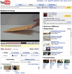
YouTube New Video Interface As the image shows the Share, Favorite, Playlists, and Flag buttons or tabs all have similar design treatment, but they do not have the same actions when you click on them. Three of the items (Share, Playlists, and Flag) all act as tabs that open up a larger area below them to provide more options and information. But, the Favorites acts like a button that when clicked it marks the item as a favorite.

This is incredibly poor interaction design as all the items should act in the same manner. If the items do not have the same action properties they really should not look the same and be in the same action space. Favorites should be a check box or a binary interface for on and off. That interaction patter more closely matches the Rate section and seems like it should have been there rather than showing a lack of understanding interaction design basics and confusing people using the site/service.

Social Sites Seem to Share a Lack of Interaction Understanding

This should have been a no brainer observation for a design manager or somebody with a design sanity check. YouTube is far from the the only site/service doing this. Nearly all of the services are not grasping the basics or are broadly applying design patterns to all user scenarios when they really do not fit all scenarios and user types (nearly every service I talk to know exactly the use type a person fits into but never takes this into account in optimization of design patterns that match that use need). Facebook really falls into this hole badly and never seems to grasp they are really making a mess of things the more features and functionality they are bringing into their service without accounting for the design needs in the interface.

My seemingly favorite site to nit pick is LinkedIn which I use a lot and has been a favorite, but their social interaction additions and interactive interfaces really need much better sanity checks and testing before they go into production (even into the beta interface). LinkedIn is really trying to move forward and they are moving in the right direction, but they really need better design thinking with their new features and functionality. Their new design is ready to handle some of the new features, but the features need a lot more refining. The new design shows they have a really good grasp that the interface needs to be a flexible foundation to be used as a framework for including new features, which could benefit from treating them as options for personalization. LinkedIn has pulled back many of the social features and seems to be rethinking them and refining them, but they really need some good sanity checks before rolling them out again.

Social Interaction in Enterprise Tools

The befuddled interaction understanding is not germane to commercial or consumer public social web sites, but it also plagues tools aimed at the enterprise. This is not overly surprising as many of the social enterprise (enterprise 2.0) tools and services are copying the public web tools and services to a large degree. This is a good thing, as it puts the focus on ease of use, which has been horribly missing in business focussed tools for far too long. But, the down side for enterprise focussed tools is they are not for the public web they are for business users, who most often do not have familiarity with the conventions on the public web and they have a large cognitive gap in understanding what the tools do and their value. There is less time for playing and testing in most business people's worklife. This means the tools need to get things right up front with clear understanding of the use needs of the people they are building for in business. This seems to be lacking in many tools as there is much copying of poor design that really needs to be tested thoroughly before launching. Business focussed tools are not hitting the same people as are on the web, which will work through poor design and functionality to see what things do. It is also important to consider that there are a wide variety of types of people using these tools with varying needs and varying interaction understandings (this will be another blog post, actually a series of posts that relate to things I have been including in workshops the last six months and presenting the last couple).

[Comments are available and moderated as usual at: YouTube New Interface and Social Interaction Design Santiy Check :: Personal InfoCloud]


22 February 2008

Remote Presentation and Perception Matrix for Social Tools

This post is also found at: Remote Presentation and Perceptions Matrix for Social Tools :: Personal InfoCloud with moderated comments turned on.]

Today I did something I had never done before (actually a few things) I sat in my office in my home and gave a live web video presentation to a conference elsewhere on the globe. I presented my nearly all new presentation, Keeping Up With Social Tagging to the Expert Workshop in: Social Tagging and Knowledge Organization - Perspectives and Potential that was put on by the Knowledge Media Research Center in Tübingen, Germany.

Remote Presentation Feelings

While the remote video presentation is normal for many people inside their large organizations and I have presented at meetings and conferences where my presentation was provided to other location on live video feed (my recent Ann Arbor trip to present at STIET was HD broadcast to Wayne State in Detroit), this home office to conference presentation was new to me. The presentation and video link used Adobe Connect, which allowed me to see whom I was talking to, manage my slides, text chat, and see myself. This worked quite well, much better than I expected. I did have my full slide presentation in lightroom view set up in Keynote on my external monitor on the side and used Awaken on the side monitor as well to help with timing.

The ability to get feedback and watch the attendees body language and non-verbal responses was insanely helpful. I have given webinars and done phone presentations where I had not visual cues to the audience responses, which I find to be a horrible way to present (I often will expand on subjects or shorten explanations based on non-verbal feedback from the audience). Adobe Connect allowed this non-verbal feedback to be streamed back to me, which completely allows me to adjust the presentation as I normally do.

One thing that was a wee bit difficult was having to change focus (I suppose that comes with use and experience), but I would watch audience feedback while presenting, peek to the side to see where I was with time and slides (to work in the transitions), but would then try to look at the camera to "connect". Watching myself on the video feedback the moments I would try to connect through the camera I would open my eyes wide as if trying to see through my iSight and boy does that come across looking strange on a close range camera. I also (unknown to myself until recently watching a video of another presentation I had done) use a similar facial expression to add emphasis, I am realizing with a camera as close as it is for web presentation also really looks odd. I am sort of used to listening to myself (normally to write out new analogies I use or responses to questions), but watching myself in playback from that close of a range is really uncomfortable.

One thing I really missed in doing this web video presentation was extended interaction with the attendees. I rather enjoy conferences, particularly ones with this focussed a gathering as it makes for great socializing with people passionate about the same subjects I am passionate about. I like comparing note, perceptions, and widely differing views. It helps me grow my knowledge and understandings as well as helps change my perceptions. Live face-to-face conversation and sharing of interests is an incredibly value part of learning, experiencing, and shaping views and it is something I greatly enjoy attending conferences in person. I am not a fan of arriving at a conference just prior to a presentation, giving the presentation, and then leaving. The personal social interaction is valuable. The video presentation does not provide that and I really missed it, particularly with the people who are so closely tied to my deep interest areas as this workshop was focused.

New Content in Presentation

This presentation included a lot of new content, ideas, and concepts that I have not really presented or written about in as open of a forum. I have received really strong positive feedback from the Faces of Perception, Depth of Perception, and Perception Matrix when I have talked about it with people and companies. I have included this content in the book on social bookmarking and folksonomy I am writing for O&Reilly and pieces have been in public and private workshops I have given, but it was long past time to let the ideas out into the open.

The components of perception came about through reading formal analysis and research from others as well as not having a good models myself to lean on to explain a lot of what I find from social computing service providers (web tools in the Web 2.0 genre as well as inside the firewall Enterprise 2.0 tools) as tool makers or service owners. The understandings that are brought to the table on a lot of research and analysis is far too thin and far too often badly confuses the roles and faces of the tool that are being reviewed or analyzed. In my working with tool makers and organizations implementing social tools the analysis and research is less than helpful and often makes building products that meet the user needs and desires really difficult. I am not saying that this conceptual model fixes it, but from those who have considered what it shows almost all have had realizations they have had a less than perfect grasp and have lacked the granularity they have needed to build, analyze, or research these social tools.

I am hoping to write these perspectives up in more depth at some point in the not too distant future, but the video and slides start getting the ideas out there. As I have been walking people through how to use the tools I have been realizing the content needed to best us the model and matrix may take more than a day of a workshop of even a few days to get the most complete value from it. These tools have helped me drastically increase my value in consulting and training in the very short time I have used them. Some are finding that their copying of features and functionality in other social services has not helped them really understand what is best for their user needs and are less than optimal for the type of service they are offering or believe they are offering.


18 October 2007

The State of Enterprise Social Software - Pointer

I have written and posted The State of Enterprise Social Software on my Peronal InfoCloud blog as it has comments on and it also is where I am trying to keep my more professional pieces.

This blog post is a reaction to Richard McManus excellent post Big Vendors Scrap for Enterprise 2.0 Supremacy. The post seemed less about supremacy than scapping to be relevant. Many of the tools I am quite or somewhat familiar with and rather unimpressed. But, go read the other post to find my assessments of the tools, but also the tools that are doing much better jobs than the traditional enterprise vendors.


25 August 2007

Reading Information and Patterns

The past few weeks and months the subject of reading, analysis, and visualization have been coming up a lot in my talking and chatting with people. These are not new subjects for me as they are long time passions. Part of the discussion the past few weeks have been focussed on what is missing in social bookmarking tools (particularly as one's own bookmarks and tags grows and as the whole service scales) as wells as group discussion monitoring tools, but this discussion is not the focus of this post. The focus is on reading, understanding, and synthesis of information and knowledge.

Not that Reading

I really want to focus on reading. Not exactly reading words, but reading patterns and recognizing patterns and flows to get understanding. After we learn to read a group of letters as a word we start seeing that group of letters as a shape, which is a word. It is this understanding of patterns that interact and are strung together that form the type of reading I have interest in.

Yesterday, Jon Udell posted about analyzing two gymnasts make turns. He was frustrated that the analysis on television lacked good insight (Jon is a former gymnast). Jon, who is fantastic at showing and explaining technologies and interactions to get to the core values and benefits as well as demoing needed directions, applied his great skill and craft on gymnastics. He took two different gymnasts doing the same or similar maneuver frame-by-frame. Jon knew how to read what each gymnast was doing and shared his understanding of how to read the differences.

Similarly a week or so ago an article about the Bloomberg Terminal fantasy redesign along with the high-level explanations and examples of the Bloomberg Terminal brought to mind a similar kind of reading. I have a few friends and acquaintances that live their work life in front of Bloomberg Terminals. The terminals are an incredible flood of information and views all in a very DOS-looking interface. There is a skill and craft in not only understanding the information in the Bloomberg Terminal, but also in learning to read the terminal. One friend I chatted with while he was working (years ago) would glance at the terminal every minute. I had him explain his glancing, which essentially was looking for color shifts in certain parts of the screen and then look for movement of lines and characters in other areas. He just scanned the screen to look for action or alerts. His initial pass was triage to then discern where to focus and possibly dive deeper or pivot for more related information.

The many of the redesign elements of the Bloomberg Terminals understood the reading and ability to understand vast information (in text) or augmented the interface with visualizations that used a treemap (most market analysts are very familiar with the visualization thanks to SmartMoney's useage). But, the Ziba design was sparse. To me it seemed like many of the market knowledge workers used to the Bloomberg Terminal and knew how to read it would wonder where their information had gone.

Simplicity and Reading with Experience

The Ziba solution's simplicity triggers the need in understanding the balance between simplicity just breaking down the complex into smaller easy to understand bits and growing into understanding the bits recollected in a format that is usable through recognition and learned reading skills. The ability to read patterns is learned in many areas of life in sport, craft, and work. Surfers look at the ocean waves and see something very different from those who do not surf in the ebb, flow, breaks, surface currents and under currents. Musicians not only read printed music but also hear music differently from non-musicians, but formally trained musicians read patterns differently from those who have just "picked it up". There has been a push in business toward data dashboards for many years, but most require having the right metrics and good data, as well as good visualizations. The dashboards are an attempt to provide reading information and data with an easier learning curve through visualization and a decreased reliance on deep knowledge.

Getting Somewhere with Reading Patterns

Where this leads it there is a real need in understanding the balance between simplicity and advanced interaction with reading patterns. There is also a need to understand what patterns are already there and how people read them, including when to adhere to these patterns and when to break them. When breaking the patterns there needs to be simple means of learning these new patterns to be read and providing the ability to show improved value from these new patterns. This education process can be short video screen shots, short how-to use the interface or interactions. Building pattern libraries is really helpful.

Next, identify good patterns that are available and understand why they work, particularly why they work for the people that use then and learn how people read them and get different information and understanding through reading the same interface differently. Look at what does not work and where improved tools are needed. Understand what information is really needed for people who are interested in the information and data.

Facebook | GroupsAn example of this is Facebook, which has a really good home page for each Facebook member, it is a great digital lifestream of what my friends are doing. It is so much better at expressing flow and actions the people I have stated I have social interest in on Facebook than any other social web tool that came before Facebook. Relative to the individual level, Facebook fails with its interface of the information streams for its groups. Much of the content that is of interest in Facebook happens in the groups, but all the groups tell you is the number of new members, new messages, new videos, and new wall posts. There is much more valuable information tucked in there, such as who has commented that I normally interact with, state the threads that I have participated in that have been recently updated, etc.

This example illustrates there needs to be information to read that has value and could tell a story. Are the right bits of information available that will aid understanding of the underlying data and stories? It the interface helpful? Is it easy to use and can it provide more advanced understanding? Are there easy to find lessons in how to read the interface to get the most information out of it?


20 August 2007

Why Ma.gnolia is One of My Favorite Social Bookmarking Tools

After starting the Portable Social Network Group in Ma.gnolia yesterday I received a few e-mails and IMs regarding my choice. Most of the questions were why not just use tags and del.icio.us. After I posted my Ma.Del Tagging Bookmarklet post I have had a lot of questions about Ma.gnolia and my preference as well as people thought I was not a fan of it. I have been thinking I would blog about my usage, but given my work advising on social bookmarking and social web, I shy away talking about what I use as what I like is likely not what is going to be a good fit for others. But, my work is one of the reasons I want to talk about what I like using as nearly every customer of mine and many presentation attendees look at del.icio.us first (it kicked the door wide open with a tool that was light years ahead of all others), but it is not for everybody and there are many other options. Much of my work is with enterprise and organizations of various size, which del.icio.us is not right for them for privacy reasons. I still add to del.icio.us along with my favorite as there are many people that have subscribed to the at feed as they derive value from that subscription so I take the extra step to keep that feed as current.

Ma.gnolia Offers Great Features for Sociality

I have two favorite tools for my own personal social bookmarking reasons Ma.gnolia and Clipmarks (I don't think I have anything publicly shared in Clipmarks). First the later, I use Clipmarks primarily when I only want to bookmark a sub-page element out on the web, which are paragraphs, sentences, quotes, images, etc.

I moved to try Ma.gnolia again last Fall when something changed in del.icio.us search and the results were not returning things that were in del.icio.us. My trying Ma.gnolia, by importing all of my 2200 plus bookmarks not only allowed me to search and find things I wanted, but I quickly became a fan of their many social features. In the past year or less they have become more social in insanely helpful and kind ways. Not only does Ma.gnolia have groups that you can share bookmarks with but there is the ability to have discussions around the subject in those groups. Sharing with a group is insanely easy. Groups can be private if the manager wishes, which makes it a good test ground for businesses or other organizations to test the social bookmarking waters. I was not a huge fan of rating bookmarks as if I bookmarked something I am wanting to refind it, but in a more social context is has value for others to see the strength of my interest (normall 3 to 5 stars). One of my favorite social features is giving "thanks", which is not a trigger for social gaming like Digg, but is an interpersonal expression of appreciation that really makes Ma.gnolia a friendly and positive social environment.

Started with Beauty, but Now with Ease

Ma.gnolia started as a beautiful del.icio.us (it was not the first) and the beauty got in the way of usability for many. But, Ma.gnolia has kept the beautiful strains and added simple ease of use in a very Apple delightful moments sort of way. The thanks are a nice treat, but the latest interactions that provide non-disruptive ease of use to accomplish a task, without completely taking you away from your previous flow (freaking brilliant in my viewpoint - anything that preserves flow to accomplish a short task is a great step). Another killer feature is Ma.gnolia Roots, which is a bookmarklet that when clicked hovers a semi-transparent layer over the webpage to show information from Ma.gnolia about that page (who has linked to it, tags, annotations, etc.) and makes it really easy to bookmark that page from that screen. The API (including a replica of the del.icio.us API that nearly all services use as the standard), add-ons, Creative Commons license for your bookmarks, many bookmarklet options, and feed options. But, there are also the little things that are not usually seen or noticed, such as great URLs that can be easily parsed, all pages are properly marked up semantically, and Microformats are broadly and properly used throughout the site (nearly at every pivot).

Intelligently Designed

For me Ma.gnolia is not only a great site to look at, a great social bookmarking site that is really social (as well as polite and respectful of my wishes), but a great example for semantic web mark-up (including microformats). There is so much attention to detail in the page markup that for those of us that care it is amazingly beautiful. The visual layer can be optimized for more white space and detail or for much easier scrolling. The interactions, ease of use, and delightful moments that assist you rather than taking you out of your flow (workflow, taskflow, etc.) and make you ask why all applications and social sites are not this wonderful.

Ma.gnolia is not perfect as it needs some tools to better manage and bulk edit your own bookmarks. It could use a sort on search items (as well as narrow by date range). Search could use some RedBull at times. It could improve with filtering by using co-occurance of tag terms as well as for disambiguation.

Overall for me personally, Ma.gnolia is a tool I absolutely love. It took the basic social bookmarking idea in del.icio.us and really made it social. It has added features and functionality that are very helpful and well executed. It is an utter pleasure to use. I can not only share things easily and get the wonderful effects of social interaction, but I can refind things in my now 2,500 plus bookmarks rather easily.


This work is licensed under the Creative Commons Attribution-NonCommercial-ShareAlike License.