Off the Top: Typography Entries

20052010201520202025

Showing posts: 1-12 of 12 total posts


22 September 2026

A Stunning Video on Design and Porcelain Watch Face Creation

As I was wrapping things up last night and I had calm travel videos on for ambient background, YouTube offered up something different that I found amazing on many levels.

The video was from the watch brand anOrdain (anOrdain from Glasgow’s Southside), which I had not heard of, but that isn’t a surprise as I’m not a big “watch guy”. I’ve had a few decent watches, my dad’s Rolex when he passed and that was 99% sentimental. And Apple Watch which is largely utilitarian, but designed well.

The anOrdain video was on their YouTube channel and focussed solely on their Model 1 Porcelain watch and the design, craftsmanship, and the process. I found the video incredibly well produced and the story of their process to make the porcelain face, the typography, and the hands. It is a highly designed and crafted watch and the video matches that really well.

The Blue on White Porcelain Video

The video Blue On White | The Model 1 Porcelain - YouTube - anOrdain color hues, pacing, focus on details is a wonderful bit of video craft on its own. But, it matches the watch maker’s esthetic and practice so very well. I’ve watched a couple other videos and they have the same craft and design forward esthetic and feel.

What I Fell For

I don’t know that I’ve really fallen for a watch. I have for things really well designed and crafted, but watches rarely fit that bill as many tilt toward flashy and gaudy not elegant. What struck me with the watch is the face with the white porcelain and the incredible blue that is a Delft Blue. It somewhat reminds me of the Elizabeth Tower Clock / Big Ben - Wikipedia after it had been refurbished and the decades of dirt and grime removed and the hands and markings were blue (Big Ben Elizabeth Tower London 2023 01 Detail - Big Ben - Wikipedia). This combination resonates really well with me and it is calming and beautiful in a way most watch faces aren’t.

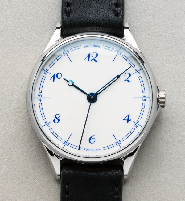
White watch face with Delft Blue numbers and markings, with blue hands created from heated steel

That wonderful white and blue combination is often really striking to me. On the anOrdain watch, The Model 1 Porcelain, it is matched with the details of the face with the curved blue rectangle markings, the custom typeface by Kia Tasbihgou (Design Practice of Kia Tasbihgou and Kiatas on Instagram and article about his typeface designs A campaigner for the unconventional, Kia Tasbihgou discusses his latest typefaces ), which is classical and playfully exaggerated like a hand drawn set of numbers. The hands on the watch are distinct and unique from each other, and are a blue from heated steel, which are a different hue and shade, but rhymes really well.

This is well outside my budget. It looks very much like an art piece crafted for one’s wrist.


7 December 2014

Link Like Bin 6 December 2014

A week of clean-up on work and project front and prepping for a some personal projects and getting new work projects settled and sorted for the new year (you still have time to grab some time, you this is you reach out and say hello).

I am also in the midst of moving from the sofa as my work space and back to my desk. This summer the lighting was much better at the sofa and then had a stretch of work travel where my desk got buried when I dumped my bag on Friday returns and not really dealt with before Monday’s trip back out. While the sofa is comfortable and the natural light is still great, I miss having a good work space to have a few books open and working through things.

Links for the Week of 6 December 2014


3 December 2014

24 Ways: A Web Holiday Favorite

Nothing makes me happier than to see the winter holiday begin and 24 Ways start its annual release of web development and design goodness. Drew McLellan and the 24 Ways crew have done another great job and I look forward eagerly for every day’s gem that is released.

To make all of this better, 24 Ways is in its 10th year. Congratulations for all the great content and work, from the very first to the current offering of the day.


1 November 2014

Zeldman and Jason Sanata Maria Hit on Design Truth

I have a small set of podcasts I really enjoy, but a couple weeks back Jeffrey Zeldman’s The Big Web Show, On Web Typography with Jason Santa Maria was a stand out. It was not only great on the subject of typography and reflected a lot of early web design, but got into the reputation of design.

Design doesn’t have a great reputation in the business world and it is seen as superficial, which is a reason I stay away from using design or user experience as a label. Jason and Jeffrey did a great job talking through this. This got huge head nods in agreement and wanted to shout to the world around (that I was driving through) “this is IT”. It was a real moment of truth and best explained by listening to their conversation.

Deep thanks Jeffrey for not only this podcast, but all your work. Keep it rocking!


5 June 2003

Inside the design process with Doug Bowman

Doug Bowman provides an insanely excellent essay on the design process behind his Zen Garden offering. This is an insanely wonderful description of the thought process that goes into wonderful design. Doug has all the proper steps, which is wonderful to see. If you want to become a graphic Web designer, it takes more than knowing PhotoShop, (X)HTML, CSS, Flash, etc. it takes understanding the process and how to approach each need to solve a problem or fill a need. This really illustrates the information design profession on for the Web.


18 January 2002

Dean Allen brings back his Twenty Faces a survey of available type faces. Dean provides a wonderful overview of each font and its background. To many, fonts are a work of art that express information in and of themselves. Dean is one of the folks that finds a typeface's inner and outer beauty.

This work is licensed under the Creative Commons Attribution-NonCommercial-ShareAlike License.