Off the Top: Data Analysis Entries

20052010201520202025

Showing posts: 1-13 of 13 total posts


18 September 2026

Homebrew Now with a Mac Desktop App

If you are on Mac, love Open Source, and are using or have been thinking about using Homebrew: The Package Manager for Everywhere, there is now a Mac app for Homebrew - Homebrew/BrewUI: Homebrew’s official macOS GUI.

Somewhere mid-week I stumbled upon it and thought it was worth a try. This may be one of my new favorite apps. I normally update Homebrew on my Mac every month or two. I use Homebrew for all sorts of different things (it is one of my Python builds, but not my main environment). But, having an app with easy quick Homebrew package and cask updates, I can easily see what packages I have (and if they need updating, and what their upstream and downstream dependancies are), and Homebrew doctor is included too.


16 September 2026

I Wrote What?

Part of the impetus for writing this post has been driven by the updates at A new Observable | Observable, which I recently wrote about Large Observable Update :: Off the Top :: vanderwal.net, and looking at changes in not only Observable, but updates to D3 by Observable. These current and not-too-distant updates have had me thinking about what I could do with some of my blogging data to make interactive charts and graphs. I’ve recently moved a lot of my legacy static charts and graphs to Plotly to gain interaction with them, for many of my own uses. But, in the process of getting a decent data workflow setup for my site (and my notes data) I have relatively clean data locally ready for use and testing.

A Little Data Workflow Background

For this blog I have been pulling down the data from the site’s backend and converting it with a set python script to extract it to SQLite, which is relational but quite fast for reading data and is great for single user write and a few read options. Over the past few months I’ve also been building many data analytics and data visualization prep python scripts (some building JSON files for standalone webpage interfaces). I’ve used Claude to debug, but also just turn out a script in less than couple minutes for the page setup for the D3 or Plotly scripts, which would usually take me 30 to 120 minutes. Once the scripts are set and I’ve reviewed them it is all just setting python flags and minor tweaks to the script to handle a data update.

With these script setups I’ve been able to try quite a few D3 chart and graph options very quickly. Going through the Python code, the data structures for the visualizations, and the hooks for the visualization and I’m rather happy with it for quick outputs.

What Can I See Using Blaugust Data

One of the things I had interest in from my A Wrap to Blaugust / Blaugust run in August was what did all of that look like from a basic statistic and graphical perspective. A few months back I created and ran a bunch of Jupyter queries and visualizations, Personal Blog Data Analysis - Looking at 25 Years. Since then I’ve been thinking about looking at a monthly view with more interactive charts and graphs. Since I had a decent amount of data from August 2026, existing data workflows, and a few D3 charting and graphing options I could work with I took a look.

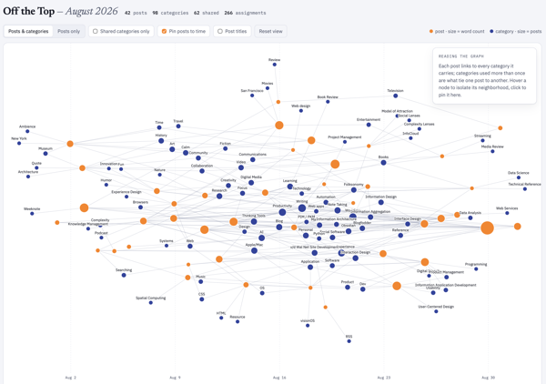
August Off the Top Force Graph

The first is an interactive forced graph with the blogpost as orange nodes with the size corresponding to word count and the tethered edges link to categories for the post. Clicking on the post will show the related categories and pulling on the post node will start to see the other tethered posts connected through the categories. There are few toggles: 1) Posts and categories or just Posts with their related interconnections; 2) Only show shared categories (a category with more than one post); 3) Post to Time, which may be my favorite view, as it take the graph and lays out the posts left (oldest) to right (most recent), with a small light timeline at the bottom and all the other relationships displayed as well; 4) Post titles, which clutters things a bit and adding the toggle resolved that clutter.

You can view this standalone interactive web chart that sits in the Lab :: Off the Top Analytics at the direct link: Off the Top, August Force Graph with Toggles. A sample is here:

A forged graph chart image showing August 2026 posts and connected categories

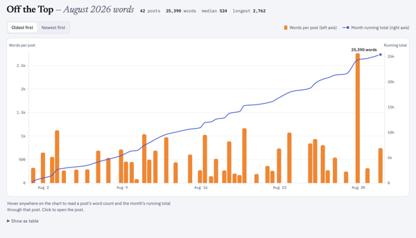
August 2026 Word Counts

As I was going through the data for August 2026 I knew and could see the word counts for posts, which I don’t have easily (nor quickly) available on my site. But, with the data local in SQLite and I’ve been using the local data to run many types of post analytics, word counts become a simple and quick option that doesn’t impact the site’s performance at all.

I was really curious about word counts per post across August, but also was more curious about a cumulative word count across the month as well. A quick and easy bar chart and line graph solved this, both having interactive hovers for metadata. August had 25,390 words posted.

The standalone interactive web chart is also in the Lab and the direct link is: Off the Top, August Word Counts by Post and Cumulative Count. A sample is here:

A bar chart image of monthly posts with height correlating to word count and a line above the bar chart showing cumulative word count for the month August 2026 posts

Cumulative Word Count for 2001 to 2026

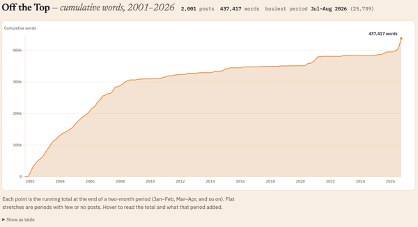
Looking at the cumulative count for August 2026 (the 25,390 words posted in the month) I had no idea what that count was in comparison to the whole life span of the blog (under this CMS that started in late October 2001 and not including the static posts prior to that). I know that in the early months and years of the blog I wrote a lot of short posts and the posts were frequent. Looking at word count I wasn’t expecting the first two or three years to have roughly the same growth slope up to 2008.

Looking across 25 years of posts I knew a single post analysis was going to be a bit rough for an interactive standalone webpage. Monthly would be better, but could still be a bit too much to process dynamically in the browser. Quarterly, was just a bit on the thin side and more difficult to see trend shifts and correlative line slope. I settled on a two-month interval and I had something interesting in under a minute.

July and August 2026 were the highest word count across all time on this blog. The 25 thousand words is roughly a quarter of a 250 page book. But, now that I had the bi-monthly chart I can also see the early years I had roughly similar counts per two months up until 2008 and then there was the “great flattening”, until the “great pandemica” lockdown when things ticked up again until lockdown ease and work went back to its normal patterns.

I ended up over the 25 years with 437,417 cumulative words just on this blog. That is roughly 4 books of 250 pages. It would be a rather odd book, but in just considering word count as the focus. I find word counts odd, particularly writing to word counts. I’ve had a regular column in tech publication that had a 750 rough word count topic, this was at a time when my posts were often 1,000 to 1,250 words on average and 750 words was about where I had the framing set to get to the meat of things. I mostly write on this blog to an amount where there aren’t good words left, which is 200 at times to 2,500 or more. To see my writing shifts in the early years roughly similar in trajectory rather interesting.

The standalone interactive web chart is also in the Lab and its direct link is: Off the Top All-time Cumulative Word Count. A sample is here:

A line chart showing cumulative word counts across 25 years of blog posts

Will this Continue?

Now that these are standalone webpage charts and graphs, I’m not sure what I will do. I need to get the templates consistent from a layout and design perspective. But, once the standalone webpage is created I just copy it to the Lab or other location, and this can be automated with a quick script. I think the month-by-month analytic is interesting, at least to me. I have not only the local standalone version that I posted, but a rough output build that isn’t fully self-contained that I can play with and iterate on.

If you like this and want to see more ping me on one of the services or send an e-mail using the Contact in the navbar.


12 September 2026

Large Observable Update

Around mid-week Observable announced a major update on their blog (A new Observable) and my evenings turned into looking at updates to the Notebooks, charts / data visualization offerings and much more. There are more interactive charting models and this is the first time I’ve noticed a downloadable notebook app for Macs (I haven’t tried it yet).

I use D3 by Observable quite a bit for data visualizations form data focussed apps (I also have been using Plotly for local Python interactive data apps). I started using D3 in late 2011 for some small data visualization projects, but in 2012 was working on a large project that made extensive use of it and it has stuck as a tool in my tool belt.

I often use Pandas, Polars, and Jupyter, but also RStudio. It might be time to look at Observable’s notebook, but I’m not overly fond of JavaScript and I’ve been using Claude to assist cut down the struggles with JS and getting to looking at and interacting with data visualizations.

The D3 and Observable sites have been some of the best resources for understanding data visualization basics and good fits for data and visualizations. The education aspect, as well as the really good quality charts and visualization tools have made it a regular resource that I use and regularly point others to.

I still have a lot of Observable and D3js tabs open as I’m pulling better notes for myself. But, I figured it was a good time to share it with others.


26 August 2026

Honey, The Thing Ate My Blog

In the past few months I’ve looked at the history of my blog analytically and captured some of it in, Personal Blog Data Analysis - Looking at 25 Years :: Off the Top, and I could see the changes in posts over time. I used to joke that “Twitter ate my blog”, as what I was posting on my site, was going into Twitter and not my site. Looking at the analysis that transition is clear. I have my archive of tweets from my three accounts (my main one turned private and two public accounts with one more work-related and the other responses to others and tracking sports).

Twitter vs. Blog

During that time posting to Twitter, my posts grew less frequent, but also longer. Twitter helped me write shorter sentences as it started with just 140 characters available. During this time I was still also keeping regular notes in text in my Notes directory. I most often used NVAlt that allowed for tagging the note file and it had really good search for the Notes directory that predated my using NVAlt by 10+ years (I started keeping notes there in 2003 in text, OmniOutliner, and HTML, but shifted to mostly text until about 2010 when it was a mix of text and markdown).

As my use of Twitter dwindled and conversations I had been having there moved to back channels and topic-focused groups, my blog post didn’t come back. The ideas and content had outlets, but that wasn’t my blog.

Notes Stayed Local

In June 2020 I had been trying to find a new notes app that worked similarly to NVAlt, which had stopped opening in the prior year. I had a few text and markdown apps I used to add notes to my normal location (one was Notional, which I used for about a year). I tried Notion for a short bit, but not having local notes and it being cloud only made it a serious no go for me. I tried Logseq, a couple apps heavily focused on zettelkasten, and I tried Obsidian. Obsidian stuck for a lot of reasons, but the most important was I just set it to watch over my existing Notes directory and just keep going. The ability to use backlinks / wikilinks, tags, and transclude notes was a great fit.

I went back to a daily note pattern using my Daily Dump set of sections as prompts for quick access to an area in the note to capture ideas and notes around things found, worked on, and ideas I cared about. The ability to have concept pages and hubs that linked back to everything related, make notes in my Daily Dump and then highlight a section and extract it out as its own separate note and bring a transclusion (see it in another context) back into the Daily Dump and other relevant concept pages, was magical.

It became the note platform I’ve long wanted. I was capturing and making notes in it a lot. Notes could easily turn into blog posts. But, they weren’t turning into blog posts they just stayed notes. “Obsidian ate my blog” became my tongue-in-cheek joke. But, it was pretty much what happened.

I was writing in my notes, much like I used to blog. From short snippets to longer worked-through ideas and concepts. It was pretty much (and still is) all in my notes that Obsidian sits over.

The Daily Notes Out to Blog

I run analytics on my Obsidian notes and I’m creating and touching 10 to 20 different notes a day. Some of these, thanks to Blaugust, have been turning into blog posts, which was my intent with Blaugust. But, I also have been fleshing things out that started as blog post ideas and I flesh them out in my “Thoughts” section of my Daily Dump note (just like this one is). This new idea blog posting isn’t helping work through my large (over 100 notes) that are flagged as “blogfodder”. Many of the blogfodder ideas are half-done and sitting for months or years. Others have been nearly fully drafted and need an edit. Some have been stuck because the post (in my belief) needs another post or two to set the foundation for the post that to be shared out (I realize this as I go to point to a post that doesn’t exist, as it is only regular content in Keynote for workshops, presentations, and work engagement foundation setting).

I’m starting to work through the some of the blogfodder. But, I’m working on my daily notes becoming blog posts more regularly. Blaugust has been helping move from notes to post. When Blaugust wraps I need to see where all of this lands.


25 August 2026

Adjusting Daily Aggregation for Less Friction

Sunday I hit a point where my daily automations (which I layout in part here - My Automations Over the Ages and Today’s View in my morning process and weekly process) and placing the outputs into my Daily Dump note sections was really making for a lot of friction in my note taking / note making. Additionally, it was breaking focus and holding my concentration on what I was trying to capture in my note’s sections.

How Daily Dump Notes are Setup

My Daily Dump has 14 sections: Plans, Thoughts, Review, Read, Talked With, Listened, Watched, Productivity, Worked, Learned, Played, Ate, Health, Bought, and Added to a wishlist.

The intent with the subheads in my note is to quickly jump to the section as I run across something or am thinking through and idea or concept and capture the thoughts or what I consumed and ideas from it, so I can get back to it later in my notes. But, since this is markdown and in Obsidian I can take the notes with its subheading and text, extract it, and then transclude it (move it out and link it back in to show it in another note). But, having each day’s note relatively clean (the exception is the Plans section for things brewing and on the front burner to do are moved from the prior day’s note to the current day’s with a python script that keeps the completed tasks on the prior day and removes things not completed and moved them to today).

Friction from Adding Aggregation to the Sections

The daily aggregations pulled in things captured from various reading and copying or favoriting tasks that get automatically captured in Instapaper and Pinboard, as well as all the files I created and modified. I also have notes from Drafts that I capture on the go and tagged to get pulled in aggregated, as well as a list of things I watched online that I want to track, but also list of videos watched where I’ve captured the transcript in Readwise I may want to review (and likely do a further clean-up step).

All of this was getting aggregated into collective notes by type and transcluded into the relevant groups in my Daily Dump note. This added a lot of friction to the intent of my Daily Dump for quick easy drop into a section and capture a note and then after sort out how I may handle it. Add to this, Sunday my Weekly Review runs and captures all of this from the week and compiles it into one note so with a heat map at the top so I can review it to see what I’ve been doing and find things to cut back on or put focus on for the upcoming week. The Weekly Review was transcluded into Productivity, which is ironic as all of this adding of aggregation transclusions was making me really unproductive.

The Fix to Bring Back Focus and Quick Capture

On Sunday I had enough of the friction and took time to sort out a solution. I liked the capture and the ability to scan through and find things I need to continue working on or make a change on, but having it in my quick capture notes area made it tough.

I added a “Review” section just under Plans and now all aggregations and transclusions go there. The best part is when I’m not reviewing it, a heading in Obsidian can be collapsed, which gives me focus on everything else.

On Sunday I did a quick manual restructuring of my note by putting everything aggregated into the Review section and then collapsed it. This was a magical focus trick.

Updating the Python Script that Automates Transclusion

Sunday I did the first edit of the python script that takes the aggregations notes created earlier in the moring and transcludes them in and repointed them to not go into the other categories, but all go into Review. This hasn’t run perfectly yesterday nor today (it works when I trigger it to run manually, but not from the trigger to run the script), but it is getting closer.

Protecting Focus is Key

Protecting focus and being able to quickly shift focus and be productive is key and has been something I’ve been working to do since I was a kid. Over the years I’ve learned the distractions and how to pull focus and calm back in. Removing the friction from abundance of information already in where I needed clean space to quickly capture created the large problem.

Now my big next step is sorting out the time to actually get a good weekly review done from what I’ve aggregated. The capture has been really good, but I just need to get better about protecting time on Sunday (or move this to Saturday) so I can sit and focus on what was done, what I can reduce and what needs focus to get done.


6 June 2026

Personal Blog Data Analysis - Looking at 25 Years

After adding sparklines to my category lists (Updated Categories with Sparklines and Search is Now in Production) I wanted to have a deeper dive looking at my categories and blog analytics over 25 years.

Category Long Tail

I done a very quick capture of category usage to look at the distribution of use. A question from James about whether my category distribution looked like a long tail distribution and I thought it may, but also looking at the numbers and not having a visualization I wasn’t sure. Charting the use, it really was a very long tail / power law distribution.

this chart is described in the test that follows

I shared it with James and he also ran his and ended up with much the same (Is there a power law of category use? - James’ Coffee Blog). There have been a few discussions of late around category use and some lean into having just a few categories. I have just over 200 categories now as most of my blog post have more than one subject and I use the categories to have an way to jump to related posts that cover the same subject. When I built my site’s CMS I wanted to have the capability to have multiple categories on each post. I have multiple categories for my own purposes, but also I’m cognizant that readers may have other terms.

With the long tail use of categories I know readers may stumble across a post through web search or a link from else where and having a category term that is familiar can get them to other things I may have posted. I view the web as being able to connect with others and blog posts are sharing things I have interests in or curiosity around and being able to connect with others in a similar mindset is the aim. So a handful of categories, particularly across 25 years and over 2,100 posts, doesn’t help build those connections.

More Analysis on Blog Posts and Categories

This distribution of categories really pushed my interest and curiosity of what the last 25 years of blogging looks like. I joke that Twitter ate my blog, but the sparklines sort of show that. I wanted to see the trends on my blog more closely (I have the archive of my Tweets and I’ll analyze them later and then bring the two analysis together).

To prep for the analysis I pulled my site’s database data local and put it into SQLite (it is already on Mac - Apple and quick) to connect locally with Jupyter Notebooks and use Plotly for interactive data visualizations in the notebook. I had a series of questions, somewhat common data analytics questions I’ve used since grad school looking at analysis over time.

Posts per Month

this chart is described in the test that follows

The first analysis is my blog posts by month over 25 years. In my early years I was posting frequently, often in shorter posts (but we will look at that next), and then around 2005 (when started engaging with Twitter) things dropped off. Also at this time I also started blogging more serious subjects at Personal InfoCloud, but those were not all that frequent (I’ll dig into this at some point later too).

My hunch that I posted much more early on and drop off around the time I engaged with Twitter, seem to hold up.

Post Length Over Time
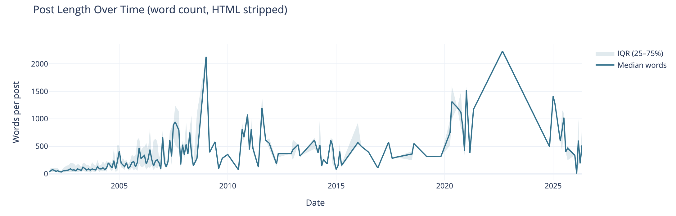
this chart is described in the test that follows

Post length over time also can tell the story of why post volume shifted. I wasn’t posting a lot of short post, but posting longer posts, but less frequently. I’m really curious what I posted in June of 2009 that caused the spike. The spike on the right end in 2020 and beyond are partly attributed to posting weeknotes, which tended to be longer than normal.

I know that my writing muscles went from a few hundred words early on to posts being around 1k and more. I found my comfortable blog post writing length was around 1.2k words. I write to find out and capture what I think, but rarely edit for brevity or other editing benefit, at least on this blog.

Median Categories per Post

this chart is described in the test that follows

This view of the median number of categories per post over time I found interesting and I didn’t know what my expected outcome was going into this analysis. The numbers pretty much are in line with longer posts have more categories to cover slightly more breadth in a post. Again June 2009, not sure. The spike spike on the right aligns with weeknotes, which cover multiple subjects in one post.

Distribution of Categories per Post

this chart is described in the test that follows

This chart groups number of categories on posts. This shows the second bar has the most number of posts (822 posts) have 2 or 3 categories on the posts. The third bar has 408 posts with 4 or 5 categories on them. This lines up well with the frequency and volume of posts early on which were shorter. Looking at the prior chart most posts had 10 or fewer categories on them.

Combined Timeline for Posts, Length, and median
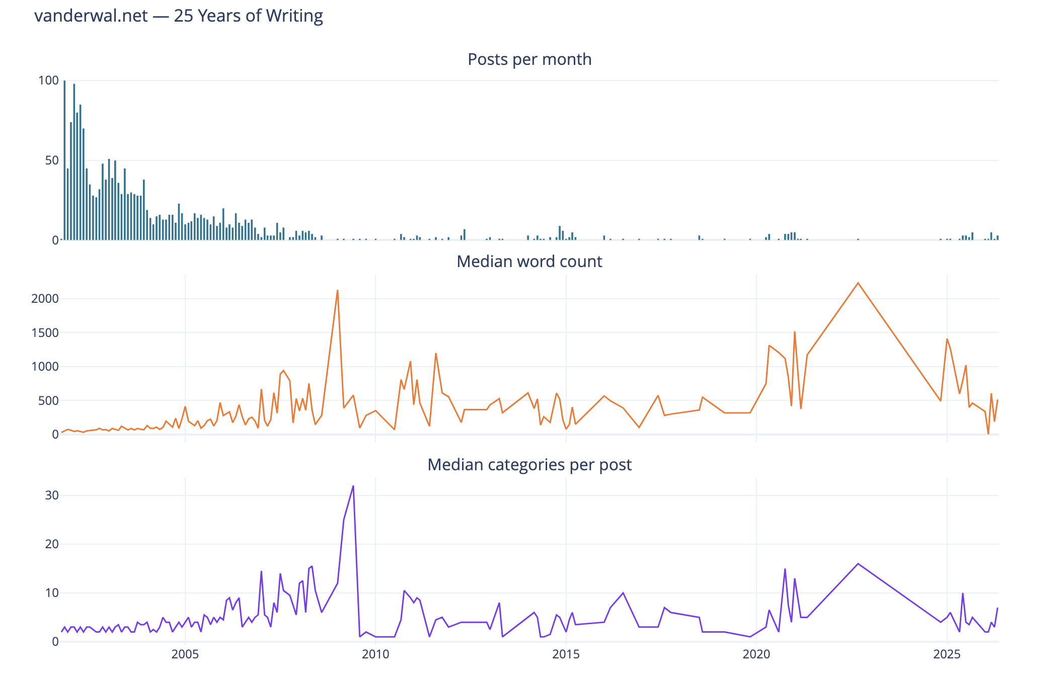
this chart is described in the test that follows

I like this combined chart that reinforces early on with high volume of posts of shorter length and few categories on them. What I find interesting is the correlation of line trends for word count per post and categories per post. This ties closely with the longer posts have more categories.

Seasonal Patterns
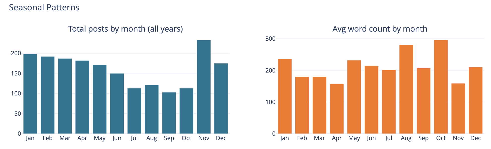
this chart is described in the test that follows

The bar chart on the left is total number of posts by month and on the left it is average word count on posts by month.

This was largely a curiosity to see what was there, but also a common analysis trend analysis to see if there are explanations of other trends looking at seasonal comparisons. The posts by month is not surprising to me as summer and early fall months have often been busy. I am not all that sure what the word count by month tells other than the correlation between more posts and shorter post length correlation showing up.

Top Category Activity Over Time
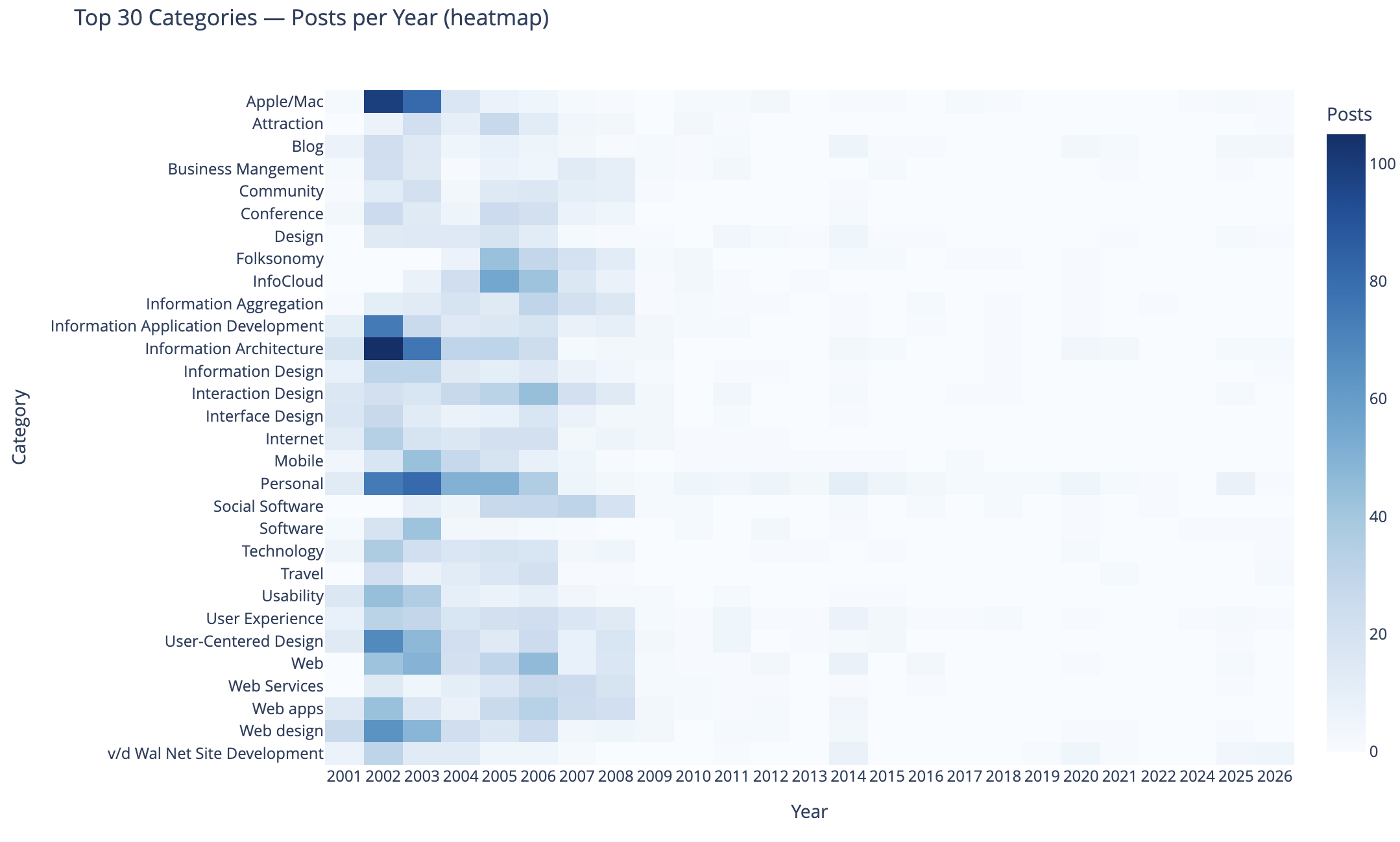
this chart is described in the test that follows

This chart shows the top 30 categories (by use) and their activity over time.

In this heat map Apple categorized posts were sure common, as well as Information Architecture, Information Application Development, Personal, User-Centered Design, and Web Design were also common. Personal and this site’s development.

The heat map being far more dense on the left in early years is skewed by volume of posts and makes activity in the middle and right (more recent years) difficult to see. I need to spend more time on this analysis and chart to separate out the early years and segment things so time outside of the early years can have trends more easily seen. I may want to select a different visualization, but if I can break things out by time that should help. Also running 3 time segements with the same top 30 categories across them and then the top 30 within each time segment could be interesting.

To 40 Co-Occuring Category Pairs

this chart is described in the test that follows

This cart of co-occurring category pairs is in part preparatory work for bringing concurrent tags into the category pages here for understanding and filtering needs for users.

The top 5 pairs are all related to UX, IA, and User-Centered Design and these being the type of concurrence isn’t a surprise to me. The broad UX community had rather divergent use of terms at times and one person’s IA was and other’s UX. For readers who think about these posts in one manner could find other similar content by the term they are familiar with using. Pretty much this whole list is application development, web design and development, web apps, and pan-UX related.

I don’t know how useful this is for broad insights. When I get to adding the concurrent categories on the category pages this will likely be more helpful on a category by category view.

Category Co-occurence Network Graph

this chart is described in the test that follows

This chart looks at the top thirty categories that have 10 or more co-occurrence of categories.

This I find more interesting than the prior in that this has Social Software and Folksonomy showing up and showing its relationships. The largest category in this view is Interaction Design and its multiple connections. I am entertained by the standalone pairing of Apple and Software, that at the scale limited for the data these only connect to each other.

I need to rerun this with higher acceptance to get more included. But, also this graph isn’t interactive in Jupyter, and every time I went to zoom in it collapsed the graph and I couldn’t move a node out of the way was disappointing.

Helpful as a Good First Pass

This analysis and data visualizations were helpful to see into my 25 years of posts. There are some analysis sets and data visualizations that need more work. Most of these are more helpful with Plotly in Jupyter and the ability to interact with the visualizations.

I am really curious with what this will look like when I look at Twitter usage and notes. Obsidian on top of my notes make note making easier and far more helpful with backlinks / wiki links. I started using it on top of my directory with notes in June 2020 that had around 2k notes in it going back to 2003. Now there are around 6k to 7k and in the past about half of these notes would have been on one of my blogs.
30 May 2026

Updated Categories with Sparklines and Search is Now in Production

I made a couple of updates I have long wanted to make to this site. I’ve been wanting to see frequency of categories used on my blog for more than 15 years (or pretty much since I’ve had category list pages). I have also wanted to have blog search and the utter mess that Google Search has become in recent years, where my site isn’t showing at all at times has driven this. These additions will likely iterate and adapt a bit going forward.

Updates to Category Lists with Sparklines

I have basically had two category list pages for years: Category List (which is alphabetical sort) and Category List by Use. I have kept these two and added sparklines to them (Sparkline - Wikipedia). Each line now has a small line chart that covers the 25+ years and what periods had used the category and some sense of the volume of use over time. One category list view I wanted and was missing was one to show a view with the focus of most recently used categories, so there is now a Category Recently Used List that not only groups by most recently used (and in the same entry keeps the alphabetical sort) but also shows the date of the last use in the list. Personally, I have been finding this recently used list view the most helpful and interesting. Skimming through the list I know I have more recent posts that have covered or touched on a subject, but it didn’t include the category, and that becomes a quick task to fix that gap.

Sparklines?

I have been a big fan of sparklines to give quick understanding of data’s distributions at a glance, which I learned about in “recommended reading” of Edward Tufte’s book The Visual Display of Quantitative Information | Edward Tufte in grad school in social / policy quant classes. (There are are many Tufte essays and book annotations on sparklines at Edward Tufte Notebooks & Sketches | Art, Science and Sculpture).

Creating the Sparklines

In creating the sparklines for my category lists I looked initially (and have long looked at them) creating static images from the data and bringing the images in (this would mean updating the images and replacing the old with the new ones, which is relatively straight forward programmatically and something I’ve done in the past, but not optimal) and I also looked at JavaScript but it was a bit slow. I poked at using creating SVGs (which work well when printing or zooming in) and often are much quicker and less strain on a browser than JavaScript. I’ve had a few goes at SVG in the past and I get get my mind around simple shapes, but I would need a little help with sparklines. A couple years back on a sparkline spelunking I found Easy SVG sparklines | Alex Plescan which showed the how. But, I have SVGs somewhat in the same category as regex, which is I do it rarely and I’ll just use Claude Code | Anthropic’s agentic coding system \ Anthropic to assist with the creation.

Chunking the Data for a Sparkline

The other part of sparklines is they are intended to be small glimpses and I have 25+ years of posts and a monthly temporal segmentation would make for a long graphic. I played around with breaking things down to quarters, but in the end I went with two segments per year and roughly 50 data points to map out on a line chart. Running a test with the two data points a year was a reasonable enough glimpse to sort out if the category was used recently or what the variation of use was over time.

One of the interesting discoveries with the first lab run of the categories of sparklines was the rather “U shaped” distribution of the use of categories, which pretty much calls out the lull I had in blogging. This softening of blog post rhythm is something I call, “when Twitter ate my blog” (where the interesting things I would discover and want to share and interact around ended up on Twitter rather than my blog(s)). Other patterns that surfaced were limited use a category in a period when I was rather sure I had posted on the subject, some of this was I was not using the term in that way or I didn’t have the category in my system yet. One of the things that helped sort this out was using my blog search.

Search is Now Out of the Lab

One of the things I have been working on and using my my Lab at vanderwal.net is blog search. But, the modifications I made to the Category pages I found I was leaning on my blog search a fair amount to investigate things. But, the categories and blog search are both in the blog section of this site, so making the change from the lab to the production side made sense. One of the things holding back moving search over, was I had an SVG of a magnifying class in the menu bar with “Blog Search”, but no matter how small I made the image it still was messing with the vertical layout of the menubar. In removing the magnifying glass and just using text things kept to the same layout.

Bringing in Search

The search in the menu in the pages in the blog section with “Off the Top” or “random” in the URL which is where there are currently menubar links to Blog Search. I have the menu bar link to a search page to search from rather than a JavaScript drop down or other menu bar convention (again layout of the menu bar was part of the considerations).

When I was working on search in the Lab section I found I needed to make some modifications to the database to have quicker search and I needed to modify the database engine so I could have search include 3 letter terms as a minimum rather than 4 letter words. In working on search I found many of my early posts didn’t (and still don’t) have titles and I was using the title as the link. I initially thought I would just add titles, but there are around 300 posts that don’t have titles (I’m adding some as I touch the posts for other clean-up issues), but I ended up coding the search results to have the results just fill in “Blog Post #…” as a proxy for a proper title.

The initial 170 or so posts are not in the database and are therefore not in the search.

Bringing Search and Categories In

As I went to move the category list pages out of the lab and into the production side I needed to modify a few other templates and pages to add the updated links. In doing this I realized I could also easily update the menu bar to include “Blog Search”. So, I took a little bit of time and made both changes at the same time.

Not all of the links are in yet. If you see something a little off with category lists or missing blog search links let me know.


9 February 2025

A Blog Move and Thin Catch-up

Yah, I know. It has been a while. Some things have changed, as I’m searching for what is next on the work front. Where I was it was a bit restrictive on sharing outward, so things got a little quiet. I’m still working on the Social Lenses / Complexity Lenses and have 80 to 90 stubs of ideas in my backlog of blogfodder, for here or the Personal InfoCloud.

A Move of Personal InfoCloud

I hadn’t posted to my blog, Personal InfoCloud in a long while. I was in the midst of a 16 part “Shift Happened” series, which was hitting embracing complexity as the next part of the series. I’m not sure if or when I will return to that. But, my work agreement frowned on sharing things out and I had a long negotiation about my prior work and corpus of IP around the Complexity Lenses. But, now that I’m back and able to freely write and share again I realized my blog where that happened much of the time needed to move off SquareSpace. Why? Poor customer support and small things breaking and them blaming me, when I hadn’t touched it in years.

The last two plus months I focussed on the move out and into another platform. I had looked at a few options for a month or so prior, but SquareSpace had one easy export path out, which is to WordPress, which I could self host (I have a few small blogs and sites that I have on self-hosted WP and they are fine). While there is a lot of turmoil in the WordPress sphere, going with the self-hosted option seems viable as a transition, if not longer option. I did an export of my SquareSpace site and in 20 minutes of export I had all my posts in WP and all comments, tags / categories, most media in blog posts, and the structure was there.

While the first step was 20 minutes to get to about 80 percent of a move done, the next portion took about two months between many meetings around advisory to start-ups, discussions about next steps (everybody was holding out until after the election, then to sort out what level of chaos may ensue, now…, and finding a lot of interest it is just getting things to a reality), mentoring professionally to director and up leadership in product management and cross-functional design and development engineering (with a lot of data focus and AI), data analytics and analysis of my own 20+ years of what I know so it can be better organized for others to pick-up. But, I had a deadline of the first week of February for the move out of SquareSpace to take place, as it was the next billing cycle.

The last two months of the move of the blog focussed on getting the design transitioned over or finding a viable design theme to use and bend to something I could work with. I found something, but it came with a lot of options and capabilities, which I initially embraced, then started printing out screens to single screen PDFs and taking the red pen to them (even after the move I think there are some things that may go, but also things that need work to come back). The next big haul was touching every post fixing some media links broken and fixing the URLs, which included the pre-post name date slug as part of the post name. I got those finally sorted out at the end of last week and Thursday I started moving the domains (from where I was developing it in a sandbox), shift to the production site, adding certificates, fixing odd typography issues, fixing routing issues, and other oddities. I hit the deadline.

Move Done and Next Steps for PIC

With the move done, I didn’t realize how much stress and mental clutter I had tied up in that move. I was managing todo lists in Obsidian, GitHub, and some quick reminders with times and dates on them. I felt free to start thinking about what I was focussing on two months prior and a ton of pressure released.

With the Personal InfoCloud blog I still need to fix links that go to Slideshare as most are broken, but I need to sort out what I want to do with those presentations. Jon and Rashmi have started a new replacement for Slideshare as a modern attempt, which I need to try a bit more and assess the fit for needs.

I also need to sort out the homepage of the site, as I’ve long wanted to have a homepage that sits in front of the blogs. I have that now, but I’m not happy with it. With the deadline out of the way I can have it as one of my projects I’m working through.

The categories, post listing, and search is also something I need to re-think and get into a better state. When I moved from TypePad to SquareSpace in 2011 to 2012 there wasn’t a good way to manage this, and what I cobbled together I hated. But, for PIC the platform is something I don’t want to think about I just want to use to post things I write. WordPress has a lot more options and I played with a couple before I put a hard focus on making the deadline about 5 to 6 weeks ago.

I have quite a few blog posts ready to be written. An introduction to the Complexity Lenses (there are over 90 of them now and in my master outline of them with sub-nodes there are over 1,500 nodes all together, which each node capable of being a page to at least 5 pages of explanation). This introduction post may iterate over time, which I’m fine with and not true blog with a line in time tied to it that other posts have. I also need to write up my “20 Social Roles”, which I do a lot of work around helping organizations sort through the roles and dynamics of their work, collaborating, cooperative, and collective environments, but also tool and platform builders creating tools that close the gaps of missing support for any and all of these Social Roles.

What Happens Here?

Here at vanderwal.net I need to get back to building a habit of blogging again. The weeknote is something I may do to help my rhythm. I still write a ton, but it is all in my notes. My daily notes, or “Daily Dump”, looks an awful lot like my first 4 to 7 years of blogging here (so 2000 to 2007 / 2008), before short snippets and observations started ending up in Twitter.

I still need to spend a week of heads down work to update the underlying code that the site runs on. I started that about 2 years back, but a day or two here and there weren’t cutting it and not a good way to make progress, particularly since it requires rewriting the code on my many templates to get data out and filling the pages in. Once that is done I have a few things I really want to address, like pagination on tag pages, and fixing the flow of the blog across time.

Whew!

If you have interest in chatting and catching up, or if you have a project, product, or work you would like help with please reach out.

Take care.


20 January 2025

The 8 Questions Answered in the Blog Questions Challenge

It has been a while since I’ve regularly blogged. I’m still writing a lot, but it is going into notes, and I need to get those back shared out. It used to be things I now put in notes, I just posted online (this sort of gets to the first question). I saw Joe Crawford answer these eight questions on his blog - ArtLung: Blog Questions Challenge ~ 16 Jan 2025. This seems like it would be a great thing to get the writing and workflow to post muscles functioning again.

1. Why did you make the blog in the first place?

I had some odd notes in HTML markup, mostly to myself, that I had posted before I started blogging. They were just HTML files roughly linked in a web directory. On this site I’ve had my links running as an HTML page since 1995, which is a couple years before I had my own domain.

In the web development community in the 1999 and 2000 I was reading sites that had become blogs. It was late 2000 when I was playing around with Blogger, mostly as a means to share links between home and work (this is what my FTP HTML files to my web directory was doing). In very late 2000 I made my first post in Blogger tied to this website. It worked on an FTP model as well at that point, but when I travelled hotels would block FTP from their hotel networks. I wrote a travel note system in PHP that allowed me to capture ideas, links, and notes. When I would get home I would introduce them back into Blogger. The travel notes turned into a CMS at work (I had been regularly rolling CMSes for work life for a few years).

2. Why did you choose to write your own blogging software?

I started with Blogger, but quickly was writing my own CMS for when I travelled. But, what I really wanted was the multiple categories added to blog posts that Grey Matter blogging software (Greymatter (software) - Wikipedia) had that Noah Gray created. I didn’t have an interest in going back to Perl as I had moved to PHP for easier development and having it be more readable code. So, I turned my Travel Notes I wrote in PHP into a more full fledged blogging tool. In Spring or Summer of 2001 I moved fully to my own hand written blogging software and It had stayed there. I still has functionality missing that I’ve long wanted to add.

I’ve updated the underlying code when I move hosts and I need to update the PHP to a newer version (I’m currently in the midst of doing that and hope by May to have that done, if not much sooner).

3. Have you blogged on other platforms before?

My Personal InfoCloud blog started on TypePad in 2005 (I had it on MovableType for a short bit, but Perl was rusty for me and I shifted to TypePad). Around 2012 that moved to SquareSpace and I’m in the midst of moving that to self-hosted WordPress. The PIC blog I just wanted to write and post, where as vanderwal.net I was fine messing with the underpinnings. I’ve setup and run a few WordPress sites. I helped get Home - Boxes and Arrows on MovableType, before MT was publicly available (Jay Allen ended up doing a lot of the heavy lifting as my worklife got very busy). Today I use Micro.blog very lightly and I need to sort out what I’m going to do with that.

4. Do you write your posts directly in the editor or in another software?

When I started blogging on this site I write in Bare Bones Software | BBEdit 15 in text, then would hand code the HTML and copy and paste that into the form, add in the title, location, type of post, and click categories to add. Around 2010 I shifted to Markdown in various Markdown editors. When the app Marked came out I started dragging the Markdown file to Marked and it would convert to clean HTML and I would check it, copy and past in to my system.

The since around 2010 or 2011 I’ve used iA Writer: The Benchmark of Markdown Writing Apps to write my blog content in Markdown. I have used Marked 2 to convert to HTML for this blog since it came out. The remainder of the workflow is to post into the CMS, it returns a blog post link, which I check through. If edits are needed I edit in Markdown, drag to Marked 2, drop in the test again for the post, and submit. If it is good, I go back to the CMS management screen and click to update the RSS feed. Then go to a push the notification something is posted to a ping service (it used to have 20+ options and now it is 2 or 3 I think).

5. When do you feel most inspired to write?

Most days I write thoughts I’ve been mulling as I wake. I capture links of interest I’ve read and write about those through out the day. In the evening I try to clear out open tabs and capture links then.

Sadly, in the last 4.5 years, since I’ve had Obsidian I just write in Markdown in there in a Daily Dump structure note template I have. Those all sit in the same directory as the Markdown for blog posts, as they are all notes.

I really need to get back in the habit of posting, at least a weeknote, if not more regularly. I have a long stack of writing to hone and post into Personal InfoCloud (more than 80 “blogfodder” items in a list for there - my past job didn’t take kindly to blogging, so I’ve held on to a lot of writing that just needs to get out).

6. Do you publish immediately after writing or do you let it simmer a bit as a draft?

Here on vanderwal.net in the Off the Top blog, it is pretty much what it says on the tin. As it is written it is posted. I’ve been trying to edit a bit more to fix missing letters, missing words, and making shorter sentences (that last bit becomes a rabbit hole), but mostly it goes out as I hit the last period. Marked 2 does some grammar checking and other lightweight edit helping, but not much more than that goes in to it.

7. Your favorite post on your blog?

Most posts I forget I’ve written once posted. The act of writing and posting clears them from my head, which is part of why I blog - so to clear my mind for other things. But, I think my favorite isn’t in the actual blog but adjacent to it, Model of Attraction - First Draft :: vanderwal.net, which is a brain dump while on a flight after the inkling of the idea for it was seeded. It was going to go into the Off the Top blog, but I set it apart as a draft. There are many posts I’ve written about attraction since that time -Attraction :: Off the Top :: vanderwal.net. The Model of Attraction is the underlying foundation for a lot of approaches to thinking through and assessing things technical, social (along with grad degree with deep social sciences and analytic / quant).

8. Any future plans for your blog? Maybe a redesign, changing the tag system, etc.?

I am in the midst of updating the PHP on the back end to bring the site’s code current. Once that is done I really need to add pagination to categories, a better previous and next navigation, calendar / chronology focus display of posts, and site search. I’ve also long wanted to have concurrent category views, say “folksonomy” and “data visualization” for better .

The other thing I really am wanting to do is to have a Digital Garden section shared out, like Maggie Appleton lays out here A Brief History & Ethos of the Digital Garden and does on her site, or as Tom Critchlow has been tending to on his site - Tom Critchlow. Move. Think. Create..


23 March 2008

Data Sharing Summit Announced

The Bay Area the week of May 12 has a couple great events that many who read this blog should be attending. I will be in Las Vegas (putting on a Enterprise 2.0 Jumpstart workshop with Jevon MacDonald) for part of the week, but should be in the Bay Area for the remainder of the time (at least that is the plan at the moment).

Data Sharing Summit

Following on the success and interest from the event last year is the Data Sharing Summit held April 15th at the Computer History Museum in Mountain View. Data sharing is getting to be the next hot spot that social web services and enterprise tool makers really much deal with as people are not satisfied living in their single walled gardens that inhibit their ability to share, find, hold on to, and refind information, media, and knowledge that is of interest or needed by them. Understanding the limits of the partitioned spaces and embracing more open (particularly securely open) uses of the contributions made by the tools and services participants is vitally important as the participants and system owners are realizing there is rich value to be gained from a much better understanding of these interactions with participants and other services.

We are living in a digital sharing realm that was dreamed up by designers and developers scratching their own itch and in doing so the tools are self contained and not living in a social ecosystem that is based on intelligent interactions. This will likely be the focus of the discussion as people on all sides are working to vastly improve the value of their services and tools and the value that people get from using them with other tools. This is not an event to sell products, but an event for smart people to discuss where things are, where they are going (or went when we were not looking), how to progress with opening up in a manner that all the parties gain value (understanding what and where the value resides is critical), and how we can all move forward.

I will see you there, right?


16 June 2007

New Profession Unfolding In Beauty and Geekery

A week or more ago I ran across the incredible video of Blaise Aguera y Arcas presentation of Photosynth and Seadragon at TEDTalks 2007. The video is stunning work of Seadragon and Photosynth bringing a collection of images to life from one or more resources.

While the video and ideas behind the tools are incredible displays of where we are today with technology and where we are heading, this caused some ideas I have been trying to get to gel to finally come together. In this video Blaise states (my own transcription):

So what the point here really is, is we can do things with the social environment taking data from everybody, from the entire collective memory of what the earth looks like, and link all of that together and make something emergent that is greater than the sum of the parts. You have a model that emerges of the entire earth, think of it as the long tail to Stephen Lawlers Virtual Earth work. This is something that grows in complexity as people use it and whose benefits become greater to the users as they use it. Their own photos are getting tagged with metadata that somebody else entered. If somebody bothered to tag all of these saints and say who they all are, then my photo of the Notre Dame Cathedral suddenly gets enriched with all of that data. I can use it as an entry point to dive into that space in that metaverse, using everybody else's photos, and do a cross-modal and cross-user social experience that way. Of course a by product of all of that is an immensely rich virtual models of every interesting part of the earth, collected not just from overhead flight and satellite images, but from the collective memory.

Torrent of Human Contributed Digital Content

What this brought together was the incredible amount of human contributed digital content we are sitting on top of at this moment in time. This is not a new concept, but what is different is the skills, tools, and understanding to make use and sense of all this content are having to change incredibly. The Photosynth team is making use of Flickr content that has been annotated by humans (tags, titles, and descriptions), as well as by devices (date, time, location, etc.). This meta information provides hooks put pull disparate information back from its sole beauty and make an even greater beauty and deeper understanding. The collective is better than the pieces, but pulling to collective together in a manner that is coherent, adds value, and brings deeper appreciation is where get hard.

Much of information understanding and sense making to date has relied on human understanding and we have used tools to augment our understanding. But, we now need to rely on deeper analytics in quantitative methods and advanced algorithms to make sense and beauty out of the bits and bytes. The models of understanding are changing to requiring visualizations methods (much like those of Stamen Design) to begin to grasp and see what is happening in our torrent of information at our finger tips and well as make sense of the social interactions of our digitally networked and digitally augmented lives.

Amalgamation of Designer and Quant Geek

What gelled in my mind watching the Blaise demonstration is there is a skill set missing in the next generation comprised of amalgamated design, information use, analytical foundation, and strong quantitative skills. I have clients in start-up businesses and in enterprise that are confronting these floods of information they need to make sense of from folksonomies and customer generated content (including annotations and regular feedback). The skills needed for building taxonomies are not translating well when the volume of information the information managers are dealing with is orders of magnitude higher than what they dealt with previously. The designer, information architect, and taxonomist who have traditionally have dealt with building the systems of information order, access, and use are missing the quantitative skills to analyze and make sense out of a torrent of loosely structured information and digital objects. Those with the quantitative and strong analytical skills have lacked the design and art skills to bring the understanding into frame for regular people grasp and understand.

This class of designer and quant geek is much like the renaissance men, but today the field of those forging new ground is open to men and women. The need to understand not only broad but deep sets of data and information so to contextualize it into understanding is the realm of few, unfortunately as there is a need for many.

I know of limited pockets of people with the skills to do the hard work of querying the vast array of information, objects, and raw data then make something of value of it. But, there needs to be more of these people getting trained as designers with solid quantitative and analytical skills (or the converse). Design shops are missing the quant geeks and engineering shops are missing the visualization geeks that bring this digital world rich in opportunity into something that makes sense and beauty.

If you know people like this that are bored, please let me know as I am finding opportunities flowing.


23 May 2006

More XTech 2006

I have had a little time to sit back and think about XTech I am quite impressed with the conference. The caliber of presenter and the quality of their presentations was some of the best of any I have been to in a while. The presentations got beneath the surface level of the subjects and provided insight that I had not run across elsewhere.

The conference focus on browser, open data (XML), and high level presentations was a great mix. There was much cross-over in the presentations and once I got the hang that this was not a conference of stuff I already knew (or presented at a level that is more introductory), but things I wanted to dig deeper into. I began to realize late into the conference (or after in many cases) that the people presenting were people whose writting and contributions I had followed regularly when I was doing deep development (not managing web development) of web applications. I changed my focus last Fall to get back to developing innovative applications, working on projects that are built around open data, and that filled some of the many gaps in the Personal InfoCloud (I also left to write, but that did get side tracked).

As I mentioned before, XTech had the right amount of geek mindset in the presentations. The one that really brought this to the forefront of my mind was on XForms, an Alternative to Ajax by Erik Bruchez. It focussed on using XForms as a means to interact with structured data with Ajax.

Once it dawned on me that this conference was rather killer and I sould be paying attention to the content and not just those in the floating island of friends the event was nearly two-thirds the way through. This huge mistake on my part was the busy nature of things that lead up to XTech, as well as not getting there a day or two earlier to adjust to the time, and attend the pre-conference sessions and tutorials on Ajax.

I was thrilled ot see the Platial presentation and meet the makers of the service. When I went to attend Simon Willison's presentation rather than attending the GeoRSS session, I realized there was much good content at XTech and it is now one on my must attend list.

As the conference was progressing I was thinking of all of the people that would have really benefitted and enjoyed XTech as well. A conference about open data and systems to build applications with that meet real people's needs is essential for most developers working out on the live web these days.

If XTech sounded good this year in Amsterdam, you may want to note that it will be in Paris next year.


12 July 2005

The World in Our Hands

SmartMobs announces It is official, there are more cellphones lines than landlines in the U.S.. I was thinking about this in the past couple weeks. We have already started seeing text and data uses tipping our mobile hands (it is about time we started getting to where much of the rest of the globe has already been).

Now if I could just keep my finger on the number of data enabled phones and the lesser number of laptop/desktop internet connections for the globe. Every time I see this number I forget to mark it or grab it.

[Hat tip Anne]


This work is licensed under the Creative Commons Attribution-NonCommercial-ShareAlike License.