Off the Top: Industrial Design Entries

20052010201520202025

Showing posts: 1-8 of 8 total posts


22 September 2026

A Stunning Video on Design and Porcelain Watch Face Creation

As I was wrapping things up last night and I had calm travel videos on for ambient background, YouTube offered up something different that I found amazing on many levels.

The video was from the watch brand anOrdain (anOrdain from Glasgow’s Southside), which I had not heard of, but that isn’t a surprise as I’m not a big “watch guy”. I’ve had a few decent watches, my dad’s Rolex when he passed and that was 99% sentimental. And Apple Watch which is largely utilitarian, but designed well.

The anOrdain video was on their YouTube channel and focussed solely on their Model 1 Porcelain watch and the design, craftsmanship, and the process. I found the video incredibly well produced and the story of their process to make the porcelain face, the typography, and the hands. It is a highly designed and crafted watch and the video matches that really well.

The Blue on White Porcelain Video

The video Blue On White | The Model 1 Porcelain - YouTube - anOrdain color hues, pacing, focus on details is a wonderful bit of video craft on its own. But, it matches the watch maker’s esthetic and practice so very well. I’ve watched a couple other videos and they have the same craft and design forward esthetic and feel.

What I Fell For

I don’t know that I’ve really fallen for a watch. I have for things really well designed and crafted, but watches rarely fit that bill as many tilt toward flashy and gaudy not elegant. What struck me with the watch is the face with the white porcelain and the incredible blue that is a Delft Blue. It somewhat reminds me of the Elizabeth Tower Clock / Big Ben - Wikipedia after it had been refurbished and the decades of dirt and grime removed and the hands and markings were blue (Big Ben Elizabeth Tower London 2023 01 Detail - Big Ben - Wikipedia). This combination resonates really well with me and it is calming and beautiful in a way most watch faces aren’t.

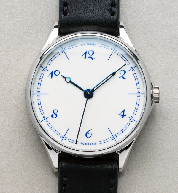
White watch face with Delft Blue numbers and markings, with blue hands created from heated steel

That wonderful white and blue combination is often really striking to me. On the anOrdain watch, The Model 1 Porcelain, it is matched with the details of the face with the curved blue rectangle markings, the custom typeface by Kia Tasbihgou (Design Practice of Kia Tasbihgou and Kiatas on Instagram and article about his typeface designs A campaigner for the unconventional, Kia Tasbihgou discusses his latest typefaces ), which is classical and playfully exaggerated like a hand drawn set of numbers. The hands on the watch are distinct and unique from each other, and are a blue from heated steel, which are a different hue and shade, but rhymes really well.

This is well outside my budget. It looks very much like an art piece crafted for one’s wrist.


3 September 2026

A Vision Pro Perspective

I have used many different VR headsets at hackathons and studio labs, but the visual quality was less than desirable. Reading in them was far less than optimal. I had found the 3D immersive capabilities somewhat interesting for training physical tasks and heightening awareness skills. But, the quality of the headsets’ visual quality and rough interaction models were large hurdles to overcome.

A couple years back (or so) I had tried the Apple Vision Pro out of curiosity at an Apple Store, after its launch and impressive walkthroughs. I was blown away with the visual quality as it was generations better than other options out there. But, the interactions with the apps and interface were incredibly simple to understand and became very quickly intuitive.

The Apple Store demo really piqued my interest. I could see its upsides for consumption. But, I could also see the potential for using it for remote work and interaction environments. That work potential became a large curiosity. The price of the Apple Vision Pro was a huge hurdle to go digging for the sake of curiosity. But, when Apple added the capability for a virtual monitor for your Mac with wide and ultrawide options, that started nudging the viability for curiosity. But, the price was still a bit too steep. I started looking at used Vision Pro models and prices were around $1k off new purchase prices. The friction there was knowing how to find one in good shape. I asked in an Apple forum I am part of how to purchase a used Vision Pro and someone in the forum had one they were thinking about selling. We chatted and worked out how to meet and purchase the device.

I figured if the two big things I had interest in it was worth the investment in the used AVP: 1) Viability for virtual meetings; 2) Virtual monitor. If it didn’t meet my interest or curiosity waned, I figured I could sell it on and get close to what I paid.

Before the Two Use Cases I Care About

The questions many ask are around:

Quality?
The quality of the hardware, visual displays, and interactions are seriously impressive. Opening web pages and reading ebooks is really nice clean and really impressive. There are no jaggies nor glitching.
Does it feel heavy?
I picked up the Annapro 2 add-on that is a brace that is padded and used at the top of the forehead area that takes the weight off your face and balances it much better. I regularly will have 2 to 5 hour sessions with the Vision Pro on and it doesn’t feel heavy nor cause neck strain for me.
How much do you use it?
I used it at least once a week, but many weeks around three times a week for tasks, virtual monitor use (more on this below), and some content consumption.
App availability?
There are apps for most things I do (many of my regular apps are available as visionOS native apps, and most other are available as iPad apps that are made Vision Pro capable), but not all apps that I really want are available as native visionOS apps. Two of the apps I really want on the device are the Drafts app (this is how I capture and surface quick notes across devices, not having it natively is a pain) and iA Writer as the Vision Pro a great device for focussed work (the input side is something). Having native Obsidian would help a lot as well, but that is more difficult as it is an Electron-based app.
I really want data visualization apps for larger data sets or data with a lot of complications, so that scaling the interface allows for better examination and interrogation of the data.
I really want Freeform as a solid whiteboard option, but it is so close and yet so far.
Isn’t it mostly a content consumption device?
The consumption capabilities of the Vision Pro are amazing, but for a consumption primary device the price is a bit much. The immersive environments to work in or consume content in are insanely well done. The immersive video content is stunning to say the least. Watching movies or other video content is a really good experience in 3D or regular viewing.

Curiosity Around Virtual Meetings

The Apple marketing pitched the Vision Pro as a good virtual interaction device. It used personas that were your face and hands. But, the big question I had around this was the ability to have meetings with colleagues that normally require hopping on a train or plane to get in the same room for 2 to 4 hours, or a couple days. That in-person interaction around plans in documents, presentations, spreadsheets, and whiteboards with a few people seems really viable. I really wanted to test it out that interpersonal interaction capability.

People that work together are most often rather distributed these days and there is no getting around that and travel isn’t cheap. But, if you can shift two or three fly-in meetings to Vision Pro you have basically paid for the device. But, if you can have more solid interactive meetings between the fly-in meetings that have better value than Zoom or Teams or even augment them with greater interaction and fidelity, that is a great win as well.

When I picked up my used Vision Pro it was still the first version of visionOS. The personas were decent and far better than other VR / AR providers, but could be better. Within a few months a major update was made and the personas really became good. Within a few minutes you forget you are interacting with a persona, and it feels normal with great facial gestures and hand and shoulders captured too.

Trying the interaction around documents and presentations with friends has been incredibly good. Once you open a document the person(s) you are interacting with shift from in front of you to arranged next to you and can point and touch what is being shared. This was and is incredibly good. I’ve done 2 and 3 hour sessions in the virtual meeting sessions and for most things it is really good where showing, talking about, interacting in shared documents, and editing is quite good.

The two limitations of this model are: 1) SharePlay is used for the interactions so it is capped to 5 people in the virtual interactive environment at a time; 2) The whiteboard with Apple’s Freeform (Apple launches Freeform) is their virtual whiteboard, which is similar to a Miro or Mural. The 5 person limitation isn’t bad and it is fine for many fly-in meeting needs for planning and check-ins, but 10 for in the same space and then have 5 person breakout sessions with much better interaction would really go a long way. Freeform in Vision Pro really need an input device and the best option is an iPad, which is rather good, but really needs a few more improvements. The iPad Pro with the Pencil Pro and the virtual shadow and the shadow for bevelled orientation seems like it was designed with Vision Pro in mind. But there needs to be some sort of pass-through to take some of the friction out of this. You can get rather proficient with a little time using the iPad Pro as the Freeform interface to do detailed work. The dedicated virtual pens lose fidelity and detail and from my perspective are a poor option.

A great advantage of using the Vision Pro virtual meetings is the focus of participants. In regular meetings most participants aren’t focussed on the matter at hand. For fly in meeting with distracted participants that is a very expensive problem. The distractions are normal and viable to keep on top of projects and problems that happen no matter if a meeting is happening or note. The advantage of Vision Pro is it puts the meeting front and center and the interactions with others in the shared virtual meeting, which is an amazingly strong value.

For virtual meetings this is a good option, but almost there and there needs to be some focus on what is needed to get there. There have been small steps, but the steps need to be more frequent and a bit larger. The other downside is a network effect problem (network effect as the converse), as there aren’t enough people who have Vision Pro devices to have ad hoc meetings with partners and clients at the drop of a hat. I have a few friends whom I interact with that I can test the advances around Share Play and different shared interaction capabilities.

Virtual Monitor

The other added value functionality I was curious about was the Virtual Monitor for Macs. I use the Vision Pro as a virtual monitor for my MacBook Pro quite a bit. The ability to use regular width screen (roughly equivalent to my 16 inch Mac Book Pro or a bit bigger), wide screen (about two screen widths), and ultra wide that wraps (about 3 screens) is really impressive. I most often use the ultrawide option when I need 3 or 4 apps open to have a screen I’m working in, one screen size for my notes, and one or two for reference.

There are two upsides for the Virtual Monitor mode. One is the ability to have Vision Pro apps open around the monitor mode as sticky notes, MindNote mindmap app, Safari floating with a page open, OmniOutliner lists open, and Apple Music. When I’m at my desk I have an external monitor to the left of my laptop stand, so I have two screens. The real life two screen setup causes more neck strain than the wide or ultrawide screen (by a long shot) and that is including the weight of the Vision Pro headset.

The quality of the pass through was a big question. The quality isn’t the same as the amazing screen on the MacBook Pro, but it is two 4k monitors with one in front of each eye. It sometimes is a little less than optimal, but if I move the virtual monitor either closer or farther back it gets to a sweet spot for really nice clarity. I don’t use the virtual monitor or ultra detail work or color precision work as the MacBook Pro screen is superior (similar for my 4k external monitor on my desk).

Two things I really enjoy doing in the virtual monitor are working on system mappings as I can go really wide and tackle and working in Freeform as a virtual whiteboard (it would be so much better were Freeform inputs much better in Vision Pro in its native app). I use Canvas in Obsidian for some capturing of systems and models, I also use OmniGraffle (the Mac version, as there isn’t an Vision Pro version yet, nor a working version of the iPad app for OmniGraffle 8 - I’m moved most of my OmniGraffle work into the beta of version 8 over the last year). In OmniGraffle I don’t use paper size, as I only use it for digital work, so I can go quite wide and tall.

One other advantage of the Virtual Monitor is that for the price of three good 4k monitors the Vision Pro is around the same price.

Vision Pro Impression Today

I still have the Vision Pro and I still get a lot of value from the device and regular use. There are some weeks where much of my use in the device is consumption, but pure consumption weeks are fairly rare.

One of my favorite uses is to put it on and just focus on work and tasks. Dropping into an immersive environment or the TGV app (a virtual TGV train trip that can provide a train focussed environment through the developer capabilities). I find trains are a great focus environment to get things done for me and this app works really well to resemble that.

I am really happy I picked up the Vision Pro, particularly used, as the price point felt it was quite on target. I really would love for Apple to take larger and more progressive steps. There are times I don’t know that Apple understands the full impact and focus of all the use cases, but I’ve virtually attended a few of the Vision Pro Developer full-day series and Apple is covering a lot of ground and covers many of the use cases well. I look forward to what is coming down the road.
5 June 2026

The Poetry of Time

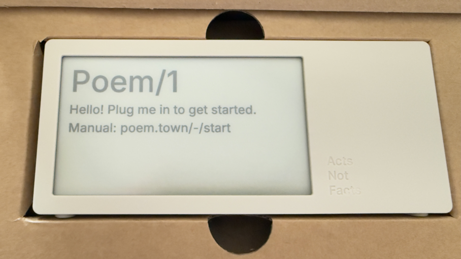
Today a package arrived that I’ve been deeply looking forward to. Part of the anticipation is the pure utter whimsy of it, part is it was a Kickstarter project that involved hardware (read hardware is hard when manufacturing is involved), and knowing the creator and watching all the steps along the way I was happy to see it and touch it. This is the Poem/1.

Poem clock in the box

Most of all, this device is giving me a lot of enjoyment and, well, glee.

The Poem/1 Arrived

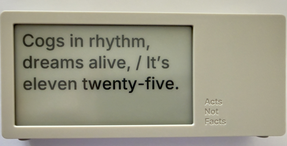
This poetry clock in the few hours I have had it running, with its e-ink display that updates every minute with a new poem for the time, which is / was generated by AI. Some of the poems are, well unique, and others are wonderful, but they can be favorited with the one button on the device.

The one button does a lot of work. It can be used to favorite a poem. There is a site with a dashboard for your device where you can push it notes you write to display, but to clear the note and get back to the clock you use the one button. There is a sleep mode with a screen saver and to clear that, you use the one button.

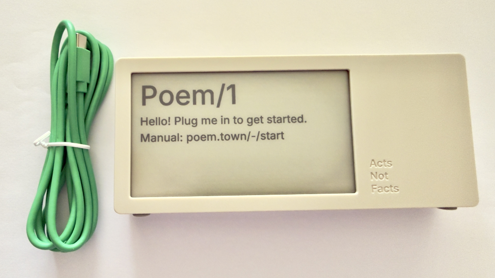
Poem clock and USB-C cable

The Poem/1 also has one USB-C cable. There is no manual in the box. Everything you need is the new Poem/1 device, the USB-C cable, and the e-ink screen tells you the rest.

After plugging it in you get a screen with some technical details and a QR code and using your phone with the QR code it then walks you through everything from easily connecting it to your WiFi (if printers could do this…), then make a selection or two and you have poetry time. There is also a dashboard website and the setup to your device is incredibly easy as is the setting up the account on that site.

photo of poem clock displaying Cogs in rhythm, dreams alife, It's Eleven twentry-five.'

The Journey of Poem/1

About 3 years ago Matt Webb blogged about an idea he had about an AI poetry clock, My new job is AI sommelier and I detect the bouquet of progress (Interconnected). This soon got connected to an e-ink device and Matt was on his way.

Matt setup a Kickstarter, which I happily backed. It wasn’t that I was overly keen with the AI bits (I’ve been working with AI/ML going back to 2008 and stayed current and it is a thing that I treated, like most everything else, as a tool). But I enjoyed the process of little printer – BERG and its outcome from afar. Having watched Little Printer’s journey of toil to come to life from Berg London (Matt and the amazing folks there), I wanted to support Matt (who mostly did this Poem/1 project alone). This provided insite into his long journey of quickly getting to a working prototype, then the slog of finding viable parts, a manufacturer, various regulatory approvals, and iterations when due to various things there were changes made late mid-stream to add to the delays.

Matt has done a good job logging his slog and journey. There were times where I’d realized I’d forgotten about Poem/1 and not heard of any progress in a while. About that time Matt would have an update in Kickstarter or on his blog.

Then there was US Customs, which stalled things for a while (not the tariffs, which became a hurdle earlier), but there there was more paperwork needed around “what is this clock”, oddly I (the customer) was sent the forms and I knew there wasn’t a winding mechanism nor jewels in it (well I haven’t checked inside, but pretty sure there are no jewels). Matt did a great job documenting the US Customs documentation hurdle in his post, How global logistics got me over my fear of personal agents (Interconnected) (my having worked at a Custom’s Brokerage for a few years I know the many reasons brokerages are needed).

What Time Is It?

I love the ability to favorite a time. (What is your favorite time?) In a few hours I have a couple favorites that I quite like:

Puddles reflect lost skies, / At two forty-five, heart sighs.

At twelve fifty, shadows creep, / Secrets held within silence deep.

Willow branches gently sway, / It’s twelve twenty-five today.

Thank you Matt I now have favorite times and a wonderful product.


22 February 2011

The Genius of Design - BBC Series Overview

This past Summer (2010) the BBC (BBC 2) showed a five part documentary series on design, called The Genius of Design (TGoD). This series is similar to Gary Hustwit's Objectified, but TGoD goes much broader and deeper offering a better reflection of the reality of design only seen through that depth. Think of Objectified as a taste sampler of TGoD. There are some people in common between the two whom are interviewed and focussed upon, but life is breathed into architecture, process, visual, industrial, and many more slices of the design world that bring design to life in TGoD. It is a wonderful look at the real nature of design.

The Five Episodes of The Genius of Design

The five episodes are: 1) Ghosts in the Machine; 2) Designs for Living; 3) Blueprints for War; 4) Better Living Through Chemistry; 5) Objects of Desire. The core focus is on the deep consideration and understanding that goes into design. It is this rigor of understanding and working through to final product all based on a core objective. Throughout the five series the focus on a deep understanding the materials deeply, use, impact on the people interacting with what has been designed, and development processes (as well as optimizing them).

Standout Themes

The obsession to understand the materials used and objects being design with depth and breadth is not the only standout theme. Many other themes and take away ideas stood out not only when watching, but also now many months later.

Focus on End Use and People Using Product of Design

One major reoccurring theme throughout is the focus on end use. The the products not only should be pleasing nearly (possibly to the point of being emotive), but they must also be usable, and do what it is intended to do very well. A continual focus on the person using what is designed is one of the central tenets of design and with out this it is something other than design.

Breadth of Design Disciplines and Roles

To the point of design having a focus on the person using what is designed, the breath of roles within design was brought up. Wonderfully, Peter Boersma's T-Model was directly mentioned in when discussing the breadth of expertise with required depth and roles in design that are required to all come together to optimally create a final product that is please and usable for the person who engages with the final product. While watching the whole series the focus on various disciplines and roles is very evident and when listening to the designers talk about their own focus and discipline (all largely falling under the moniker of design) as it relates to final crafting of the final object) it is they all have depth in their own discipline, but understand the materials deeply and the class and required needs for the final product very well.

Every Designer Has A Chair In Them

Another reoccurring thread, that gets depth of focus a few times, is the idea that every designer has a chair in them (this has become a meme in the broad design community from the near instant this was uttered mid-Summer). The chair is emblematic of the need for utility (purpose, comfort, durability, etc.) as well as providing style. A chair that collapses is not well designed. The chair also often has requirements beyond basic sitting, which can include long term comfort, ability to stack and store it, be environmentally friendly, and many more possible variations. This intersection of use, style, material, and production around the chair leads to a lot of the depth of understanding required to get to a final product prototyped, tested, and into production. This depth and breadth that designers put in is often not considered by people outside the design community, but also the depth and rigor involved in design is missed in some disciplines that are tangential to design, but do not consider themselves purely in the design profession.

Process Design and Optimization

Within the Blueprints for War episode the focus of designing the process was often repeated. The episode focussed on Britain in World War II and the need to have mass production of goods needed for the war that worked for their purposes, but there were limitations of materials and time needed to get mass amounts of goods in military personnel�s hands. Streamlining production and simplifying the goods became essential, but as well thinking of solutions seemed like their was expansive production (dummy planes, etc.) and alternate facilities (fake factories) were included in the design mix.

Wishing for More

In all this was a fantastic series for those in and around the design profession, those who intersect with design, and just fans of design.


26 June 2006

Prefab and the Blog Template

I have been fascinated by prefabricated (prefab) homes for the past few years. It first started with "why"? Why would somebody want to live in a prefab home. But, that turned into, "Hmmm, there is something to this prefab stuff". Part was the Dwell magazine interest in prefab, which played out into a prefab competition and prefab competition winners.

Prefab Blogs

I had the same feelings toward the standard blog styles, templates, and themes. Quickly, the standard designs became the norm. Where we had personally designed pages that had their own distinct flavor and style we had beautiful generic designs adopted by growing masses. The level to entry to beauty was lowered. In doing so I began to have many friends with the same blog design (this personally caused me cognitive difficulty as I remember blogs by color and distinct design and the wonderful design of the generics made my methods of distinguishing one blog from the other null and void). This sameness may say something about my friends and their similar taste and my apparent lack of diversity in choice in those whose company I enjoy all through the lens of visual design.

Prefab as an Old Cultural Trend

The more I thought, and still think, about prefab homes the more I realize our modern post-industrial lives are prefab. The suburbs (even urban settings) are all based on a limited selection of "floorplans" and exterior designs. I have spent a fair amount of time traveling the past year or two in the northern and western hemisphere in urban settings. There is a sameness to the city center architecture in Amsterdam, Oxford (England), San Francisco, Berlin, London, etc. The homes, commercial, and public buildings have their set patterns that distinguish time, use, and taste.

I think about my home, which was built in 1951 and was part of a small sub-division, which had a limited number of options that included our "cape cod" floor plan and style. Our neighborhood is changing like many others around the country that have homes more than 20 years old the older homes are being vastly modified and expanded or are being torn down and new larger homes are taking their place. These newer homes are too quite similar in style and floor plan to each other.

Is Prefab Bad?

As my initial dislike of prefab has faded, I still keep wondering about good or decent design being mass marketed and becoming too familiar and creating a backlash. One purveyor or good design for everybody is IKEA, which everybody I know owns at least one or two pieces of furniture from, no matter their financial or social status. Prefab homes are not quite in the same category, but they are heading in a similar direction. In our post-industrial life familiarity and similarity breeds comfort for many. We see similar patterns of similarity even in those cultures of differentiation (punk, MySpace, alternative, etc.) where the rebellion against the "beautiful" and commonly accepted "good design" is subverted. Tattoos, piercing, mohawks (again, which is comforting and ironic to me), illegible text in designs, low contrast design of bold color choices, etc. all are part of the counter culture, but are all a blending and a culture of familiarity and comfort.

There are set patterns in our cultures. When personal websites started (this one is a variant of one I started more than 10 years ago) there was a handful of them, a few hundred or a few thousand handfuls. Personal sites were personal reflections. They were our playgrounds and our means to be different, as much a part of being divergent as they were emergent. In MySpace we see much of the same attempt to separate one's self from the crowd. But, at the same time with 51 million (give or take 10 or 20 million more) differentiation is only part of a much larger pattern.

Finding a Home

Prefab is not bad, but just a means to inexpensively and easily get a home. It is not the exterior, but the interior space that is the place for personalization. Just as templates in blogs are a means to get a good design as a starting point to personalize, but the personalization is minor edits to the design as one component. The real personalization is the content that fills the once blank spaces. It is what is put in the blank text box. It is the voice and the expression of our views and ideas that make the space its ours and theirs. Much like what activities, what we make of the places we occupy, and who we interact with that shape our physical prefab spaces it is much the same same in the digital prefab spaces.

We are all out to find and build our home. It is something that is ours. It is something that is a reflection of who we are, who we want others to believe we are, and/or who we want to be.


23 June 2003

G5 is sexy

Apple's new G5 has made me drool. It is georgeous design and the sucker flat out flies. I am so wanting one of these to replace my desktop PC. I live in my TiBook laptop, but really would like to have a Mac desktop to be a home base. The TiBook is my homebase, but it is not optimal for me. Don't get me wrong I love the TiBook like no other computer I have had to date.

The beauty of the G5 case would make me want it on my desk top to stare at it.


29 April 2002

New TiBook

Sigh! A new TiBook with better graphics, faster chip, and more 1MB L3 cache. This is the first time in a long long time I have computer envy. Only three or four months after I received my TiBook, which was nearly the top of the line, a new one has me gaga. I don't ever remember being this way over any PC I ever bought. No, I don't wish I had waited, because my TiBook rocks.


12 February 2002

MS Natural Keyboard

New item causing muscle memory issues. I had to get a new keyboard for my PC as many keys went out for good last night (a, s, d, e, f, g, h, j, left ctrl, delete and down page). This made for creative alternatives this morning. The keyboard started developing a personality a couple months ago, but always came back to life in 15 minutes or so. I got a MS Natural keyboard, which had really nice key movement. I am quite impressed. Being a touch typist (is it okay to say that?) I really like the feel of the humped center, as it really eases typing. I am not sure I like the directional arrow layout, but I will learn. I did give up a volume knob and a mute button (along with 20 other buttons I did not use), but oh well.

This work is licensed under the Creative Commons Attribution-NonCommercial-ShareAlike License.