Off the Top: Statistics Entries

20052010201520202025

Showing posts: 1-7 of 7 total posts


16 September 2026

I Wrote What?

Part of the impetus for writing this post has been driven by the updates at A new Observable | Observable, which I recently wrote about Large Observable Update :: Off the Top :: vanderwal.net, and looking at changes in not only Observable, but updates to D3 by Observable. These current and not-too-distant updates have had me thinking about what I could do with some of my blogging data to make interactive charts and graphs. I’ve recently moved a lot of my legacy static charts and graphs to Plotly to gain interaction with them, for many of my own uses. But, in the process of getting a decent data workflow setup for my site (and my notes data) I have relatively clean data locally ready for use and testing.

A Little Data Workflow Background

For this blog I have been pulling down the data from the site’s backend and converting it with a set python script to extract it to SQLite, which is relational but quite fast for reading data and is great for single user write and a few read options. Over the past few months I’ve also been building many data analytics and data visualization prep python scripts (some building JSON files for standalone webpage interfaces). I’ve used Claude to debug, but also just turn out a script in less than couple minutes for the page setup for the D3 or Plotly scripts, which would usually take me 30 to 120 minutes. Once the scripts are set and I’ve reviewed them it is all just setting python flags and minor tweaks to the script to handle a data update.

With these script setups I’ve been able to try quite a few D3 chart and graph options very quickly. Going through the Python code, the data structures for the visualizations, and the hooks for the visualization and I’m rather happy with it for quick outputs.

What Can I See Using Blaugust Data

One of the things I had interest in from my A Wrap to Blaugust / Blaugust run in August was what did all of that look like from a basic statistic and graphical perspective. A few months back I created and ran a bunch of Jupyter queries and visualizations, Personal Blog Data Analysis - Looking at 25 Years. Since then I’ve been thinking about looking at a monthly view with more interactive charts and graphs. Since I had a decent amount of data from August 2026, existing data workflows, and a few D3 charting and graphing options I could work with I took a look.

August Off the Top Force Graph

The first is an interactive forced graph with the blogpost as orange nodes with the size corresponding to word count and the tethered edges link to categories for the post. Clicking on the post will show the related categories and pulling on the post node will start to see the other tethered posts connected through the categories. There are few toggles: 1) Posts and categories or just Posts with their related interconnections; 2) Only show shared categories (a category with more than one post); 3) Post to Time, which may be my favorite view, as it take the graph and lays out the posts left (oldest) to right (most recent), with a small light timeline at the bottom and all the other relationships displayed as well; 4) Post titles, which clutters things a bit and adding the toggle resolved that clutter.

You can view this standalone interactive web chart that sits in the Lab :: Off the Top Analytics at the direct link: Off the Top, August Force Graph with Toggles. A sample is here:
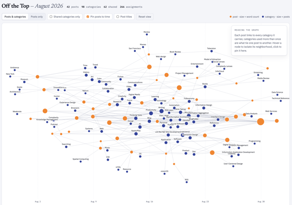
A forged graph chart image showing August 2026 posts and connected categories

August 2026 Word Counts

As I was going through the data for August 2026 I knew and could see the word counts for posts, which I don’t have easily (nor quickly) available on my site. But, with the data local in SQLite and I’ve been using the local data to run many types of post analytics, word counts become a simple and quick option that doesn’t impact the site’s performance at all.

I was really curious about word counts per post across August, but also was more curious about a cumulative word count across the month as well. A quick and easy bar chart and line graph solved this, both having interactive hovers for metadata. August had 25,390 words posted.

The standalone interactive web chart is also in the Lab and the direct link is: Off the Top, August Word Counts by Post and Cumulative Count. A sample is here:
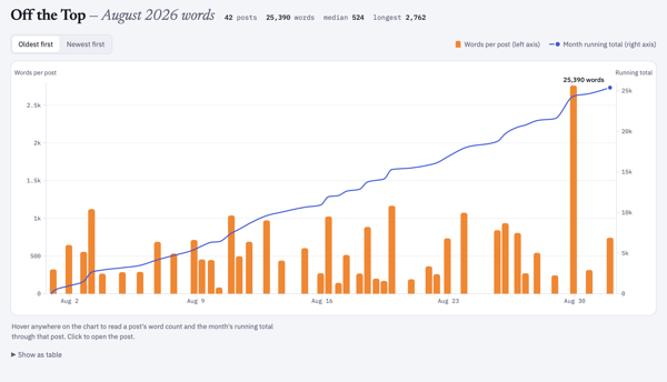
A bar chart image of monthly posts with height correlating to word count and a line above the bar chart showing cumulative word count for the month August 2026 posts

Cumulative Word Count for 2001 to 2026

Looking at the cumulative count for August 2026 (the 25,390 words posted in the month) I had no idea what that count was in comparison to the whole life span of the blog (under this CMS that started in late October 2001 and not including the static posts prior to that). I know that in the early months and years of the blog I wrote a lot of short posts and the posts were frequent. Looking at word count I wasn’t expecting the first two or three years to have roughly the same growth slope up to 2008.

Looking across 25 years of posts I knew a single post analysis was going to be a bit rough for an interactive standalone webpage. Monthly would be better, but could still be a bit too much to process dynamically in the browser. Quarterly, was just a bit on the thin side and more difficult to see trend shifts and correlative line slope. I settled on a two-month interval and I had something interesting in under a minute.

July and August 2026 were the highest word count across all time on this blog. The 25 thousand words is roughly a quarter of a 250 page book. But, now that I had the bi-monthly chart I can also see the early years I had roughly similar counts per two months up until 2008 and then there was the “great flattening”, until the “great pandemica” lockdown when things ticked up again until lockdown ease and work went back to its normal patterns.

I ended up over the 25 years with 437,417 cumulative words just on this blog. That is roughly 4 books of 250 pages. It would be a rather odd book, but in just considering word count as the focus. I find word counts odd, particularly writing to word counts. I’ve had a regular column in tech publication that had a 750 rough word count topic, this was at a time when my posts were often 1,000 to 1,250 words on average and 750 words was about where I had the framing set to get to the meat of things. I mostly write on this blog to an amount where there aren’t good words left, which is 200 at times to 2,500 or more. To see my writing shifts in the early years roughly similar in trajectory rather interesting.

The standalone interactive web chart is also in the Lab and its direct link is: Off the Top All-time Cumulative Word Count. A sample is here:
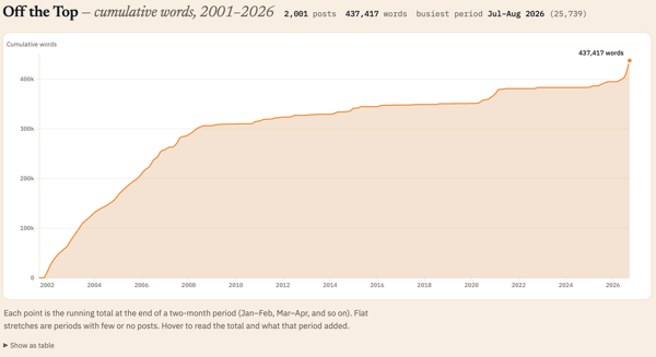
A line chart showing cumulative word counts across 25 years of blog posts

Will this Continue?

Now that these are standalone webpage charts and graphs, I’m not sure what I will do. I need to get the templates consistent from a layout and design perspective. But, once the standalone webpage is created I just copy it to the Lab or other location, and this can be automated with a quick script. I think the month-by-month analytic is interesting, at least to me. I have not only the local standalone version that I posted, but a rough output build that isn’t fully self-contained that I can play with and iterate on.

If you like this and want to see more ping me on one of the services or send an e-mail using the Contact in the navbar.


12 March 2009

Catching Up On Personal InfoCloud Blog Posts

Things here are a little quiet as I have been in writing mode as well as pitching new work. I have been blogging work related items over at Personal InfoCloud, but I am likely only going to be posting summaries of those pieces here from now on, rather than the full posts. I am doing this to concentrate work related posts, particularly on a platform that has commenting available. I am still running my own blogging tool here at vanderwal.net I wrote in 2001 and turned off the comments in 2006 after growing tired of dealing comment spam.

The following are recently posted over at Personal InfoCloud

SharePoint 2007: Gateway Drug to Enterprise Social Tools

SharePoint 2007: Gateway Drug to Enterprise Social Tools focusses on the myriad of discussions I have had with clients of mine, potential clients, and others from organizations sharing their views and frustrations with Microsoft SharePoint as a means to bring solid social software into the workplace. This post has been brewing for about two years and is now finally posted.

Optimizing Tagging UI for People & Search

Optimizing Tagging UI for People and Search focuses on the lessons learned and usability research myself and others have done on the various input interfaces for tagging, particularly tagging with using multi-term tags (tags with more than one word). The popular tools have inhibited adoption of tagging with poor tagging interaction design and poor patterns for humans entering tags that make sense to themselves as humans.

LinkedIn: Social Interaction Design Lessons Learned (not to follow)

I have a two part post on LinkedIn's social interaction design. LinkedIn: Social Interaction Design Lessons Learned (not to follow) - 1 of 2 looks at what LinkedIn has done well in the past and had built on top. Many people have expressed the new social interactions on LinkedIn have decreased the value of the service for them.

The second part, LinkedIn: Social Interaction Design Lessons Learned (not to follow) - 2 of 2 looks at the social interaction that has been added to LinkedIn in the last 18 months or so and what lessons have we as users of the service who pay attention to social interaction design have learned. This piece also list ways forward from what is in place currently.


1 February 2007

Pew Research on Tagging

Lee Ranie of the Pew Internet and American Life Project announced the release of Pew Internet Project Report on Tagging in America. The report also includes an extensive interview with David Weinberger on the subject of tagging. The most interesting parts of this report at the percentages of people in America who tag (includes those who add categories). Based on their survey, which randomly selected and spoke to 2,373 adults, 28% of Americans online have added tags or categories. The survey found 7% of the respondents tag/categorize daily.

I am really happy with the report as it looks at the numbers from a use perspective. Up to this point I have been using tagging service provider numbers (few are made public) along with Alexa hit reports across many services and took that total and divided by the Neilsen report number of total people on the web (approximately 750 million people). This approach provided about .85% of all the people on the web are tagging (does not include tagging on blogs as that is more ad hoc categories, but that is a long post to explain or done over a beer or two).

The difference between the percentages in the Pew report and the numbers I backed into is the Pew is just an American view and mine was looking at things globally. Pew looks at tags and categories and many systems have categories. I am really comfortable with the daily number of 7% on the web are tagging/categorizing and I will likely use that number in future presentations. The 28% number is really surprising, but for one time use it is accurate. This represents a much larger user base than I thought, but is also includes categories with tagging.

Separating Tagging and Categories

The Pew Report on Tagging combines categories and tagging. While optimally it would be great to separate the two out, explaining the difference between the two to a regular person (non-geek) in America will be difficult. Asking if somebody has used certain functionality on a service or one of the 130 or so social bookmarking tools or the many hundreds of products that include tagging will negatively impact the results. The terms tagging and categories combined for a research question make for a question that is more easily answered yes or no.

The Pew Report provides a starting place for future research, hopefully delving into the subject with a little more clarity, where tagging and categories are separated.

Tagging and Race

If one looks at tagging as a means to refind information and looks at tagging as adding context by adding a person's own vocabulary and social terminology as one of the tools of tagging then looking at various social groups is a simple way to start to validate this (a much better approach is to ascertain why somebody is adding a tag). One simple way to look at different social structures is race. The inclusion of the break down of who tags by race can provide a good argument that people who tag are adding missing language terms, if the assumption is made that the content is missing metadata or is provided by somebody not of that race.

The Pew Report indicates the following tagging breakdown by race:

  • 26% of White, non-Hispanics
  • 36% of Black, non-Hispanic
  • 33% of English-speaking Hispanic

These higher numbers of people tagging who are not white seems to support the idea that those whose vocabulary and terminology is not represented will tag to ease their refinding the information. When things are in familiar terms they are easier to find and having the ability to tag from one's own context eases refindability. The Report does not dive into this and it is a really good subject for future research.

[I initially posted this at Personal InfoCloud :: Pew Research on Tagging, which has comments open


17 November 2003

This one goes to 80

Dave Weinberger points out gross errors Information Week made when graphically comparing perceived problems with Windows and Linux. The error is that the Windows graphic uses a scale of 80 percent, while Linux uses a scale of 40 percent. When you realize this the differences in perception become huge.

Microsoft shows nearly 80 of those surveyed had concerns about their software quality and vulnerabilities, while Linux had less than 25 percent. More than 60 percent felt the cost of ownership is too high with Microsoft, while far less than 5 percent had the same concern with Linux. The Linux perceived problems revolve around a lack of complete and fully integrated software environment (40 percent), accountability if problems arise (above 35 percent), and lack of clear product road map (35 percent). Each of the Linux perceived problems, once you spend time looking into them, is not really a problem, but more of a lack of a company with a large marketing budget. I am hoping that Novel and IBM can really start making headway in this area. The quality of Linux products is far higher than Microsoft's and for nearly every product that Microsoft pushes there is at least an equal product in the Linux community.

Then again there is Apple too.


14 November 2003

NBA does Moneyball

Fans of Moneyball will like the Washington Post story on the NBA wiz kid executive. The focus of the article is the San Antonio Spur's Sam Presti, age 27, who is applying MBA tactics to the NBA. Yes, quantitative analysis to mitigate risk and control cost is behind the NBA version of Moneyball, just as it is in Major League Baseball.


1 August 2003

NNG Usability ROI debunked and Web Traffic Analytics at B and A

Boxes and Arrows is currently running two wonderful articles. Report Review: Nielsen/Norman Group's Usability Return on Investment by Peter Merholz and Scott Hirsch. The second article is Web Traffic Analytics and User Experience by Fran Diamond.

Go read, I will be back shortly.


30 March 2002

Perl to parse weblogs

Looking to parse your Web logs to gain those wonderful nuggets of information regarding those that visit your site? If you have perl at your fingertips (those of you with OS X do natively) check out Perl for Web Site Management's sample chapter, Parsing Web Access Logs. This will be a very good start, if not exactly what you need.

This work is licensed under the Creative Commons Attribution-NonCommercial-ShareAlike License.