22 June 2026

Does the Internet Make My Type Look Small

Early in the week I was “doing a thing” that is part of future improvement to the back catalog of 25 plus years of posts and I looking at my site a lot, as well as other sites and my type looked small when comparing to most. To me my site was quite readable and keeping comfortable line lengths, but there was a size difference that I really hadn’t noticed as much.

I checked with a few fellow bloggers, whom I swore recently had type around the same rendered size mine has, but they nearly all said they hadn’t touched their type size in years (a couple had adjusted it in recent months). Their type sizes were larger.

Adjusting Type Size

The last visual adjustments I made were in 2020 and it was a bumping up of the default type size and making the page size wider, as screens were larger and could accommodate the size increase of the type (today I found my original draft of the Model of Attraction is still in the older page size - Model of Attraction - First Draft).

I still set the default font size in pixels and call Helvetica Neue to be displayed. I started working with the modifying the CSS in the Lab - vanderwal.net, as there are enough page types in there to test many of the layouts and furniture with the adjustments.

I bumped up the font size two pixels and that needed a lot of adjustments for the header, nav bar, margins, and padding. I was about halfway through the adjustments of sizing for other CSS elements when I realized the line lengths for body text were tight, like a cheap suit that “stretches”. I backed down the font size one pixel and that improved the type size nicely and kept good line lengths and reading more comfortable. One thing I needed to do was add height to the heading to let the “highly creative” heading set more clearly again. This meant adjusting the height of the heading background image (there is plenty of width).

I completed adjusting the margins and padding and the body text was breathing well. I opened a few other pages from other sites I regularly visit for blogs and new and informative sites. The type on vanderwal.net felt like it fit on the web.

Moving the CSS Out of the Lab

On Friday I took the steps to move the CSS over to this side of things.Because there are some things that are a little different on the Lab side I needed to use diff to compare the two CSS files and update this side. I turned to my trusty BBEdit to do the task (I hadn’t used the compare in BBEdit in years) and it reminded me why I like using BBEdit for the, “I wish I had something that could…” type tasks.

After about a half an hour things were sorted and most things looked as I had hoped. There are a handful of alignments that need fussing with. There is a margin and / or padding issue that has been around from the last size tweaking a few years back.

Side Benefit

There are some small benefits that have come from these adjustments. One is related to the links page and improved ease clicking Vision Pro and on iPad. I have kept the line height a bit tight as there are many links and on a laptop or desktop screen it is fine clicking. It has also improved clicking on mobile as the touch target is increase.

11 June 2026

The Blue Ant Trilogy and The Near Future and Everynow

This may need another edit, but it is still a bit time-foldy, but what I’m focusing on is very time-foldy.

When I read the Blue Ant Trilogy from William Gibson (Pattern Recognition, Spook Country, and Zero History) as they came out in 2003, 2007, and 2010 I wondered then how they would hold up, as they were near future scifi. Each was sat in the now and /or the just about to become. If, at the time, you were paying attention to culture (particularly around a technology focused world) all of the elements in the book were familiar to nearly familiar. Most of the roles, technology, and ways of thinking were already at the edges of society, but very very niche and not yet made it into the main consciousness. How does near future look in the future?

I regularly pull Pattern Recognition off the shelf and read snippets and it takes me back to that time in 2003. I’m a big fan of that book on many levels. But, to me it still holds up, yet I’m looking at it from the living through this at the front edge of emergent culture and technology. I still wonder how someone would read this today who was less than, say, 10 years old would read and perceive this today.

In the past week or two I’ve run into a handful of YouTube videos and blog posts / articles by people who have recently read one of the books, most often Pattern Recognition. I find interesting in that some see things in the books from 15 to 20 years ago are still coming in the near future (this really intrigues me) and others things seem quite foreign and more futuristic. Yet for some of us they have happened and became normal outside of the far edges of culture, but were far from mainstream. I was expecting reviews, at least some, to talk about how these books seemed set in the past. But, yet no, not one. They focused on, what to me is, an odd perspective continuum.

This surfacing of ideas and perceptions in a society and culture hit two scenarios and situations: 1) Common, but at the edges; 2) Things from the past that still seem futuristic as they haven’t happened in someone’s (or mainstream’s) perception lens. Yes, William Gibson’s famous, “The future is already here — it’s just not very evenly distributed” applies readily. But, there is more to this where things happen in pockets and spread more widely, but not too widely and don’t take hold broadly, nor are they known of more widely.

This phenomena isn’t just related to scifi and technology, but global understandings around mental models, and the language structures around broad cultural mental models (that are mainstream in another culture in an other part of the globe that people in another culture don’t have curiosity about and are more settled in their parochialism and pedestrian thinking to look up and notice). The scales of this and the complex mappings around it from edge cultures, out to large global cultures are more than a lifetimes of effort. But, the key piece is a response of curiosity or defending one’s own currently limited understanding. The common responses are often, “Wait, what? Tell me more.” Or, “That is wrong.” My common phrase when people discover something new that changes how they see and understand things, and they feel like they were doing things wrong, or didn’t know of other helpful possibilities, is, “You can’t know until you know.”

But, with in those interested in exploring at the edges and particularly around the fluidity of time and understandings and seeing something from the past (20 plus years in the past) that was then just happening at the edges and moved more into some cultures mainstreams and faded, as still in that same state of temporal now or about to happen. Now is different for everybody.

In 2004 I started using the term Everynow and included it in a lot of presentations and writing and ended up writing about it explicitly in the linked post in 2013. I was focussing on technology and ideas that set in play the now. But, for some reason concept of having people read a piece that is around 20 years old about the early edges of something and it being still near future, is really surprising to me. The concept of near future from 20 plus years in the past and for many (yet still a small few in the whole of it all) today becoming again (or still) the near future is wild.

The near future idea, has a sense of anticipation in it that something is coming. But, for those who went through that near future and lived it as it was happening, and to the past transition cycle, it seems odd that a near future for something in the past doesn’t just jump straight to the now stage as they experience it. Having a near future anticipatory stage for something that happened for many in the past feels odd, but it is just another reflection of experiencing the now of others viewed throw and really wide and elastic everynow.

7 June 2026

Slideshare is Back Functioning Well

I’ve been thinking about how much of a relief it was to see Slideshare get a refurbishment. A few weeks back I went to Slideshare following a link that I didn’t pay attention to where it was going. But, when I got to Slideshare I was pleasantly pleased that it was not only working, but seemingly in good shape. I looked and it seems like all of my old presentations are still there even it it looks like my old view and download counts were reset at some point, c’est le vie.

I was a really early user of Slideshare and was the 6th or 7th person outside Slideshare shown the concept by Rashmi. My early sharing of my presentations by common web options and commonly frustration and needing a good service was a small piece of what got Slideshare moving. I think in Keynote, as one of my tools for having progressive reveals and animations to get ideas set. Slideshare doesn’t quite allow for that, but it is a good option for sharing.

I have a lot of blog posts which have presentations embedded from Slideshare when Rashmi and Jon ran it and then LinkedIn. Things broke in recent years when it left LinkedIn. I now need to track down all of my posts with Slideshare embeds and sort out what I need to do up update the embeddings. A lot of the progressions through explaining and breadth of things that folksonomy can help with are in Slideshare, and so much more.

6 June 2026

Personal Blog Data Analysis - Looking at 25 Years

After adding sparklines to my category lists (Updated Categories with Sparklines and Search is Now in Production) I wanted to have a deeper dive looking at my categories and blog analytics over 25 years.

Category Long Tail

I done a very quick capture of category usage to look at the distribution of use. A question from James about whether my category distribution looked like a long tail distribution and I thought it may, but also looking at the numbers and not having a visualization I wasn’t sure. Charting the use, it really was a very long tail / power law distribution.

this chart is described in the test that follows

I shared it with James and he also ran his and ended up with much the same (Is there a power law of category use? - James’ Coffee Blog). There have been a few discussions of late around category use and some lean into having just a few categories. I have just over 200 categories now as most of my blog post have more than one subject and I use the categories to have an way to jump to related posts that cover the same subject. When I built my site’s CMS I wanted to have the capability to have multiple categories on each post. I have multiple categories for my own purposes, but also I’m cognizant that readers may have other terms.

With the long tail use of categories I know readers may stumble across a post through web search or a link from else where and having a category term that is familiar can get them to other things I may have posted. I view the web as being able to connect with others and blog posts are sharing things I have interests in or curiosity around and being able to connect with others in a similar mindset is the aim. So a handful of categories, particularly across 25 years and over 2,100 posts, doesn’t help build those connections.

More Analysis on Blog Posts and Categories

This distribution of categories really pushed my interest and curiosity of what the last 25 years of blogging looks like. I joke that Twitter ate my blog, but the sparklines sort of show that. I wanted to see the trends on my blog more closely (I have the archive of my Tweets and I’ll analyze them later and then bring the two analysis together).

To prep for the analysis I pulled my site’s database data local and put it into SQLite (it is already on Mac - Apple and quick) to connect locally with Jupyter Notebooks and use Plotly for interactive data visualizations in the notebook. I had a series of questions, somewhat common data analytics questions I’ve used since grad school looking at analysis over time.

Posts per Month

this chart is described in the test that follows

The first analysis is my blog posts by month over 25 years. In my early years I was posting frequently, often in shorter posts (but we will look at that next), and then around 2005 (when started engaging with Twitter) things dropped off. Also at this time I also started blogging more serious subjects at Personal InfoCloud, but those were not all that frequent (I’ll dig into this at some point later too).

My hunch that I posted much more early on and drop off around the time I engaged with Twitter, seem to hold up.

Post Length Over Time
this chart is described in the test that follows

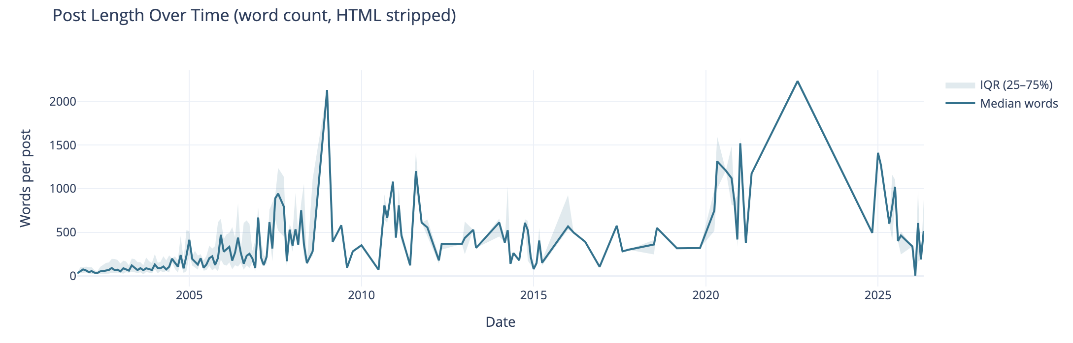
Post length over time also can tell the story of why post volume shifted. I wasn’t posting a lot of short post, but posting longer posts, but less frequently. I’m really curious what I posted in June of 2009 that caused the spike. The spike on the right end in 2020 and beyond are partly attributed to posting weeknotes, which tended to be longer than normal.

I know that my writing muscles went from a few hundred words early on to posts being around 1k and more. I found my comfortable blog post writing length was around 1.2k words. I write to find out and capture what I think, but rarely edit for brevity or other editing benefit, at least on this blog.

Median Categories per Post

this chart is described in the test that follows

This view of the median number of categories per post over time I found interesting and I didn’t know what my expected outcome was going into this analysis. The numbers pretty much are in line with longer posts have more categories to cover slightly more breadth in a post. Again June 2009, not sure. The spike spike on the right aligns with weeknotes, which cover multiple subjects in one post.

Distribution of Categories per Post

this chart is described in the test that follows

This chart groups number of categories on posts. This shows the second bar has the most number of posts (822 posts) have 2 or 3 categories on the posts. The third bar has 408 posts with 4 or 5 categories on them. This lines up well with the frequency and volume of posts early on which were shorter. Looking at the prior chart most posts had 10 or fewer categories on them.

Combined Timeline for Posts, Length, and median
this chart is described in the test that follows

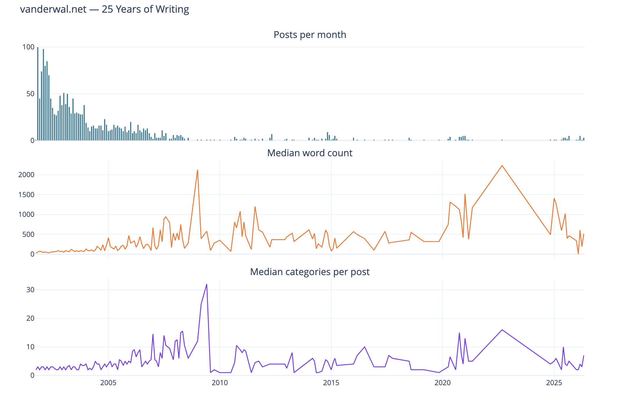
I like this combined chart that reinforces early on with high volume of posts of shorter length and few categories on them. What I find interesting is the correlation of line trends for word count per post and categories per post. This ties closely with the longer posts have more categories.

Seasonal Patterns
this chart is described in the test that follows

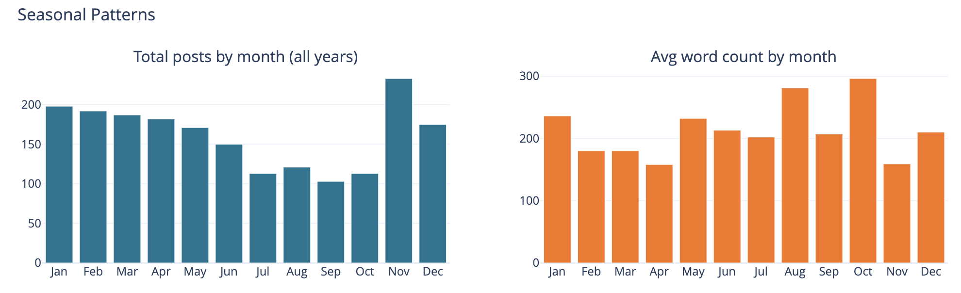
The bar chart on the left is total number of posts by month and on the left it is average word count on posts by month.

This was largely a curiosity to see what was there, but also a common analysis trend analysis to see if there are explanations of other trends looking at seasonal comparisons. The posts by month is not surprising to me as summer and early fall months have often been busy. I am not all that sure what the word count by month tells other than the correlation between more posts and shorter post length correlation showing up.

Top Category Activity Over Time
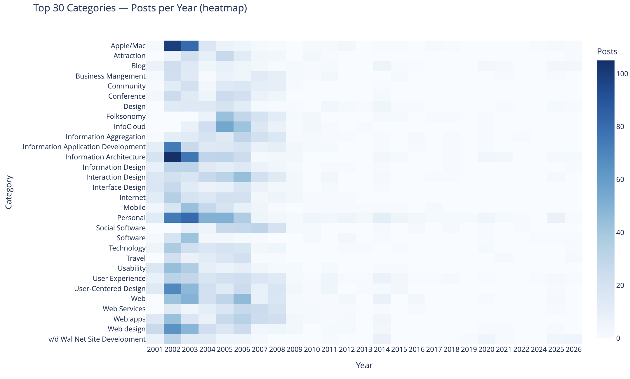
this chart is described in the test that follows

This chart shows the top 30 categories (by use) and their activity over time.

In this heat map Apple categorized posts were sure common, as well as Information Architecture, Information Application Development, Personal, User-Centered Design, and Web Design were also common. Personal and this site’s development.

The heat map being far more dense on the left in early years is skewed by volume of posts and makes activity in the middle and right (more recent years) difficult to see. I need to spend more time on this analysis and chart to separate out the early years and segment things so time outside of the early years can have trends more easily seen. I may want to select a different visualization, but if I can break things out by time that should help. Also running 3 time segements with the same top 30 categories across them and then the top 30 within each time segment could be interesting.

To 40 Co-Occuring Category Pairs

this chart is described in the test that follows

This cart of co-occurring category pairs is in part preparatory work for bringing concurrent tags into the category pages here for understanding and filtering needs for users.

The top 5 pairs are all related to UX, IA, and User-Centered Design and these being the type of concurrence isn’t a surprise to me. The broad UX community had rather divergent use of terms at times and one person’s IA was and other’s UX. For readers who think about these posts in one manner could find other similar content by the term they are familiar with using. Pretty much this whole list is application development, web design and development, web apps, and pan-UX related.

I don’t know how useful this is for broad insights. When I get to adding the concurrent categories on the category pages this will likely be more helpful on a category by category view.

Category Co-occurence Network Graph

this chart is described in the test that follows

This chart looks at the top thirty categories that have 10 or more co-occurrence of categories.

This I find more interesting than the prior in that this has Social Software and Folksonomy showing up and showing its relationships. The largest category in this view is Interaction Design and its multiple connections. I am entertained by the standalone pairing of Apple and Software, that at the scale limited for the data these only connect to each other.

I need to rerun this with higher acceptance to get more included. But, also this graph isn’t interactive in Jupyter, and every time I went to zoom in it collapsed the graph and I couldn’t move a node out of the way was disappointing.

Helpful as a Good First Pass

This analysis and data visualizations were helpful to see into my 25 years of posts. There are some analysis sets and data visualizations that need more work. Most of these are more helpful with Plotly in Jupyter and the ability to interact with the visualizations.

I am really curious with what this will look like when I look at Twitter usage and notes. Obsidian on top of my notes make note making easier and far more helpful with backlinks / wiki links. I started using it on top of my directory with notes in June 2020 that had around 2k notes in it going back to 2003. Now there are around 6k to 7k and in the past about half of these notes would have been on one of my blogs.
5 June 2026

The Poetry of Time

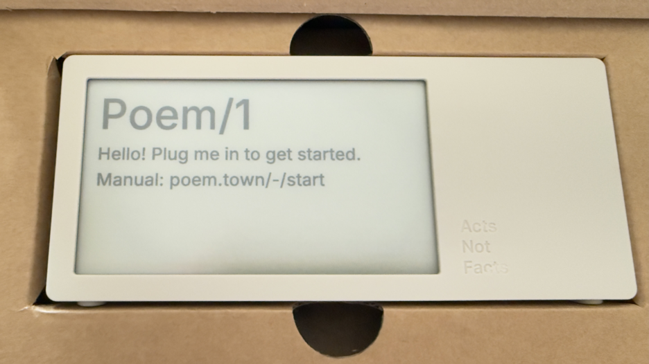
Today a package arrived that I’ve been deeply looking forward to. Part of the anticipation is the pure utter whimsy of it, part is it was a Kickstarter project that involved hardware (read hardware is hard when manufacturing is involved), and knowing the creator and watching all the steps along the way I was happy to see it and touch it. This is the Poem/1.

Poem clock in the box

Most of all, this device is giving me a lot of enjoyment and, well, glee.

The Poem/1 Arrived

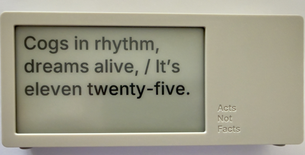
This poetry clock in the few hours I have had it running, with its e-ink display that updates every minute with a new poem for the time, which is / was generated by AI. Some of the poems are, well unique, and others are wonderful, but they can be favorited with the one button on the device.

The one button does a lot of work. It can be used to favorite a poem. There is a site with a dashboard for your device where you can push it notes you write to display, but to clear the note and get back to the clock you use the one button. There is a sleep mode with a screen saver and to clear that, you use the one button.

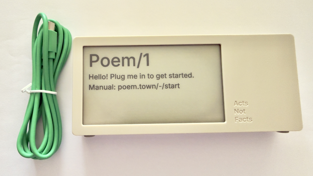
Poem clock and USB-C cable

The Poem/1 also has one USB-C cable. There is no manual in the box. Everything you need is the new Poem/1 device, the USB-C cable, and the e-ink screen tells you the rest.

After plugging it in you get a screen with some technical details and a QR code and using your phone with the QR code it then walks you through everything from easily connecting it to your WiFi (if printers could do this…), then make a selection or two and you have poetry time. There is also a dashboard website and the setup to your device is incredibly easy as is the setting up the account on that site.

photo of poem clock displaying Cogs in rhythm, dreams alife, It's Eleven twentry-five.'

The Journey of Poem/1

About 3 years ago Matt Webb blogged about an idea he had about an AI poetry clock, My new job is AI sommelier and I detect the bouquet of progress (Interconnected). This soon got connected to an e-ink device and Matt was on his way.

Matt setup a Kickstarter, which I happily backed. It wasn’t that I was overly keen with the AI bits (I’ve been working with AI/ML going back to 2008 and stayed current and it is a thing that I treated, like most everything else, as a tool). But I enjoyed the process of little printer – BERG and its outcome from afar. Having watched Little Printer’s journey of toil to come to life from Berg London (Matt and the amazing folks there), I wanted to support Matt (who mostly did this Poem/1 project alone). This provided insite into his long journey of quickly getting to a working prototype, then the slog of finding viable parts, a manufacturer, various regulatory approvals, and iterations when due to various things there were changes made late mid-stream to add to the delays.

Matt has done a good job logging his slog and journey. There were times where I’d realized I’d forgotten about Poem/1 and not heard of any progress in a while. About that time Matt would have an update in Kickstarter or on his blog.

Then there was US Customs, which stalled things for a while (not the tariffs, which became a hurdle earlier), but there there was more paperwork needed around “what is this clock”, oddly I (the customer) was sent the forms and I knew there wasn’t a winding mechanism nor jewels in it (well I haven’t checked inside, but pretty sure there are no jewels). Matt did a great job documenting the US Customs documentation hurdle in his post, How global logistics got me over my fear of personal agents (Interconnected) (my having worked at a Custom’s Brokerage for a few years I know the many reasons brokerages are needed).

What Time Is It?

I love the ability to favorite a time. (What is your favorite time?) In a few hours I have a couple favorites that I quite like:

Puddles reflect lost skies, / At two forty-five, heart sighs.

At twelve fifty, shadows creep, / Secrets held within silence deep.

Willow branches gently sway, / It’s twelve twenty-five today.

Thank you Matt I now have favorite times and a wonderful product.

Previous Month

This work is licensed under the Creative Commons Attribution-NonCommercial-ShareAlike License.