Off the Top: Navigation Entries
Showing posts: 1-15 of 22 total posts
Animoji Trains Future Interaction Interface
In the September 2017 Apple iPhone 8 and iPhone X announcement Keynote they demonstrated the Apple ARKit driven face emoji, Amimoji. This is similar to other platform’s and service’s offerings.
But, there is something I think a little different about what Apple is doing. One piece is the face identification system that Apple has in the iPhone X and the 30,000 dots it uses on people faces to ascertain an identity, which makes it difficult for someone to use a photo or mask of a person to gain access. The other piece is people interacting with their screens and the live face scans of muscles and facial features moving.
It is this second piece, the live interaction where I have a strong hunch Apple is seeding things for the future. People are learning to interact with a facial scan interface for fun and learning the capabilities so to be comfortable with it. This seems very similar to Microsoft’s using the Solitaire game in early Windows to provide a fun interaction as a means to train people how to use a mouse and get comfortable with it.
Look out a few years and start to see not Animoji, but people talking to Siri to bring up an app on their wrist, car heads-up display, or (rather banal) iPhone and use facial interactions to swipe, scroll, sort, etc. feature options and light contextual information options for simple / calm interfaces. A raise of the eyebrow could scroll up options, a side smile left moves to preferred options and side smile right moves to next screen.
I know nothing other than a hunch, but playing around with this idea for years, I’m seeing the potential could be around the corner. Finally. Maybe. Come on Apple, lets take that step.
Social Design for the Enterprise Workshop in Washington, DC Area
I am finally bringing workshop to my home base, the Washington, DC area. I am putting on a my "Social Design for the Enterprise" half-day workshop on the afternoon of July 17th at Viget Labs (register from this prior link).
Yes, it is a Friday in the Summer in Washington, DC area. This is the filter to sort out who really wants to improve what they offer and how successful they want their products and solutions to be.
Past Attendees have Said...
"A few hours and a few hundred dollar saved us tens of thousands, if not well into six figures dollars of value through improving our understanding" (Global insurance company intranet director)
From an in-house workshop:
"We are only an hour in, can we stop? We need to get many more people here to hear this as we have been on the wrong path as an organization" (National consumer service provider)
"Can you let us know when you give this again as we need our [big consulting firm] here, they need to hear that this is the path and focus we need" (Fortune 100 company senior manager for collaboration platforms)
"In the last 15 minutes what you walked us through helped us understand a problem we have had for 2 years and a provided manner to think about it in a way we can finally move forward and solve it" (CEO social tool product company)
Is the Workshop Only for Designers?
No, the workshop is aimed at a broad audience. The focus of the workshop gets beyond the tools' features and functionality to provide understanding of the other elements that make a giant difference in adoption, use, and value derived by people using and the system owners.
The workshop is for user experience designers (information architects, interaction designers, social interaction designers, etc.), developers, product managers, buyers, implementers, and those with social tools running already running.
Not Only for Enterprise
This workshop with address problems for designing social tools for much better adoption in the enterprise (in-house use in business, government, & non-profit), but web facing social tools.
The Workshop will Address:
Designing for social comfort requires understanding how people interact in a non-mediated environment and what realities that we know from that understanding must we include in our design and development for use and adoption of our digital social tools if we want optimal adoption and use.
- Tools do not need to be constrained by accepting the 1-9-90 myth.
- Understanding the social build order and how to use that to identify gaps that need design solutions
- Social comfort as a key component
- Matrix of Perception to better understanding who the use types are and how deeply the use the tool so to build to their needs and delivering much greater value for them, which leads to improved use and adoption
- Using the for elements for enterprise social tool success (as well as web facing) to better understand where and how to focus understanding gaps and needs for improvement.
- Ways user experience design can be implemented to increase adoption, use, and value
- How social design needs are different from Web 2.0 and what Web 2.0 could improve with this understanding
More info...
For more information and registration to to Viget Lab's Social Design for the Enterprise page.
I look forward to seeing you there.
YouTube New Interface and Social Interaction Design Santiy Check
YouTube has released a new design for the site and its individual video pages. This gets shared in Google Operating System :: User Inferface Updates at YouTube and TechCrunch :: YouTube Updates Layout, Now with Tabs and Statistics. While the new design looks nice and clean, it has one design bug that is horribly annoying it has mixed interaction design metaphors for its tabs or buttons.
Broken Interaction Design on Buttons or Tabs
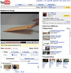 As the image shows the Share, Favorite, Playlists, and Flag buttons or tabs all have similar design treatment, but they do not have the same actions when you click on them. Three of the items (Share, Playlists, and Flag) all act as tabs that open up a larger area below them to provide more options and information. But, the Favorites acts like a button that when clicked it marks the item as a favorite.
This is incredibly poor interaction design as all the items should act in the same manner. If the items do not have the same action properties they really should not look the same and be in the same action space. Favorites should be a check box or a binary interface for on and off. That interaction patter more closely matches the Rate section and seems like it should have been there rather than showing a lack of understanding interaction design basics and confusing people using the site/service.
Social Sites Seem to Share a Lack of Interaction Understanding
This should have been a no brainer observation for a design manager or somebody with a design sanity check. YouTube is far from the the only site/service doing this. Nearly all of the services are not grasping the basics or are broadly applying design patterns to all user scenarios when they really do not fit all scenarios and user types (nearly every service I talk to know exactly the use type a person fits into but never takes this into account in optimization of design patterns that match that use need). Facebook really falls into this hole badly and never seems to grasp they are really making a mess of things the more features and functionality they are bringing into their service without accounting for the design needs in the interface.
My seemingly favorite site to nit pick is LinkedIn which I use a lot and has been a favorite, but their social interaction additions and interactive interfaces really need much better sanity checks and testing before they go into production (even into the beta interface). LinkedIn is really trying to move forward and they are moving in the right direction, but they really need better design thinking with their new features and functionality. Their new design is ready to handle some of the new features, but the features need a lot more refining. The new design shows they have a really good grasp that the interface needs to be a flexible foundation to be used as a framework for including new features, which could benefit from treating them as options for personalization. LinkedIn has pulled back many of the social features and seems to be rethinking them and refining them, but they really need some good sanity checks before rolling them out again.
Social Interaction in Enterprise Tools
The befuddled interaction understanding is not germane to commercial or consumer public social web sites, but it also plagues tools aimed at the enterprise. This is not overly surprising as many of the social enterprise (enterprise 2.0) tools and services are copying the public web tools and services to a large degree. This is a good thing, as it puts the focus on ease of use, which has been horribly missing in business focussed tools for far too long. But, the down side for enterprise focussed tools is they are not for the public web they are for business users, who most often do not have familiarity with the conventions on the public web and they have a large cognitive gap in understanding what the tools do and their value. There is less time for playing and testing in most business people's worklife. This means the tools need to get things right up front with clear understanding of the use needs of the people they are building for in business. This seems to be lacking in many tools as there is much copying of poor design that really needs to be tested thoroughly before launching. Business focussed tools are not hitting the same people as are on the web, which will work through poor design and functionality to see what things do. It is also important to consider that there are a wide variety of types of people using these tools with varying needs and varying interaction understandings (this will be another blog post, actually a series of posts that relate to things I have been including in workshops the last six months and presenting the last couple).
[Comments are available and moderated as usual at: YouTube New Interface and Social Interaction Design Santiy Check :: Personal InfoCloud]
Stitching Conversation Threads Fractured Across Channels
Communicating is simple. Well it is simple at its core of one person talking with another person face-to-face. When we communicate and add technology into the mix (phone, video-chat, text message, etc.) it becomes more difficult. Technology becomes noise in the pure flow of communication.
Now With More Complexity
But, what we have today is even more complex and difficult as we are often holding conversation across many of these technologies. The communication streams (the back and forth communication between two or more people) are now often not contained in on communication channel (channel is the flavor or medium used to communicate, such as AIM, SMS, Twitter, e-mail, mobile phone, etc.).
We are seeing our communications move across channels, which can be good as this is fluid and keeping with our digital presence. More often than not we are seeing our communication streams fracture across channels. This fracturing becomes really apparent when we are trying to reconstruct our communication stream. I am finding this fracturing and attempting to stitch the stream back together becoming more and more common as for those who are moving into and across many applications and devices with their own messaging systems.
The communication streams fracture as we pick-up an idea or need from Twitter, then direct respond in Twitter that moves it to SMS, the SMS text message is responded back to in regular SMS outside of Twitter, a few volleys back and forth in SMS text, then one person leaves a voicemail, it is responded to in an e-mail, there are two responses back and forth in e-mail, an hour later both people are on Skype and chat there, in Skype chat they decide to meet in person.
Why Do We Want to Stitch the Communication Stream Together?
When they meet there is a little confusion over there being no written overview and guide. Both parties are sure they talked about it, but have different understandings of what was agreed upon. Having the communication fractured across channels makes reconstruction of the conversation problematic today. The conversation needs to be stitched back together using time stamps to reconstruct everything [the misunderstanding revolved around recommendations as one person understands that to mean a written document and the other it does not mean that].
Increasingly the reality of our personal and professional lives is this cross channel communication stream. Some want to limit the problem by keeping to just one channel through the process. While this is well intentioned it does not meet reality of today. Increasingly, the informal networking leads to meaningful conversations, but the conversations drifts across channels and mediums. Pushing a natural flow, as it currently stands, does not seem to be the best solution in the long run.
Why Does Conversation Drift Across Channels?
There are a few reasons conversations drift across channels and mediums. One reason is presence as when two people notice proximity on a channel they will use that channel to communicate. When a person is seen as present, by availability or recently posting a message in the service, it can be a prompt to communicate. Many times when the conversation starts in a presence channel it will move to another channel or medium. This shift can be driven by personal preference or putting the conversation in a medium or channel that is more conducive for the conversation style between people involved. Some people have a preferred medium for all their conversations, such as text messaging (SMS), e-mail, voice on phone, video chat, IM, etc.. While other people have a preferred medium for certain types of conversation, like quick and short questions on SMS, long single responses in e-mail, and extended conversations in IM. Some people prefer to keep their short messages in the channel where they begin, such as conversations that start in Facebook may stay there. While other people do not pay attention to message or conversation length and prefer conversations in one channel over others.
Solving the Fractured Communication Across Channels
Since there are more than a few reasons for the fractured communications to occur it is something that needs resolution. One solution is making all conversations open and use public APIs for the tools to pull the conversations together. This may be the quickest means to get to capturing and stitching the conversation thread back together today. While viable there are many conversations in our lives that we do not want public for one reason or many.
Another solution is to try to keep your conversations in channels that we can capture for our own use (optimally this should be easily sharable with the person we had the conversation with, while still remaining private). This may be where we should be heading in the near future. Tools like Twitter have become a bridge between web and SMS, which allows us to capture SMS conversations in an interface that can be easily pointed to and stitched back together with other parts of a conversation. E-mail is relatively easy to thread, if done in a web interface and/or with some tagging to pull pieces in from across different e-mail addresses. Skype chat also allows for SMS interactions and allows for them to be captured, searched, and pulled back together. IM conversations can easily be saved out and often each item is time stamped for easy stitching. VoIP conversations are often easily recorded (we are asking permission first, right?) and can be transcribed by hand accurately or be transcribed relatively accurately via speech-to-text tools. Voice-mail can now be captured and threaded using speech-to-text services or even is pushed as an attachment into e-mail in services as (and similar to) JConnect.
Who Will Make This Effortless?
There are three types of service that are or should be building this stitching together the fractured communications across channels into one threaded stream. I see tools that are already stitching out public (or partially public) lifestreams into one flow as one player in this pre-emergent market (Facebook, Jaiku, etc.). The other public player would be telecoms (or network provider) companies providing this as a service as they currently are providing some of these services, but as their markets get lost to VoIP, e-mail, on-line community messaging, Second Life, etc., they need to provide a service that keeps them viable (regulation is not a viable solution in the long run). Lastly, for those that do not trust or want their conversation streams in others hands the personally controlled application will become a solutions, it seems that Skype could be on its way to providing this.
Is There Demand Yet?
I am regularly fielding questions along these lines from enterprise as they are trying to deal with these issues for employees who have lost or can not put their hands on vital customer conversations or essential bits of information that can make the difference in delivering what their customers expect from them. Many have been using Cisco networking solutions that have some of these capabilities, but still not providing a catch all. I am getting queries from various telecom companies as they see reflections of where they would like to be providing tools in a Come to Me Web or facilitating bits of the Personal InfoCloud. I am getting requests from many professionals that want this type of solution for their lives. I am also getting queries from many who are considering building these tools, or pieces of them.
Some of us need these solutions now. Nearly all of us will need these solutions in the very near future.
MyWeb 2 Grows Up Quickly into a Usable Tool
Earlier this week I chose to use Yahoo! search rather than the default Google that I usually use. The search page on Yahoo! had sponsored links at the top of the page, but then a few other offerings followed by the usual offerings. The second set was dead on what I was seeking. What were these second set of links? They were the results of those in "My Community" in MyWeb 2 Search, which is similar to del.icio.us in that it is a social bookmarking tool with tagging.
This discovery from a community of less than 40 people really surprised me. Of those 40 people less than 15 have more than 5 pages they have bookmarked, but this community is one I share interests and vocabulary. I was partial shocked with amazement as when MyWeb 2 launched in beta a few weeks ago (or a few months at this point) I was completely under whelmed as most of the links in MyWeb 2 were for things I not only had not interest in, but did not care to have recommended.
As the net effect of more people adding their bookmarks to this socially shared tool grew the value of the tool increased. As it grows I am positive it the aspects of my community will need to get more fine grained so I can say I like the tags from person X (similar to the granular social network which would make better use of the social network for recommender systems that actually could be used and trusted). One of the benefits of MyWeb 2 is that it gets layered on top of Yahoo's search results, which is a great place for this information.
I would love to replicate my del.icio.us bookmarks and tags into MyWeb 2 at Yahoo. The next step would be to feed both systems at the same time from one central interface. There are things in del.icio.us that I really like, but the layering of the social bookmarking and with tagging on top of other tools adds greater value to the user.
Chevy Redesigns with Standards
Chevrolet has redesigned with fully valid (one minor issue in the style sheet) XHTML (strict) and CSS. It is beautiful and wonderfully functional. All the information can be easily copied and pasted to help the discerning car buyer build their own crib sheet. The left navigation (browsing structure) is wonderful and not a silly image, but a definition list that is expandable. The style layer is semantic, which is a great help also (for those IAs who understand). Those of you so inclined, take a look under the hood as there are many good things there.
Make My Link the P-link
Simon hit on plinks as an echo to Tim Bray's comments and variation on Purple Numbers (Purple Numbers as a reference). As I have mentioned before, page numbers fail us and these steps are a good means to move forward.
Simom has also posted in more plinks and in there points to Chris Dent's Big Day for Purple Numbers.
I have been thinking for quite some time about using an id attribute in each paragraph tag that includes the site permalink as well as the paragraph with in that entry. This would look like: <p id="1224p7">. This signifies permanent entry 1224 and paragraph 7 with in that entry. What I had not sorted out was an unobtrusive means of displaying this. I am now thinking about Simon's javascript as a means of doing this. The identifier and plink would be generated by PHP for the paragraph tag, which would be scraped by the javascript to generate the plink.
The downside I see is only making edits at the end of the entry using the "Update" method of providing edits and editorial comments. The other downside is the JavaScript is not usable on all mobile devices, nor was the speed of scrolling down Simon's page that fluid in Safari on my TiBook with 16MB of video RAM.
Indi on site navigation and keeping it under control
Indi Young provides a great guide for building browsing structures in her article Site Navigation: Keeping It Under Control.
Matt Jones looses faith in navigation
Matt picks up on the failure of navigation and points to similar conversations to ones I had with Stewart that turned me to look for something other than navigation as a means to build information structures. Each user approaches information with two of their own receptors, cognitive and sensory receptors. The cognitive elements include vocabulary and rhetoric (essentially writing style). The sensory include visual elements, which include color, texture, and layout. Layout includes the visual structure and context given through proximity. These two seem to have paralells to Andrew Dillon's semantic spatial model, but I want to know more about his model.
Matt discusses the problems with navigation consistancy at the BBC sites. Here is where navigation gets in the way, as browsing structures is a better term and less restrictive. The user needs a means to find other information that is related or provides context to the information the see on their screens. If there is some attraction to the information infront of the user they often believe what which they seek will be close by if the information is grouped by like information. Much like a market where produce is grouped together, as they are like products.
Wayfinding and navigation in digital spaces
The IA Summit session on Wayfinding and navigation in digital spaces has the presentation slides posted on Rashmi's site (Rashmi was the panel moderator). The panelists were Mark Bernstein, Andrew Dillion, and Susan Campbell. (Oddly enough I was presenting the Model of Attraction at the same time in another session. The Model of Attraction provides a framework for thinking about information structure and development in a navigation metaphor environment.)
Peter has posted his notes on this panel (navigation and hypertext).
The Web, information use, and the failure of the spacial metaphor
Francis Cairncross' book title Death of Distance is a wonderful understanding of the world around us in many way and should now apply to spacial relationships on the Web. The idea of spacial relationships on the Web have been a stretch of the truth for a long time. Initially the idea of a person going out and "navigating" other spaces helped those new to the prospect of what the Web held grasp the Web concept.
The problem with spacial explanations of the Web is they do not work very well. The truth is we go nowhere on the Web, information is brought to us. The Web user is ego-centric and rightfully so, as the world of information and commerce on the Web revolves around the user. The Web is truly omnipresent. Information is everywhere at once. The Web can even follow the user on mobile devices. The user does not go out and explore different places, the artifacts of the places come to the user's screen based on what is of interest to the user.
I was reading David Weinberger's book Small Pieces Loosely Joined and it was painful to watch him twist and turn to get the spacial metaphor to work. A whole chapter in the book is devoted to Space [on the Web] (the book as a whole is very enjoyable and worth the time to read). Weinberger first discusses how we use the Web, using surf, browse, and go to a site. This is wrapped with an analogy explaining the Web is like a library where the user does not have access to the stacks of books, but a librarian (or clerk) goes and retrieves the book, based on the request the user made, and brings it to the user. He also states:
... this is perhaps the most significant change the Web brings to the world of documents: the Web has created a weird amalgam of documents and buildings. With normal paper documents, we read them, file them, throw them out, or sent them to someone else. We do not go to them. We don't visit them. Web documents are different. They're places on the Web. We go to them as we might go to the Washington Monument or the old Endicott Building. They're there, we're here, and if we want to see them, we've got to travel.
.... the odd thing is that, of course, we're not really going any place, and we know it.
This is just painful to follow. We keep bringing up this bloodied and battered spacial metaphor trying to make it work to explain more than the very tiny bit it did explain well. The spacial metaphor has long overstayed its welcome and it now hinders us as we try to build the future information interfaces, which include mobile information access and internationalization of information.
Yes, I am saying mobile information use is hindered by a spacial metaphor. It is more than hindered it is crippled by it. When prepare information now location is largely irrelevant, but access, device, application, and information form and highly relevant. Before we prepared information on paper and sent that information to people (which can be done today) and we largely knew how that information was going to be used. Today, with digital information the ease of information reuse and the user's ego-centric view of the information world, we must think of the user and how the information will be used. The proximity of the information to the user through access, storage, or personalization is what is paramount. Proximity is the only spacial element that has significance. This equally applies to internationalization as language and culture are the barriers to the information not space. A Brazilian may be sitting on the T in Boston and want to read the most recent information on rollout of WiFi in Rio. The user should not need to find the Brazilian neighborhood in Boston to get the information in the proper language (Portuguese) with familiar cultural inflections. The user can attract that information form easily, which can be brought to the user if that information and access have been prepared and enabled. The user may have come across a resource for this information while looking for a client's most recent press release and the user forwarded the link to her mobile device to read later. Access to information can and should be based on the users actions and choices.
The user can (and has been able to for some time) create their own metadata and retrieval structures. Communication with live people or machines that can and will convey useful information at the user's desire is not only the reality of the wired world, but what mobile use is all about. The user can set their proximity to information they have come across and connectivity conduits are enablers of that information they have yet to discover.
Up to this point the spacial metaphor only provided us with the navigation, but flat out failed us with what the user could do once they found what they were seeking. The user can browse, search, receive in e-mail (based on list subscriptions), read an information feed that brings to the user new information from sites the user likes or from aggregators, or a variety of other means. Once the user comes across information they have an interest in they want to keep that information attracted to themselves, via storage, putting it on a page that is accessible to a mobile or stationary device, and/or have the information delivered at a time that will be more convenient (getting a text message on your phone with the address and time of a party at an art gallery). Proximity also plays a role in location based services, such as bringing up restaurant listing and reviews when the GPS in our mobile device indicates we are near these establishments. The user should be able to identify favorites or preferences that can help provide "best options".
The realization of the failure of the navigation metaphor to provide for much other than a nice name for the grouped set of links that provide browsing options pushed me to investigate the Model of Attraction (MoA). The MoA is not perfect, but does provide a framework to think about information use and reuse as users currently interact with it. The MoA offers a method for us to work through how we allow the user to easily reuse information they found. The devices are just conduits for the attraction interaction to take place. MoA offers a framework that is also easy to understand, but is a literal description, which helps us see building, structuring, and preparing information and applications for the future.
Navigation -- R.I.P.
Model of Attraction moves forward
The upcoming IA Summit in Portland, Oregon is providing me the opportunity to offer the Model of Attraction live and in person. In the coming weeks I will be posting background to this presentation in digestible chunks. You are free to peruse the initial draft of Model of Attraction from March 2002, the Model of Attraction outline from December 2002, and the attraction category here in Off the Top.
Navigation is Broken
Part of the need for developing the Model of Attraction revolves around the broken metaphor of navigation that many IA's put much trust in. Metaphors use a concept that is understood (often not related to the topic at hand) to describe the hard to understand or the new. All metaphors limit understanding as they do not accurately describe the actions and relationships, they only provide a framework that helps understand bits of the whole. The navigation metaphor has been stretched beyond its limits and has limited the possibilities of information structures. We as IAs are worse off by leaning on navigation beyond its narrow boundaries and the users of the sites and the information bound in the sites are worse off by the over reliance on the navigation metaphor.
To see where this discovery began, go to this discussion on IA, navigation, and information space. Pay attention to Stewart Butterfield's comments. In addition navigation does not permit us to think about understanding visual attraction, reuse of information, information access methods outside the PC based Web, mobile access, personalization, content management, or the ability to have a rough cloud of information that follows the user (access to information where and when one needs it). In the Peterme discussion I stated I would sleep on a solution. I repeatedly slept and woke thinking about this problem and fell into the Model of Attraction early last March and have been working with the MoA since then.
I have used the MoA with clients and when mentoring IAs and Web developers. The comprehension is much better when describing the same approach than when using the navigation metaphor. Clients quickly understand the need for controlled vocabularies based on the user's common language and understanding. MoA helps easily explain the need for grouping of information around categories and facets. Card sorting tasks become easy to understand for the clients and helps them assist in the process. Most of the IAs took kit (persona, taxonomy, wireframes, metadata, etc.) are more usable as their need is easily understood by all in the context of attraction.
Scent not Strong
You may be thinking this rough explaination you are getting sounds like Information Scent. You would be right, to some degree. But information scent, like navigation, is a metaphor. Yes, scent breaks too and is quite difficult to use with clients as some things get very confusing for them. Scent helps IAs understand what is going on a little better and there is great research that has come out of the Information Scent community. But when you get down to it scent is a subset of attraction. Scent is one method of attracting or repelling the user toward information they are seeking and keeping extraneous information out of the mix. Scent also has its limits. The scent metaphor works with getting the user to information, but it gets very murky when the information needs metadata (to help augment the attraction between the user and the information they are seeking). Scent and odors have distinct understandings and altering the scents for understanding (metadata) raises many questions from clients as the client tries to understand. Scent does not work well when trying to build information structures for mobile access to information, nor for setting the ability to have the information follow the user (What you want to use a blueberry muffin as a perfume? Don't think so).
More to Come
This only defines MoA by showing the limits of navigation and scent. More understanding is on its way in upcoming weeks and will be put in a presentation format for the IA Summit. Those that are worried, we are not throwing out navigation or scent. We are keeping navigation in its small usable space where it works well. Scent has provided great research and has similar properties to attraction as it is a subset. The Model of Attraction will provide a broader foundation that allows us to move into the future as we build information structures that include possibilities for mobile access, social networks, and true access to information as the user needs it by keeping the information close at hand. The MoA does not solve these problems, but provides a framework that does not break when we work to solve these issues.
Model of Attraction Outline - Version 1
The Model of Attraction ouline version 1 is now posted. The outline has been structured to set up a structure for filling in the blanks and providing a better strucutre for understanding the MoA. Outlines are my foundations for writing more serious works. Outlines help me find holes and provide a structure to rest content upon. This verion is largely attributed a train ride to Philly that allowed me time and untethered space to think, order, and write.
Please comment if you are so inclined. Find holes are areas that do not seem fully fleshed out enough. Thank you in advance.
Go back
I had an early preview of a site this past week so to add comments. It is odd to me that sites are still being built with the frame of reference that the user will come through the "font door". If you read your log files the users come in at every opening. It is about even odds that a new user to the site will come there from a search engine, an external link, or from another pointer (e-mail or article). The frame of reference should always try to provide some orientation to the user, such as breadcrumbs or some other link out to related or parent information.
The item that I found a little jarring was a "Go back to the previous page" and it was not a javascript, but a link to what the developer thought was a next level up page. Pure linear navigation is a practice that is no longer a practice, if it ever was. Somebody last night at the DC-IA book club asked whether we navigated or searched, as always it seems to depend. With sites like Amazon we mostly searched, while some smaller sites we would click around. It seemed the greater volume of information lead to a greater instance of searching.
We did not talk about this for long, but it has been resonating all day. One of the things that Amazon does extremely well is end-search navigation. Most folks seem to search Amazon to find a particular item, but then Amazon's navigation and related offerings that could attract the user to the item, which they were searching for or to a similar item. The search result pages offer links to narrow the results or to ensure the user is looking for the musician Paul Young or author Paul Young. A user arriving at an Amazon book page would have all the options and information they needed to find related information and where they are in the Amazon site.